TravelX
The birth of a game changer.
Industry
blockchain
travel
digital
Serivces
Strategy
Positioning
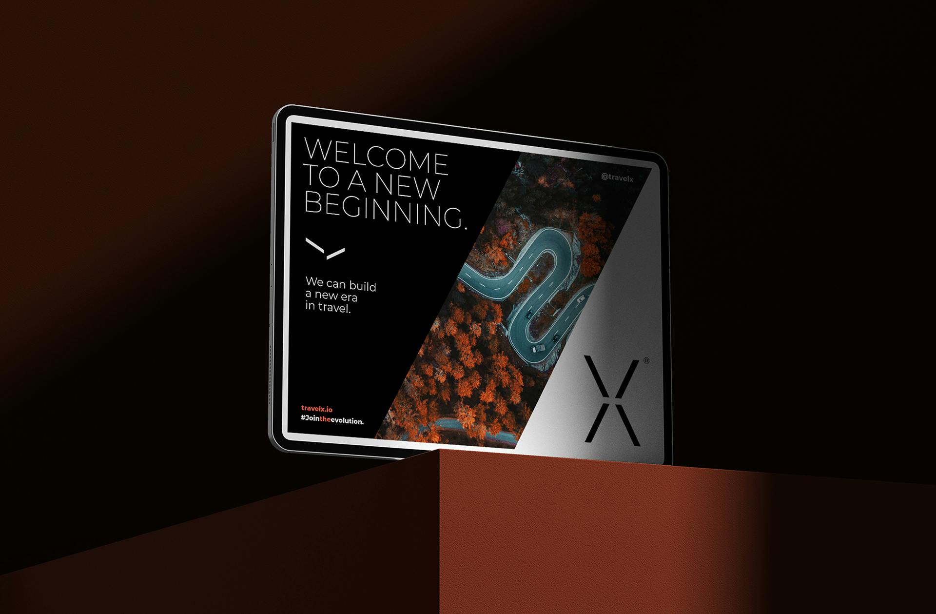
Visual identity
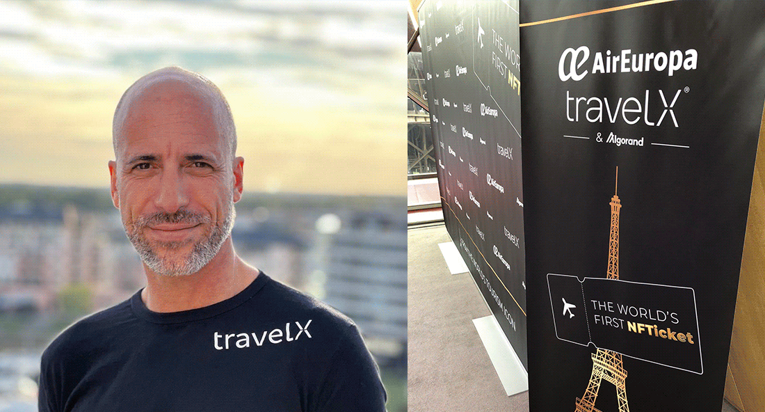
We created the identity for the new blockchain-based distribution and retailing infrastructure for a secure, decentralized, frictionless, efficient, transparent, and profitable Travel Industry.
TravelX benefits both customers and airlines, by giving travelers access to better products with clear terms and conditions and tools to freely dispose of their travel assets, and by reducing suppliers’ distribution costs and inefficiencies, ultimately improving their profitability.

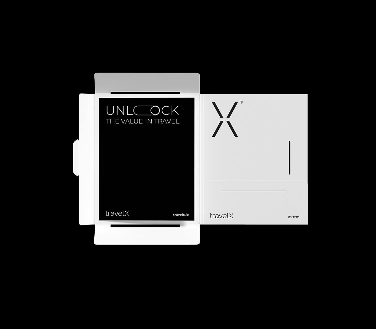
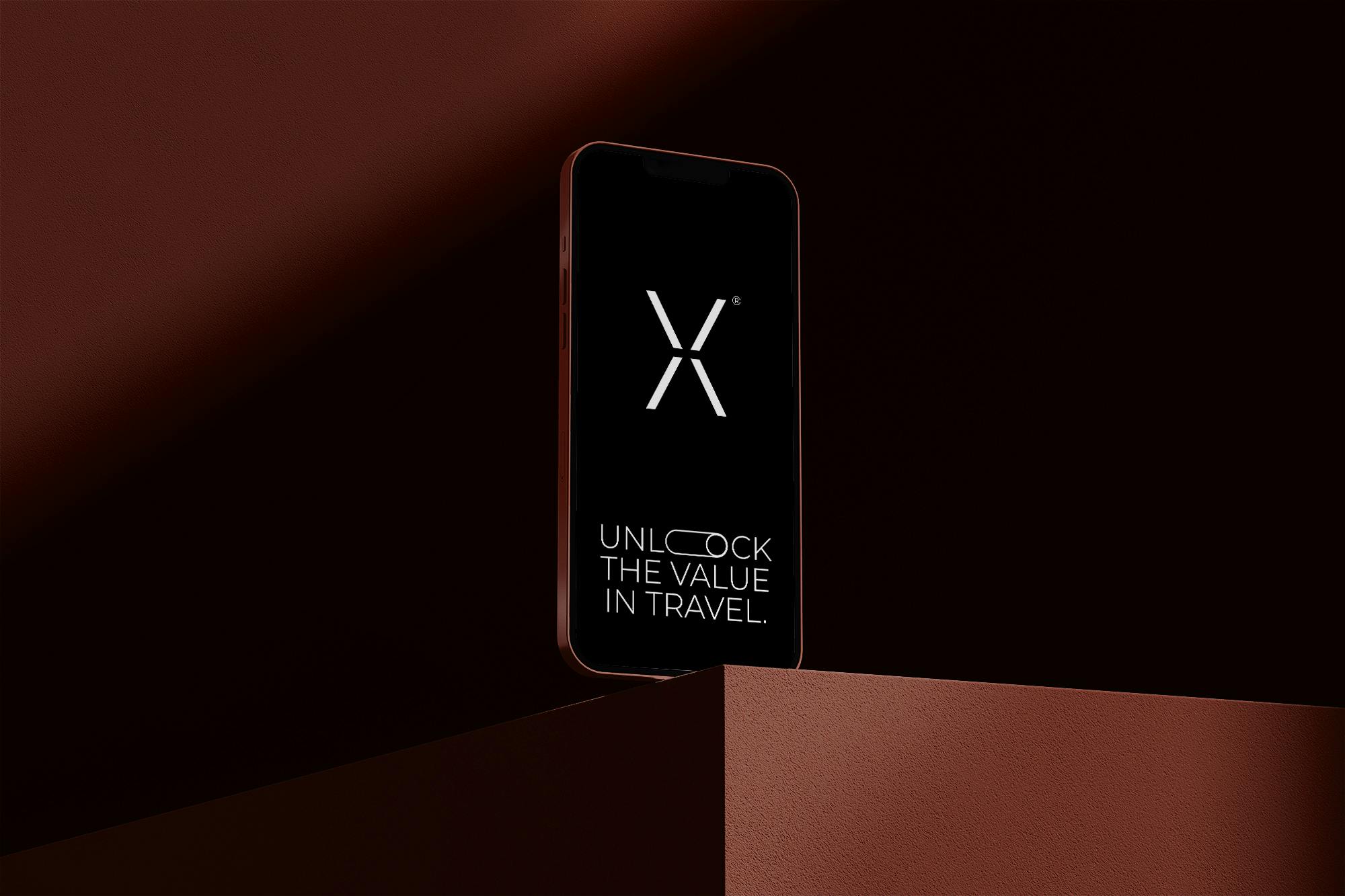
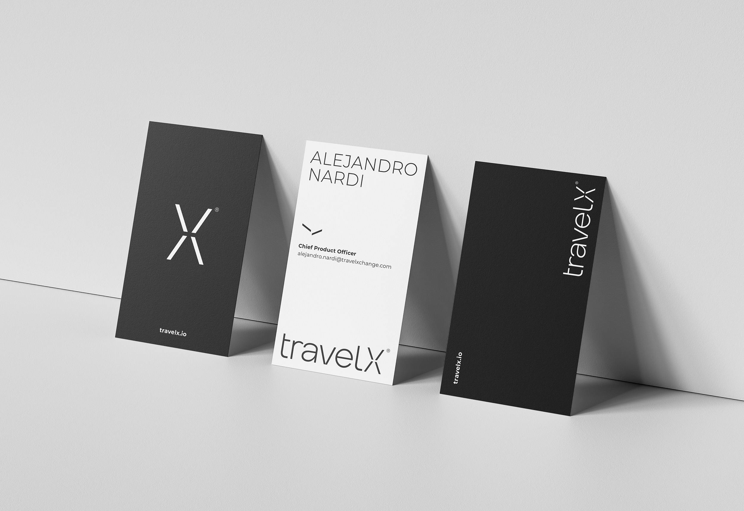
A letter, a symbol.
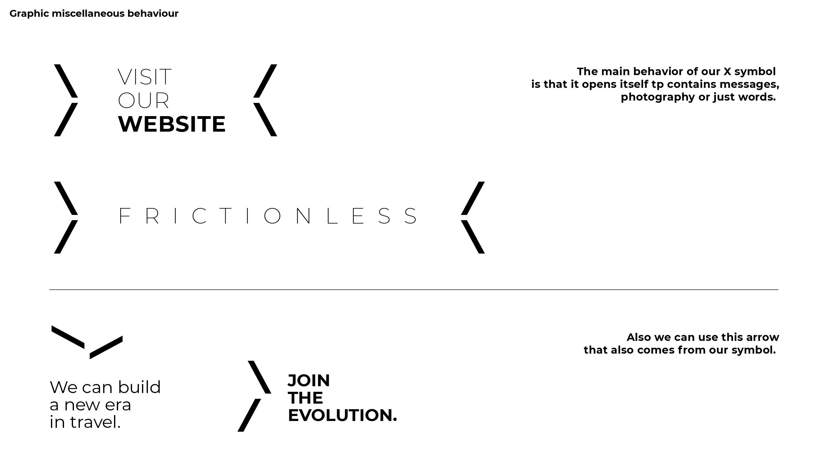
The brand name has a clear protagonist: the X. Since this letter is a transversal symbol to new categories within the digital world, we worked on the design of the letter so that it can represent a clear X but also be a living resource to build the design system. It contains informatinon, key words and images. It also moves in other direction as a dinamic arrow representing a miscellaneous element.
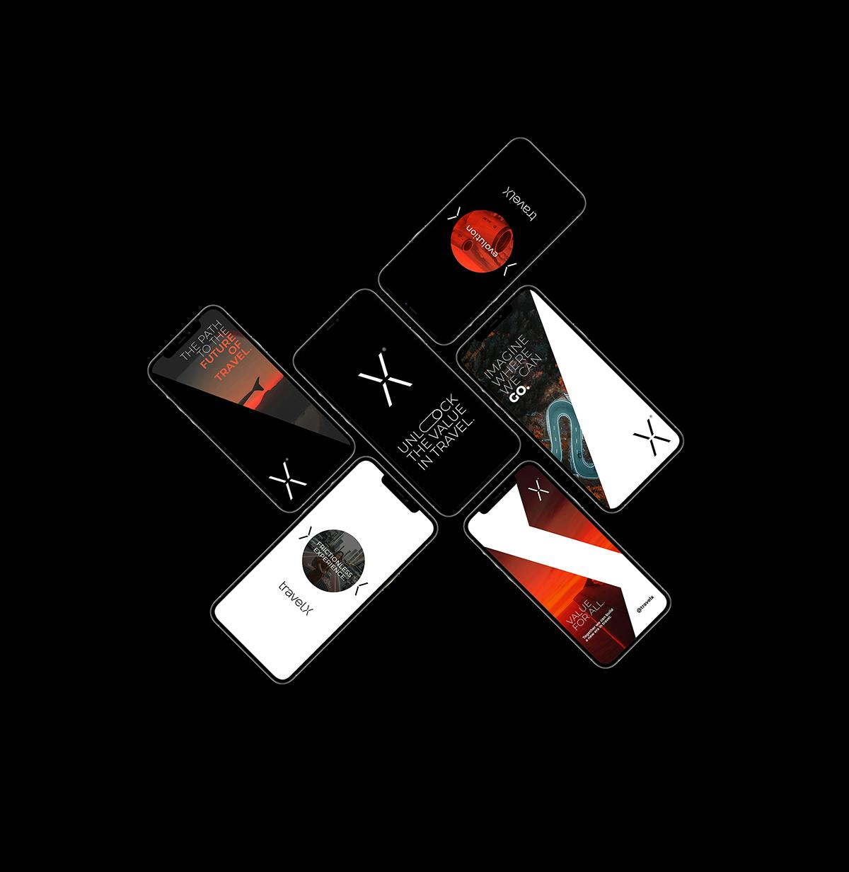
Graphic universe
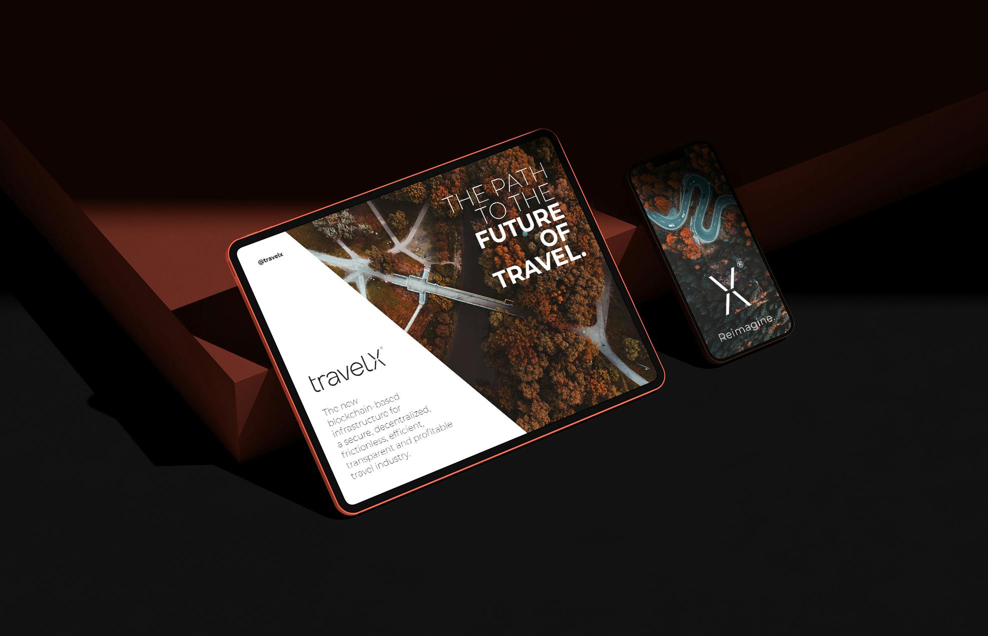
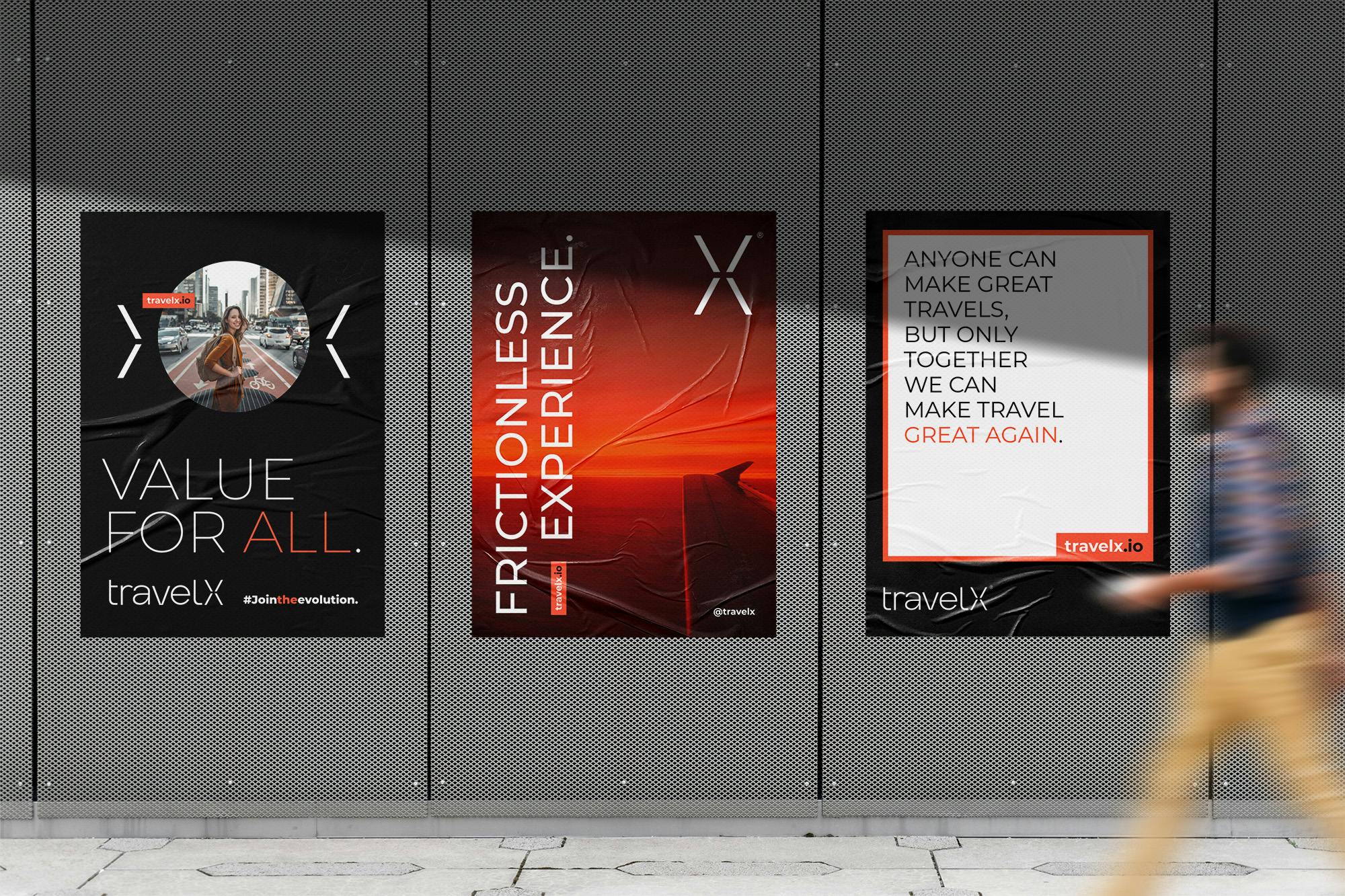
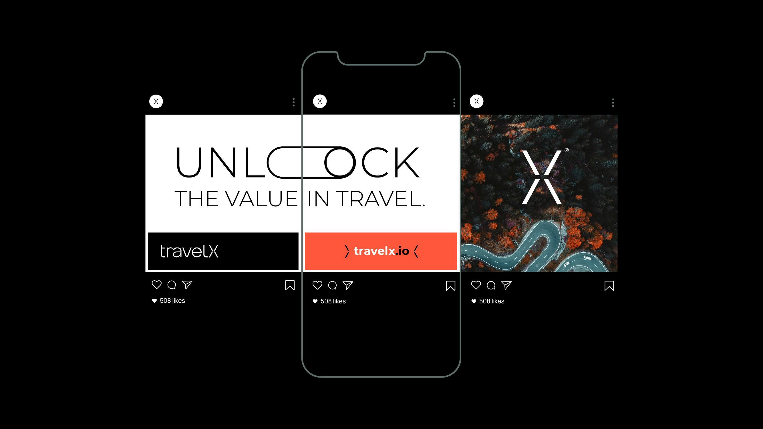
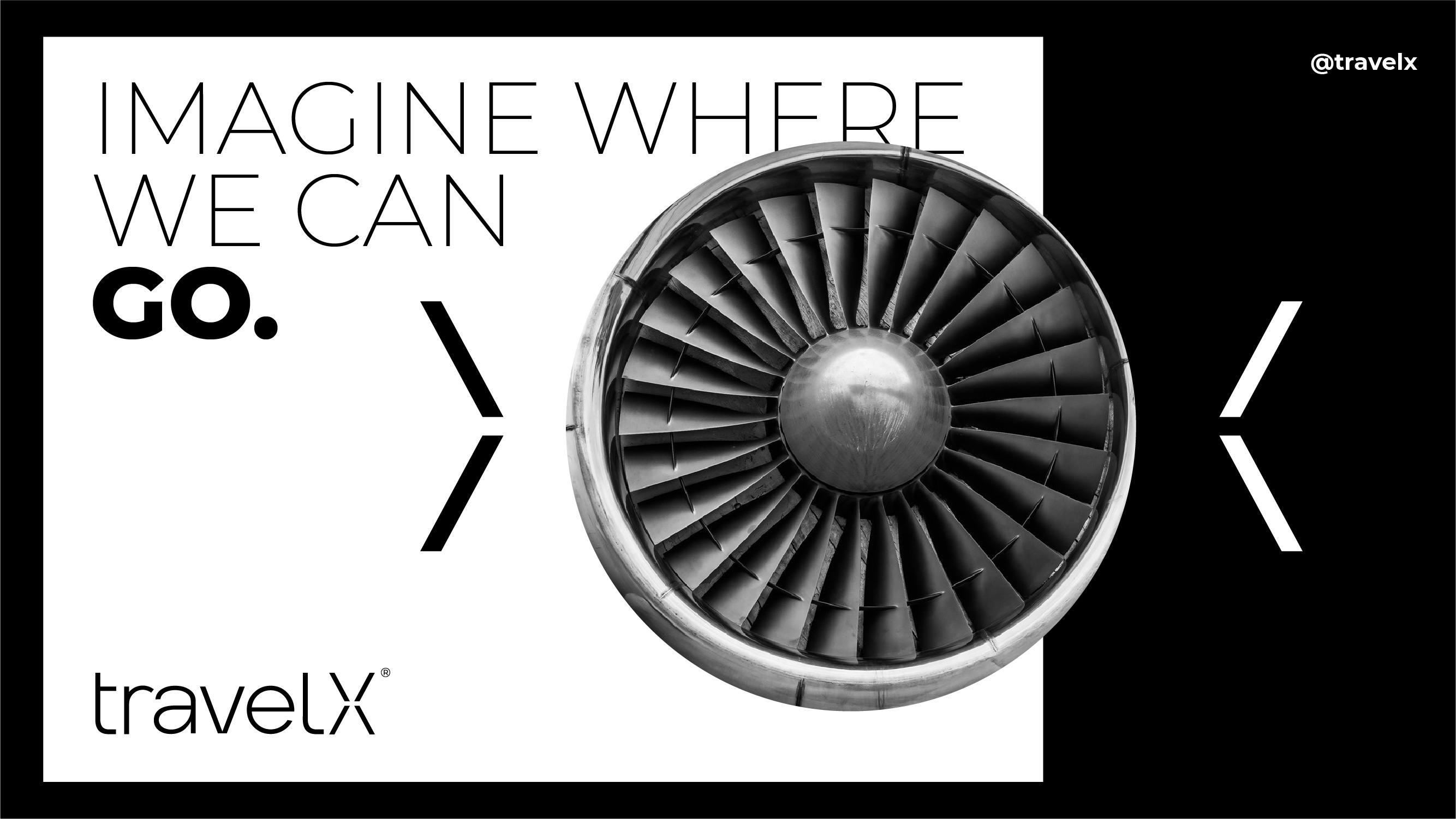
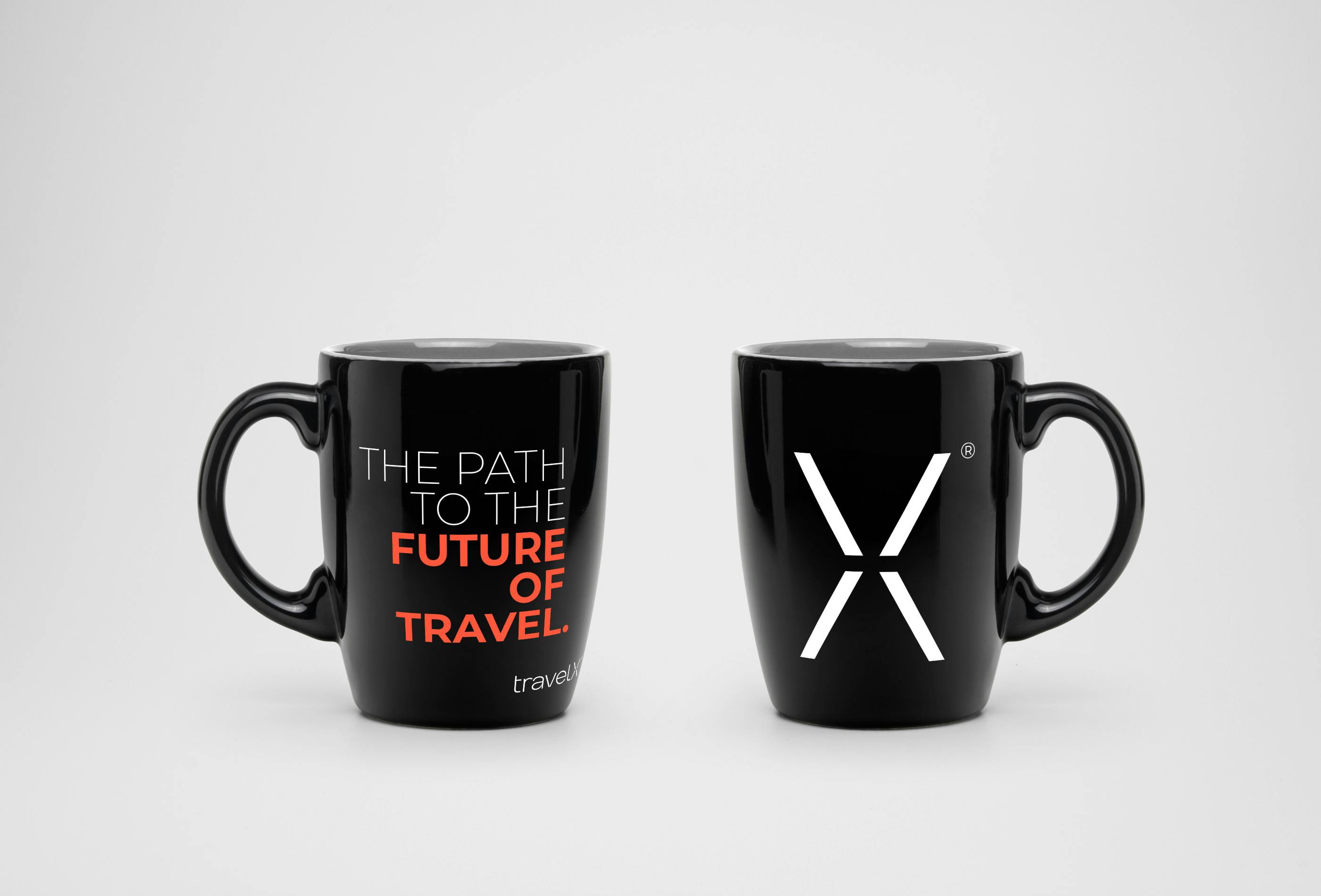
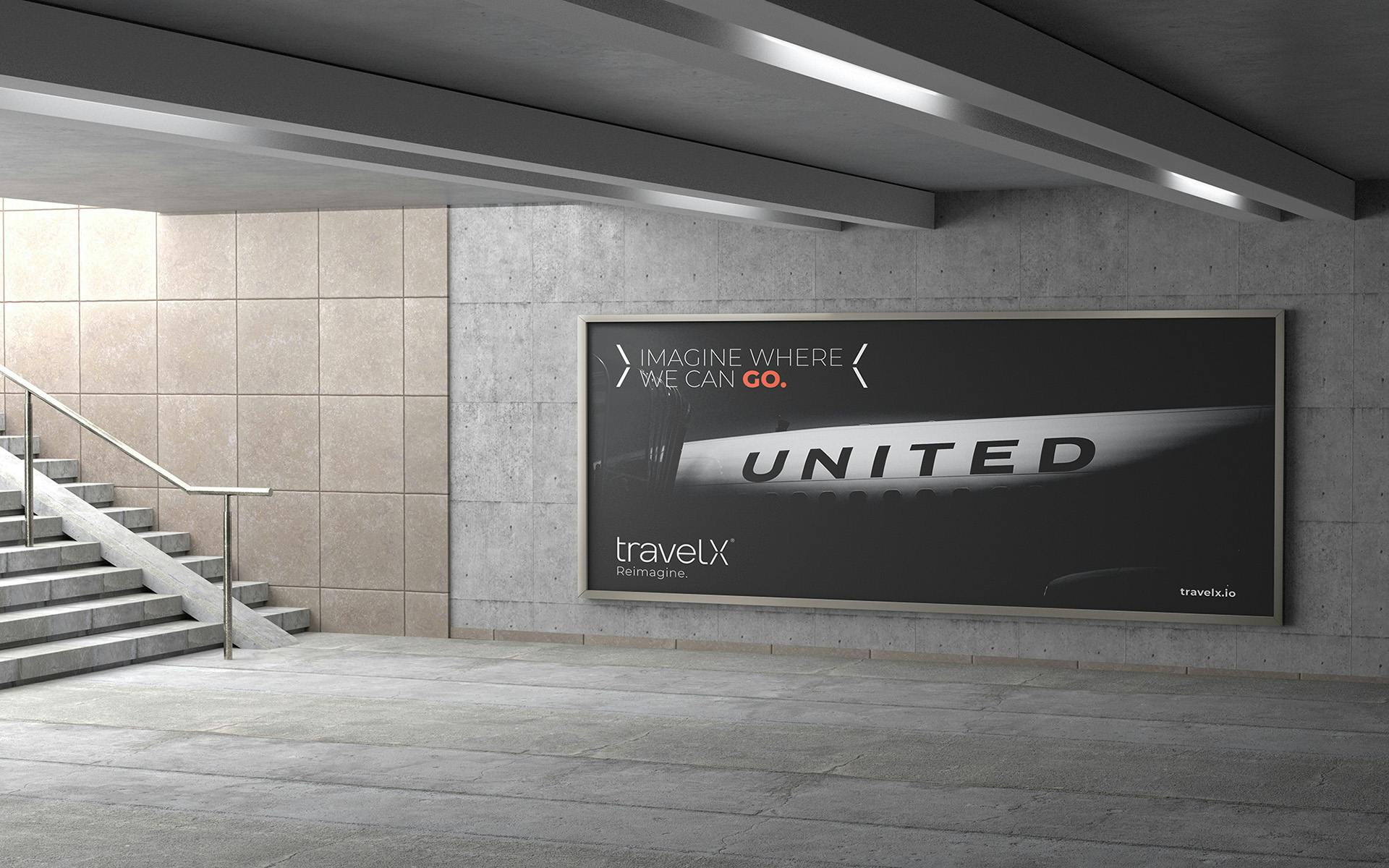
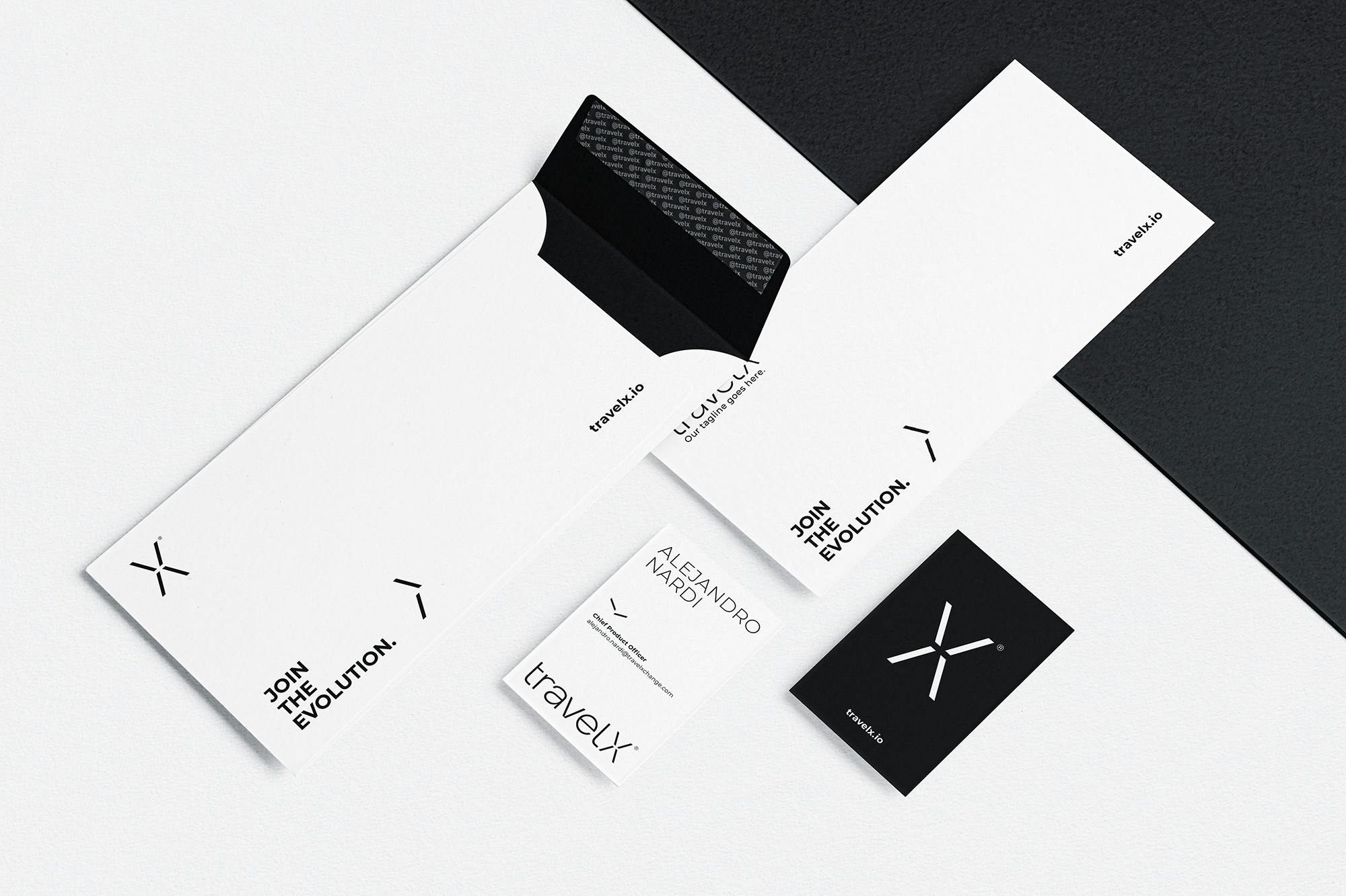
Beyond the logo, a minimalist design system has been developed to express the brand behavior through clear communications. The visual brand territory is black and white to identify the strong concept of "community" this company has. We reinforce the system with a digital orange swatch to make this color a distinguishing element within their communication, along with a modular design system and functional typography selection to convey the innovative aspect of the brand.
1 of 3
-X-implicity.
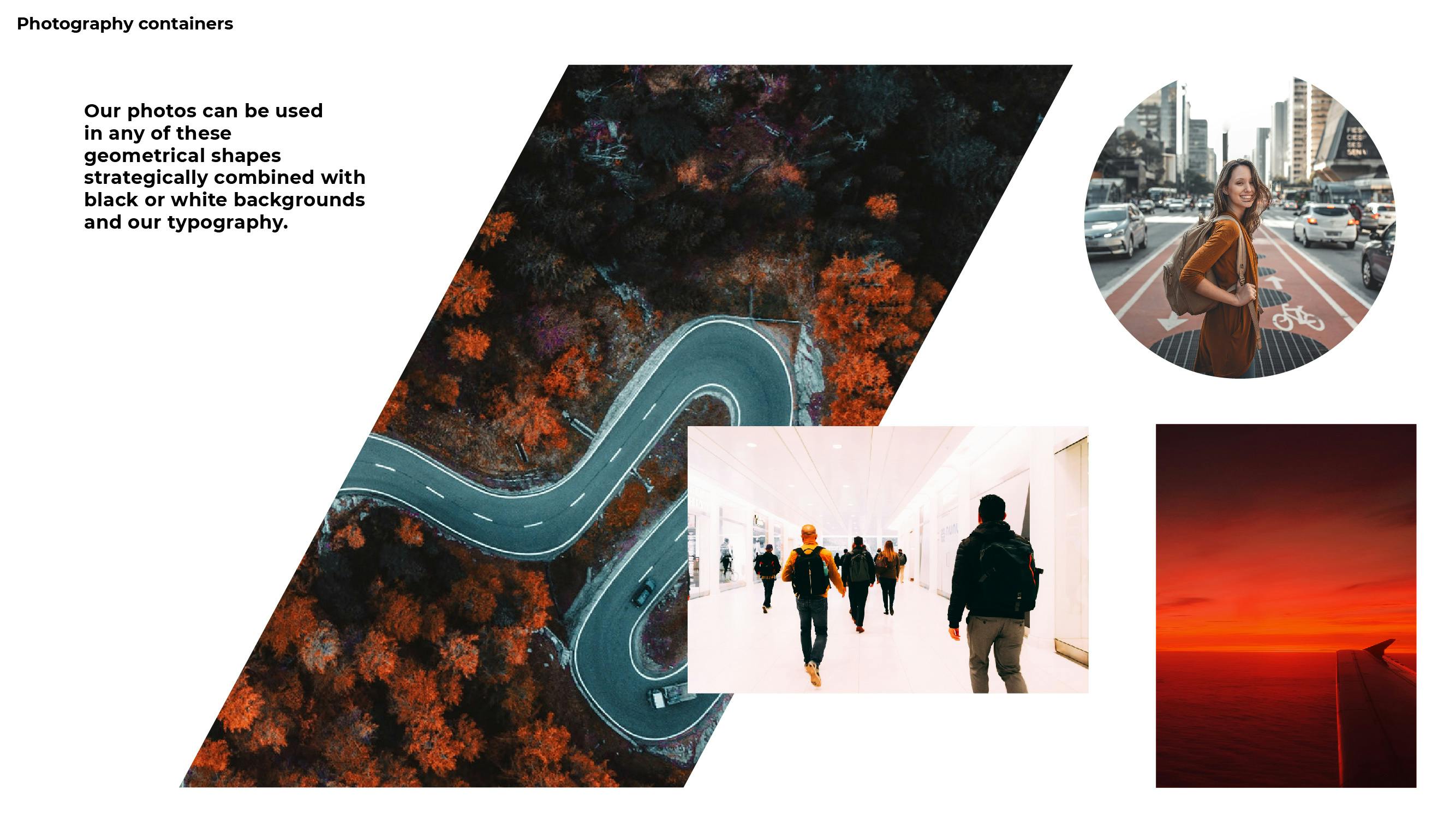
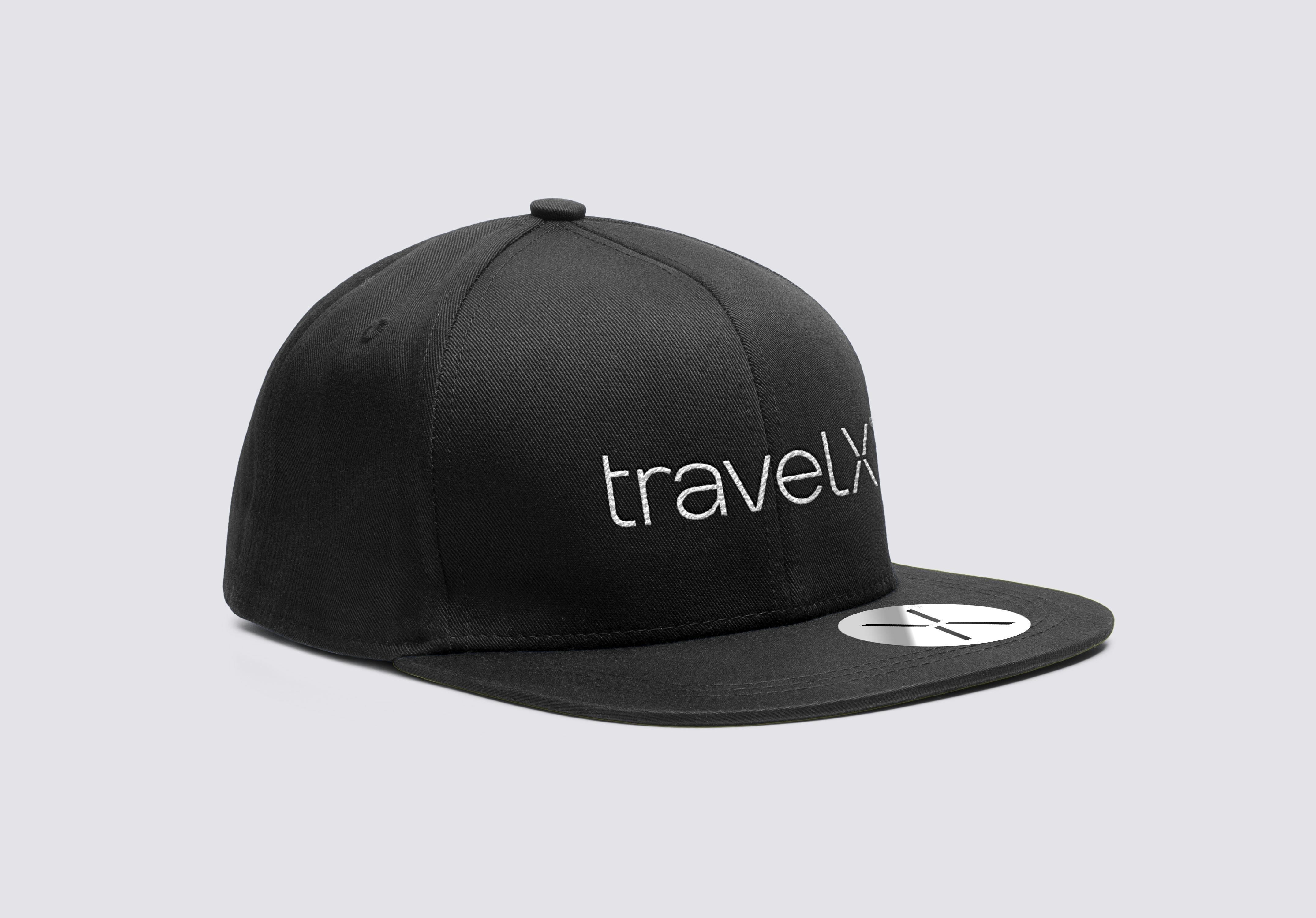
We employed a simple and digital easy-to-use typeface to establish hierarchies on the brand touchpoints. We also established a clean and simple art direction for the project’s photography establishing the brand simplicity along all communications.

1 of 3