

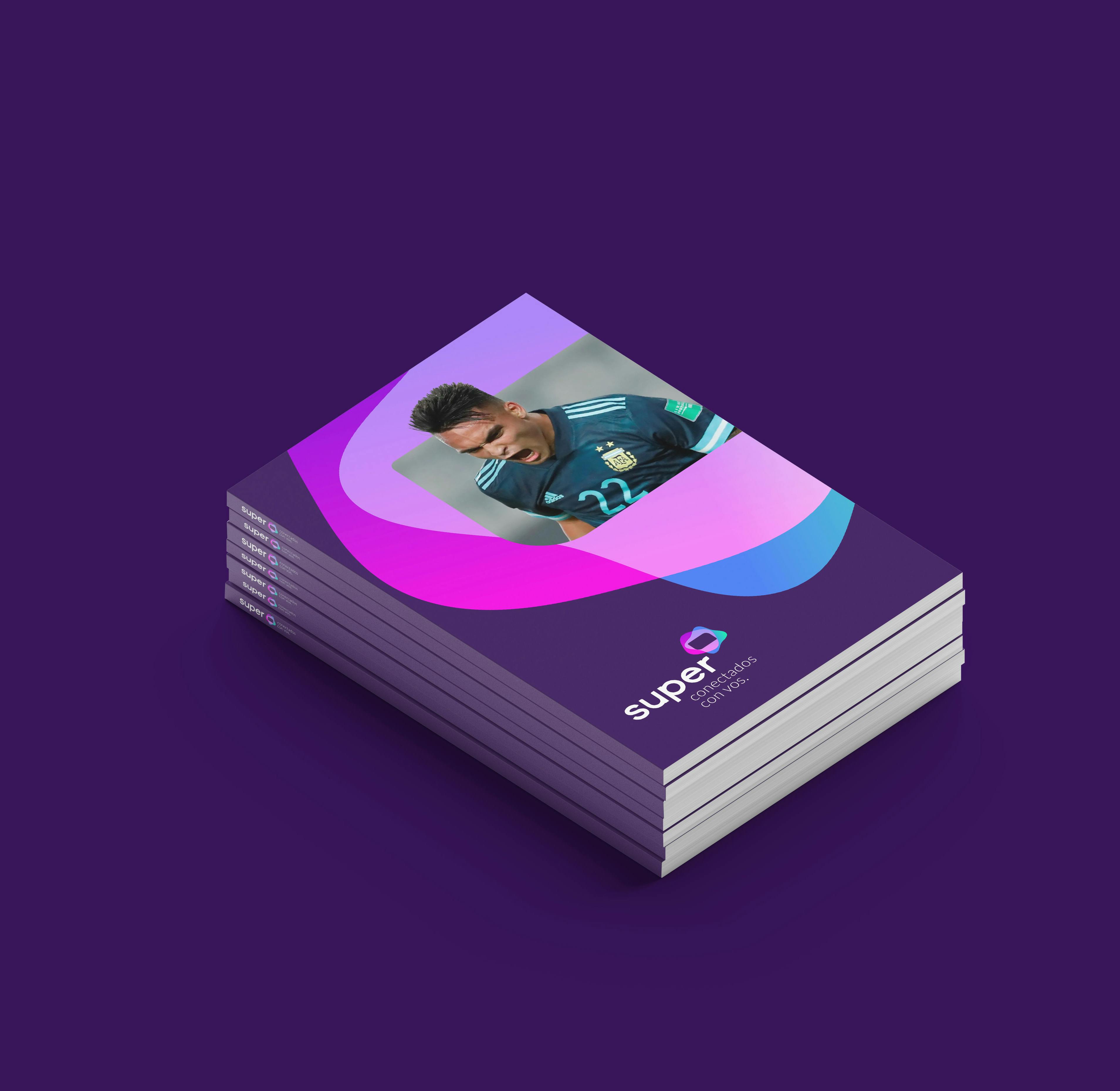
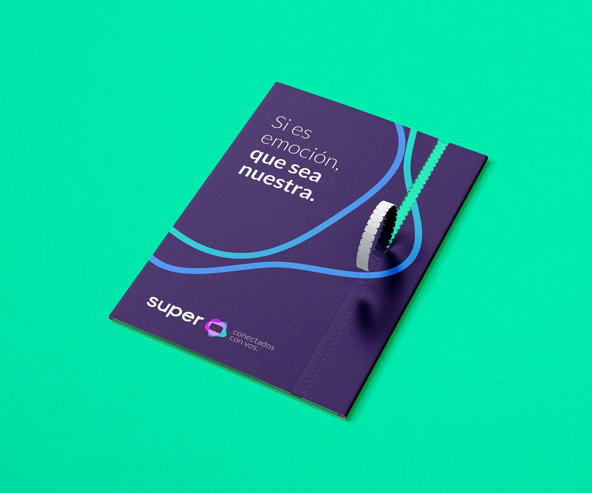
Super
Joining quality and warmth.
Industry
Telecommunication
Internet
TV
Serivces
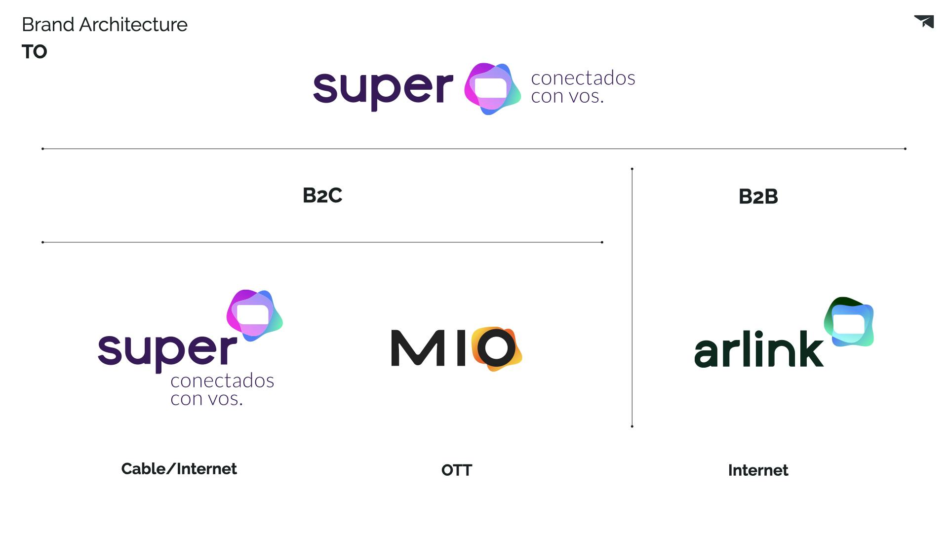
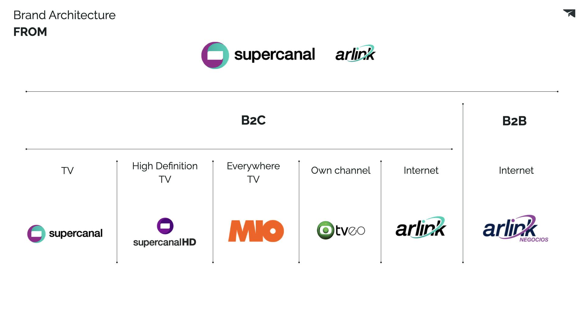
Brand Architecture
Positioning
Verbal & Visual Identity
Sonic Branding
The client:
Super is a local TV and Internet company that leads the entire Cuyo region of Argentina.
As a local brand with presence in places where global players are not with the opportunity of becoming a real challenger, Super expands internet coverage via new infrastructure deployments and boosting the stability of connections. Along with the brand identity evolution, the project also seeks to enhance its internet service and evolve with an investment plan of USD 30 million until 2022.
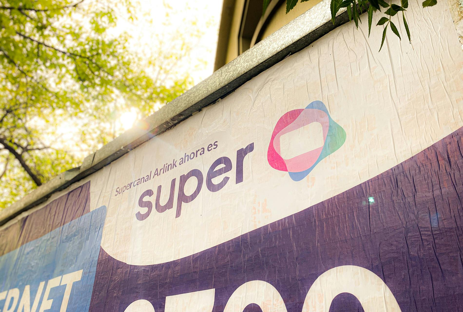
Briefly known as Supercanal, we changed its name simplifying it to Super.
The starting point:
A brand name, Supercanal, which needed to change to be aligned to the portfolio strategy to optimize brand resources.
The arquitecture guiding rule: To keep it human. From a B2C and B2B segmentation to a #H2H (Human to Human) approach. Businesses do not have emotion. Products do not have emotion. Humans do. Humans want to feel something. And humans make mistakes.
The solution:
A brand evolution built around understanding people emotions, therefore being close to them and continue connecting the country. The purpose of the project was to simplify the company's brand portfolio, representing the new product offering: cable and residential internet, a new own OTT platform and the corporate internet business unit.
1 of 2
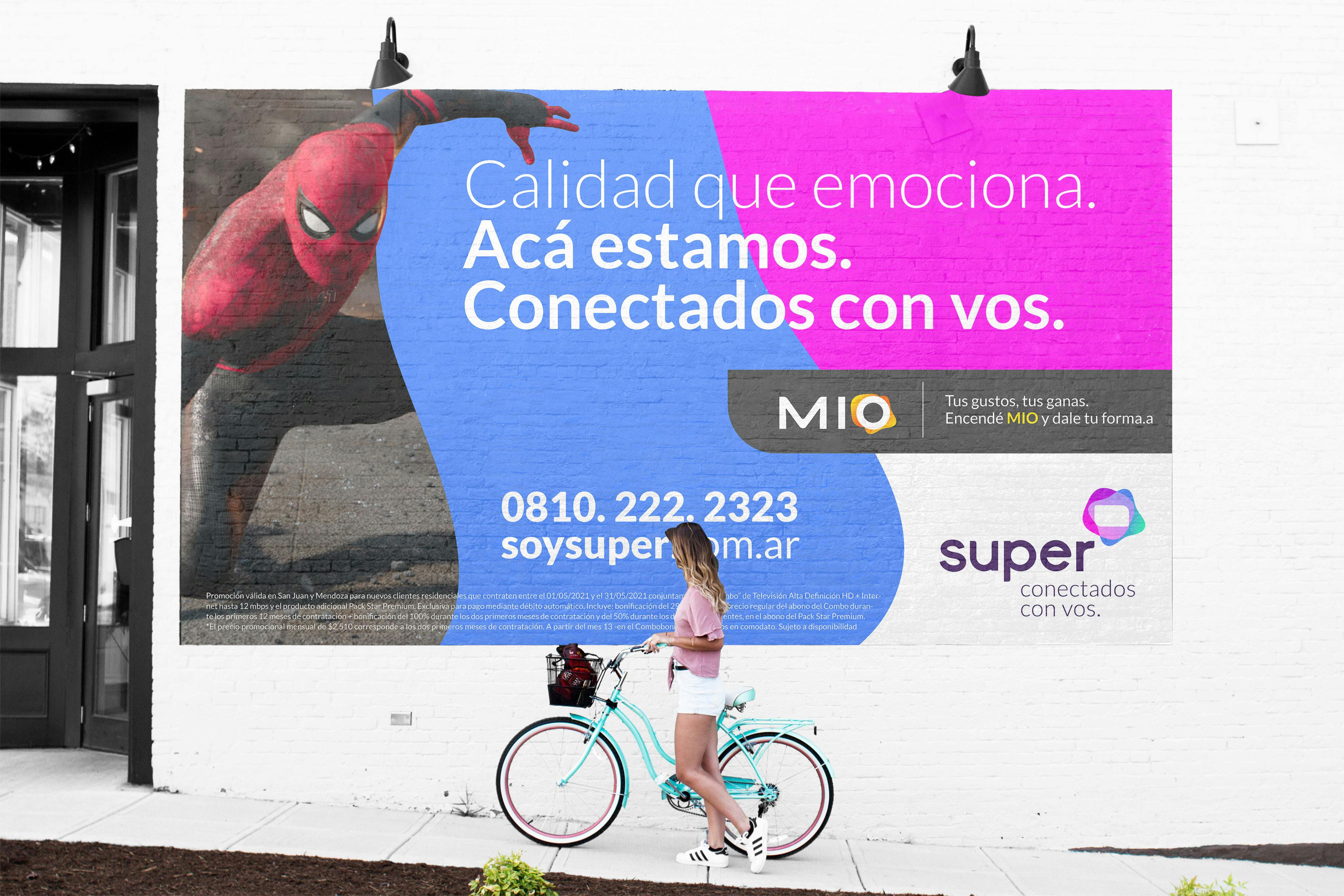
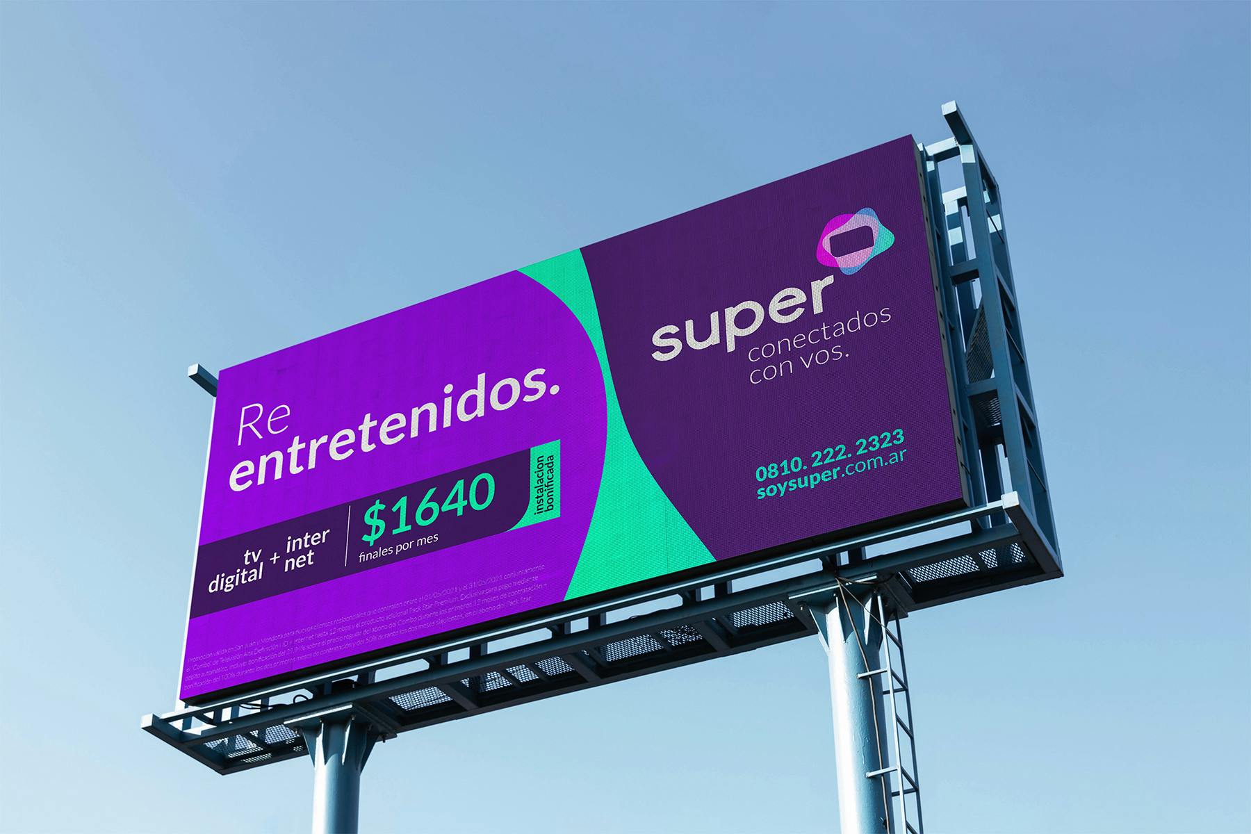
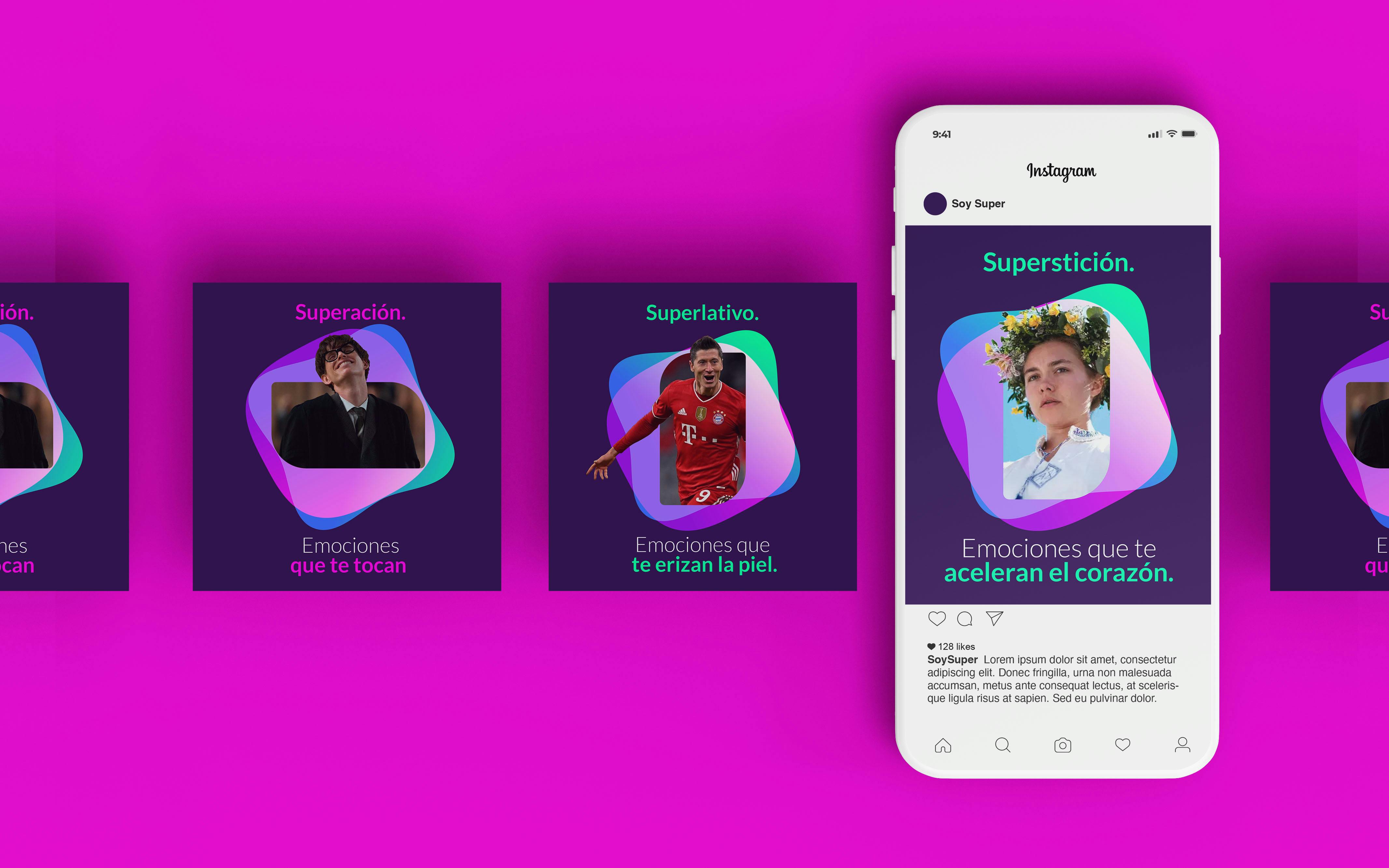
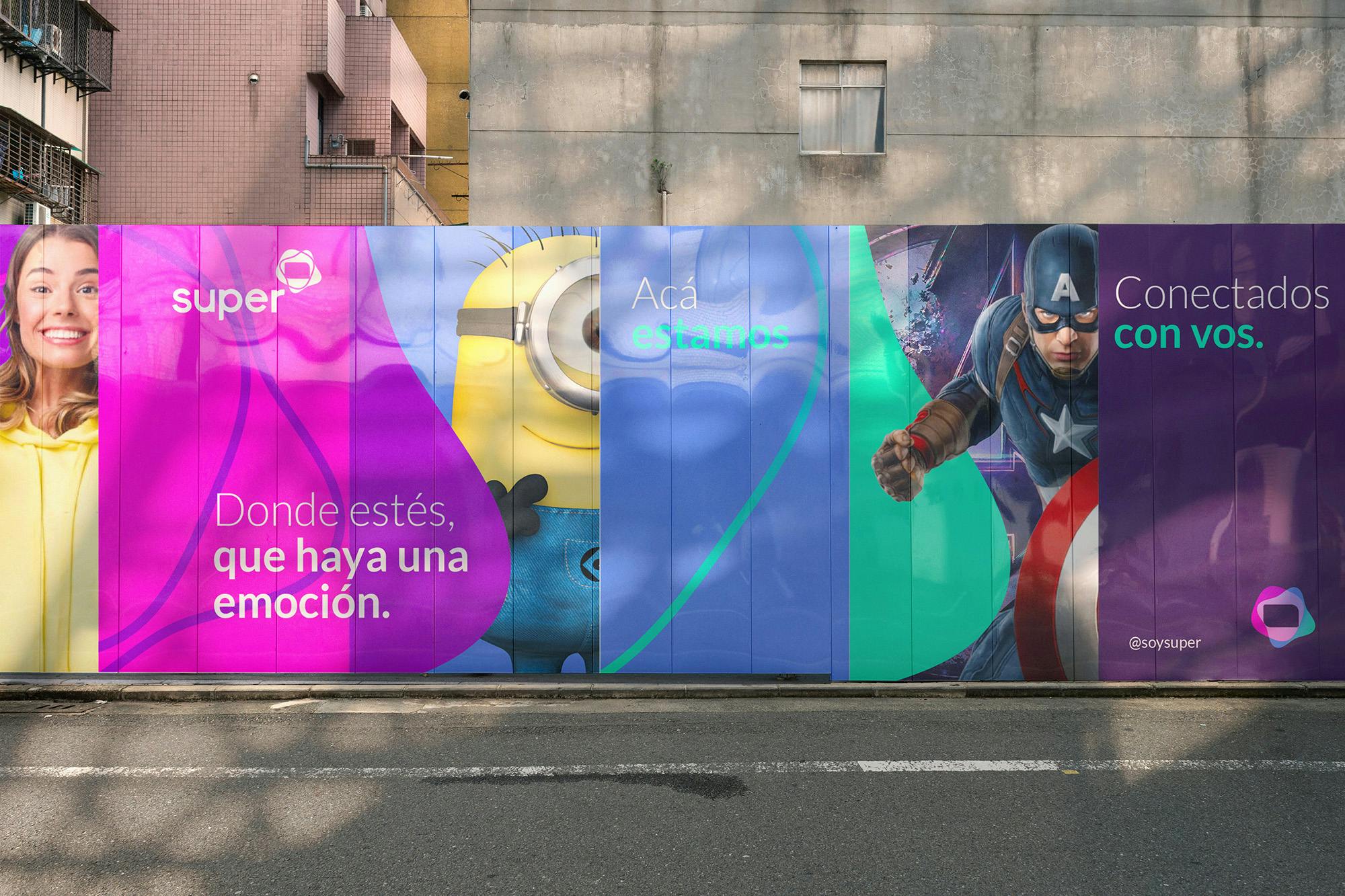
A flexible symbol.
The evolution of Supercanal to "Super-connected to you" was to convey the clear representation of moments of human connection that generates "the shape of our emotions." Thus, the visual rebranding transformed the circular and static symbol of the company into two forms that represent the quality and warmth connection when a screen is turned on.


An -audio-visual brand: the evolution from Supercanal to Super was supplemented by an audiovisual development that featured a Sonic branding process by Drop Music Branding. The audiologo clearly represents this union between quality and warmth visualized in the new brand symbol:

1 of 3
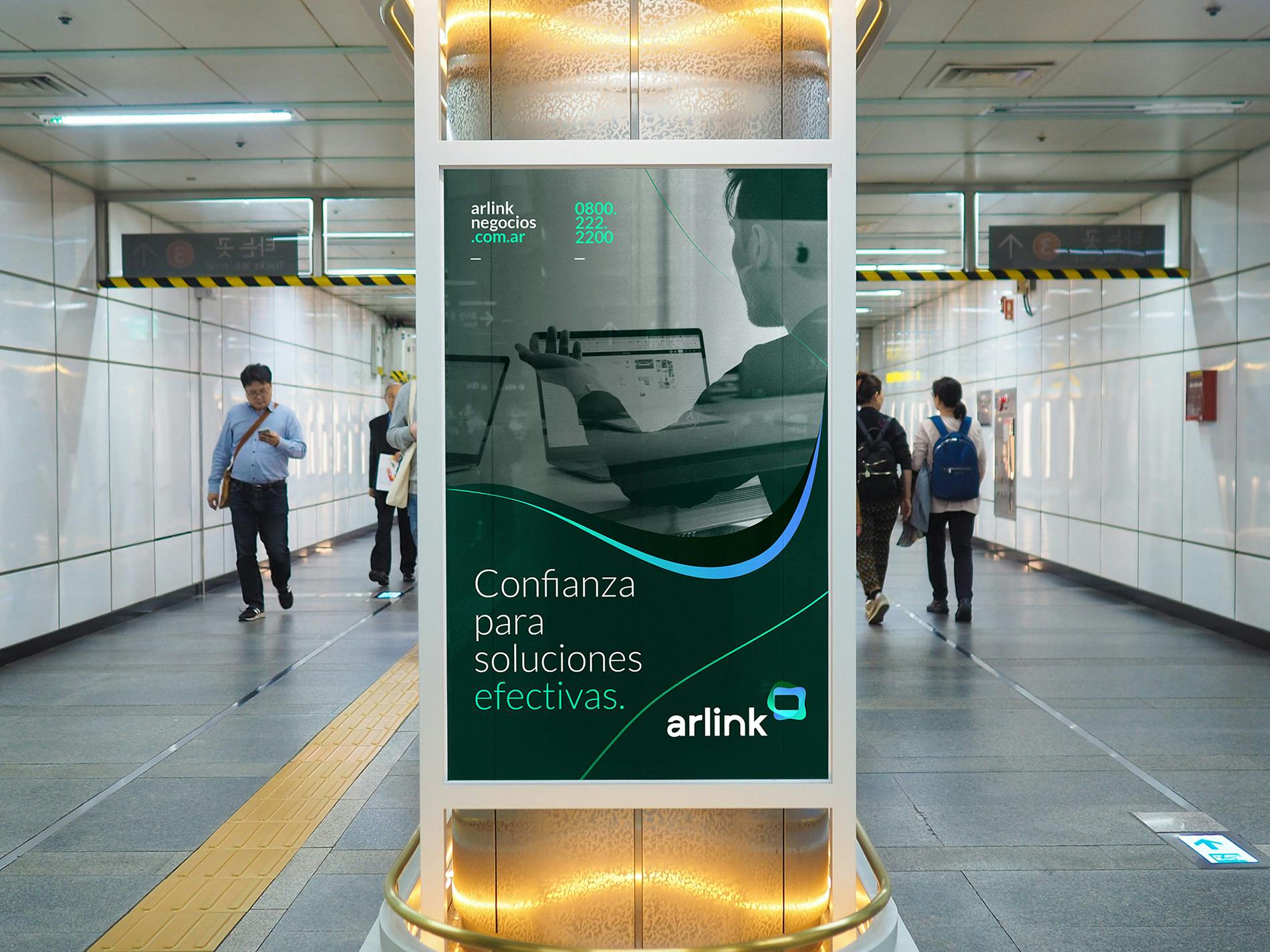
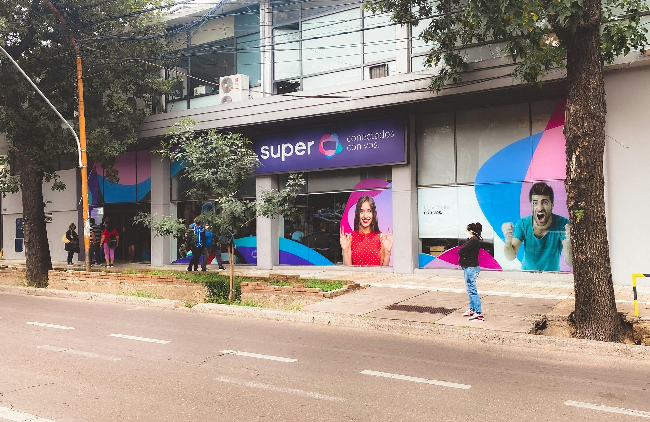
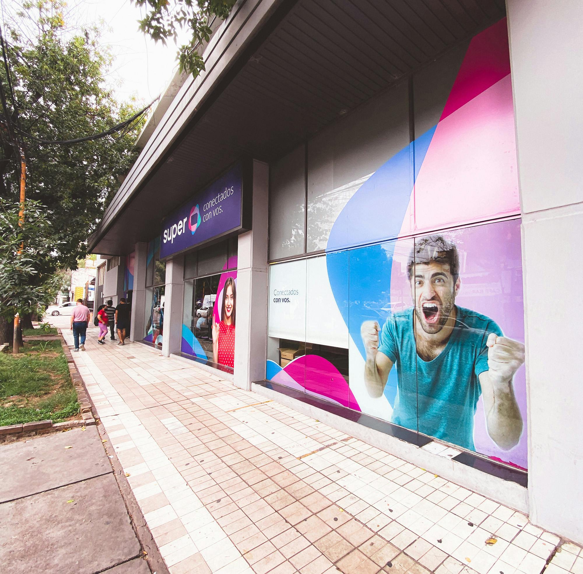
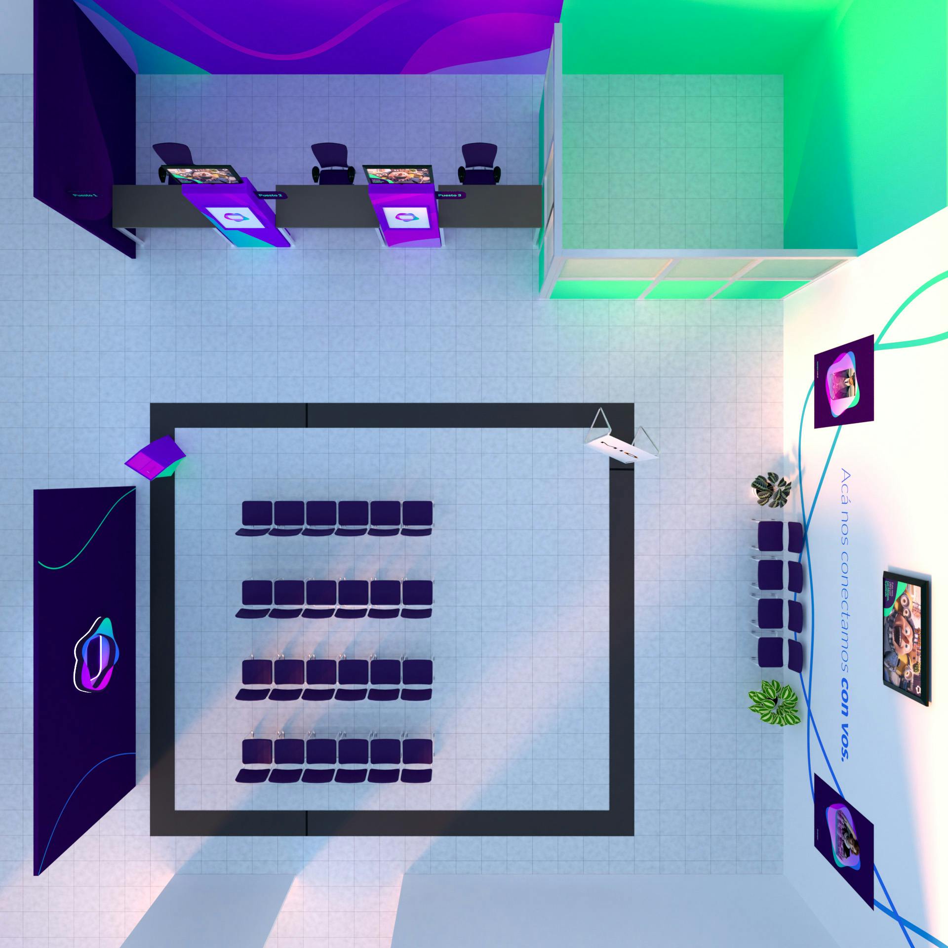
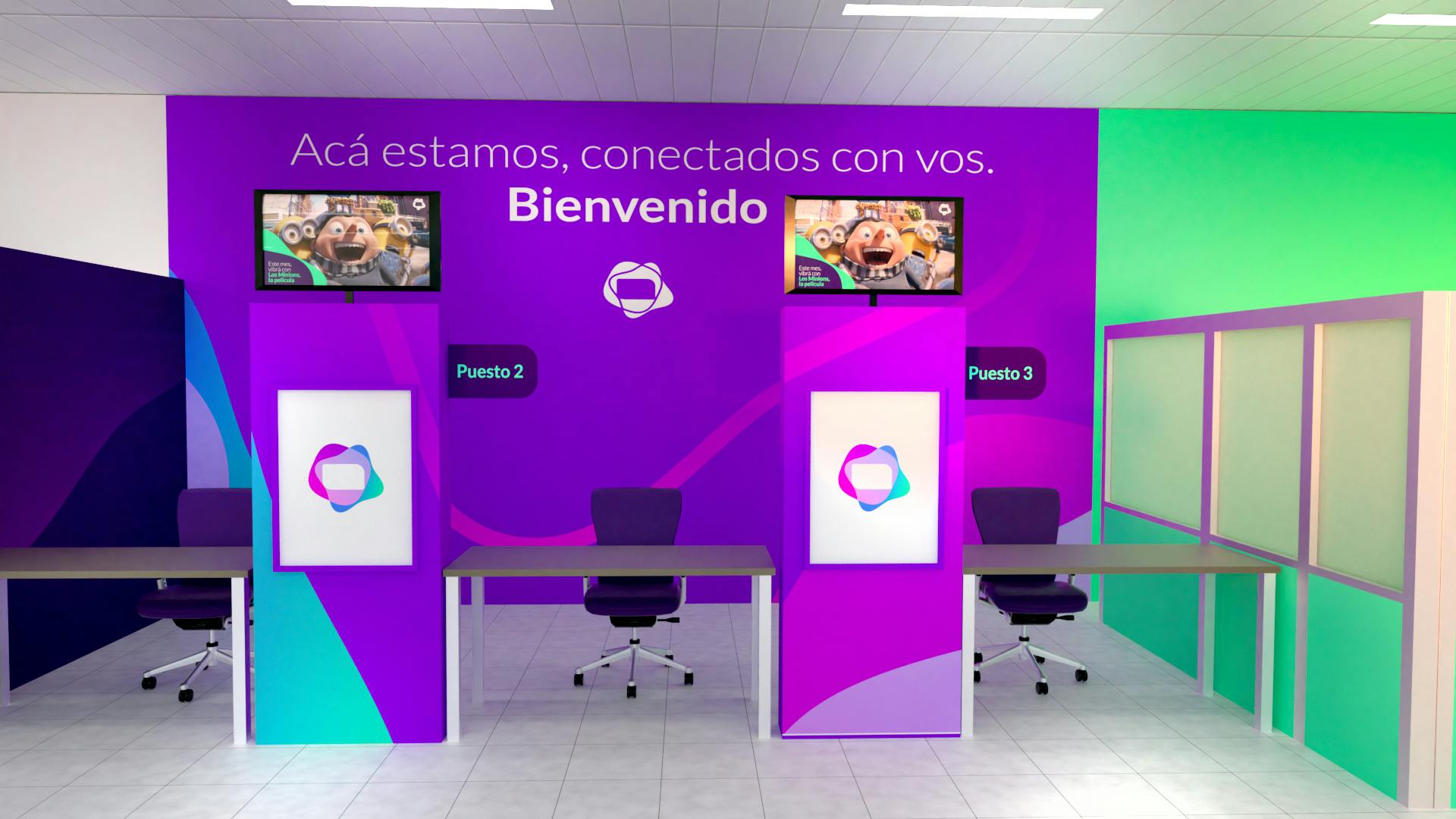
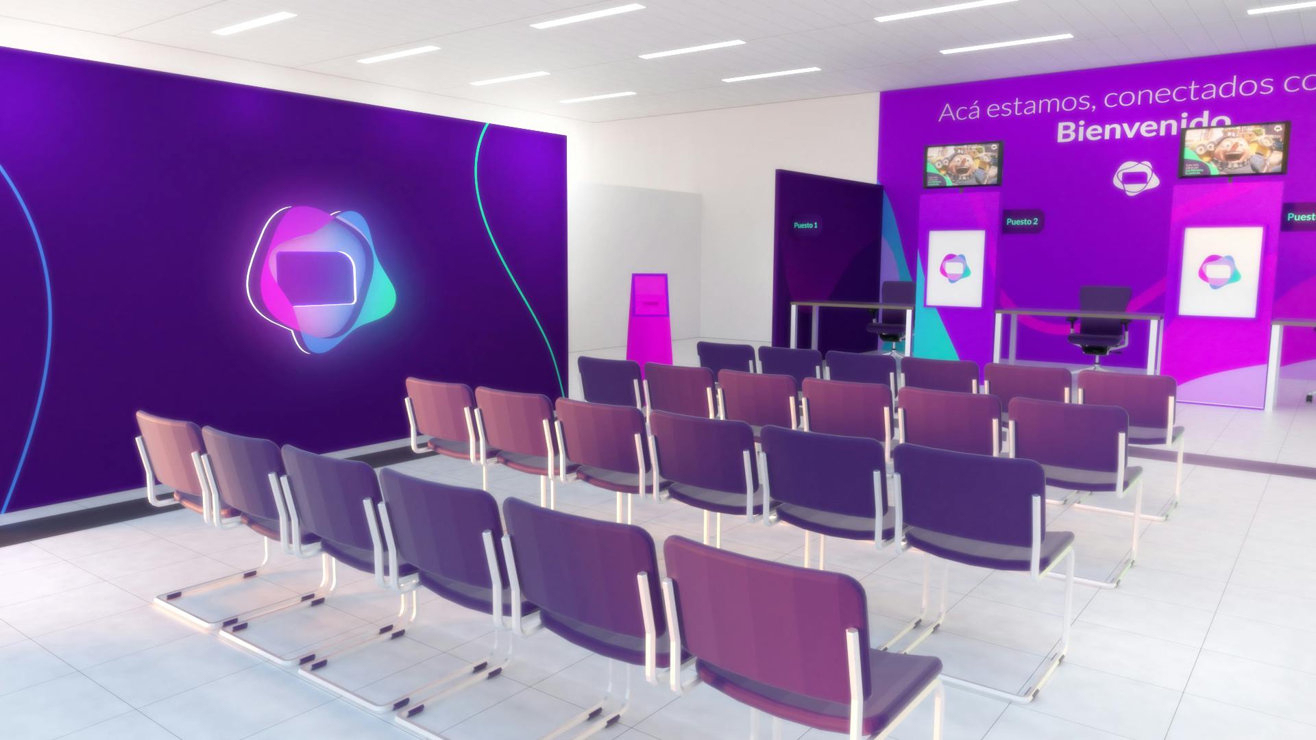
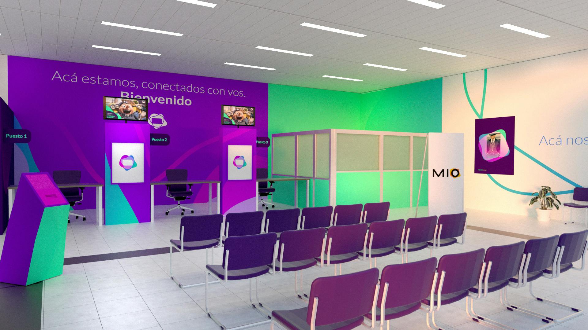
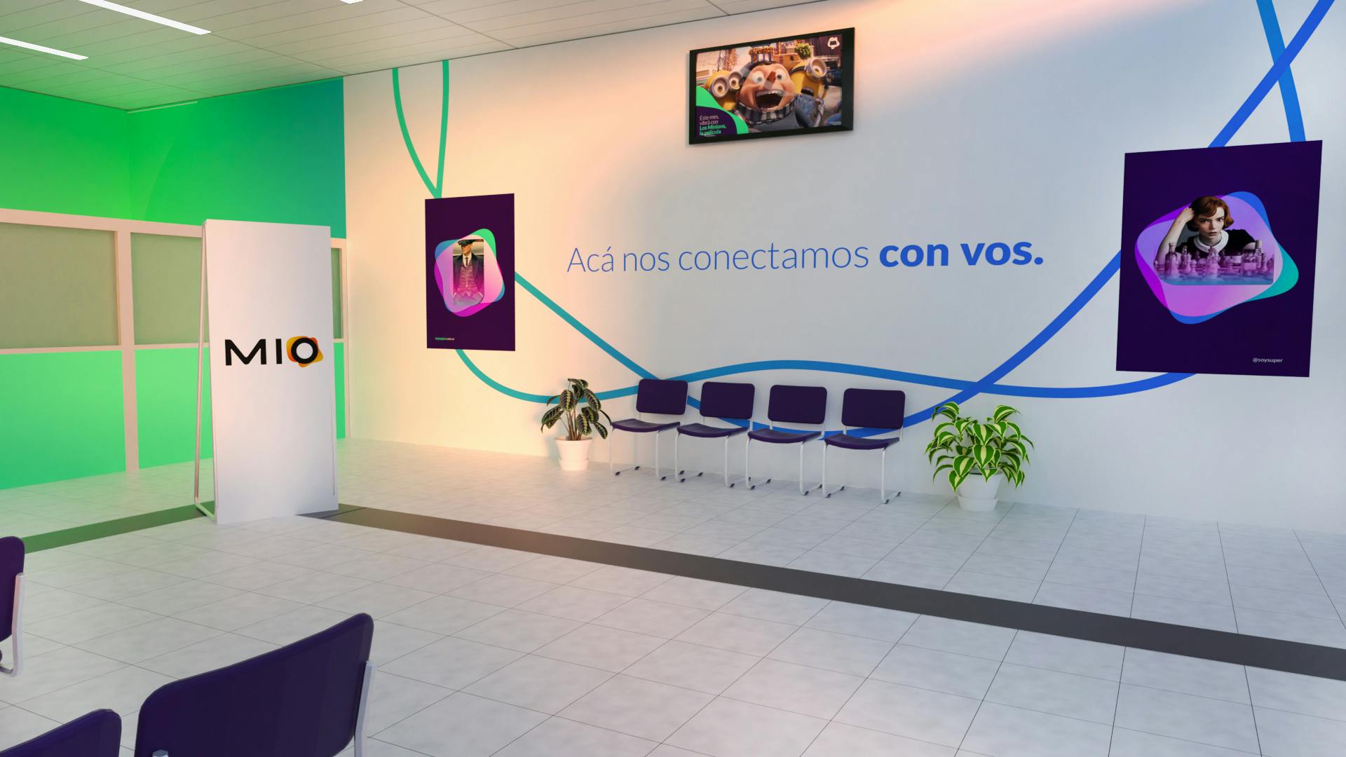
Super entrusted us with the main layout of its branch network throughout the center, north and south of the country. The objective was to reorganize the customer journey under the new visual and verbal behavior of the new identity.
1 of 4
Special credit:
Audiologo developed by Drop Music Branding > dropmusicbranding.com
