Motomel
Your life on wheels.
Industry
Mobility
Motorcycles
Two-wheels
Serivces
Strategy
Positioning
Verbal & Visual identity
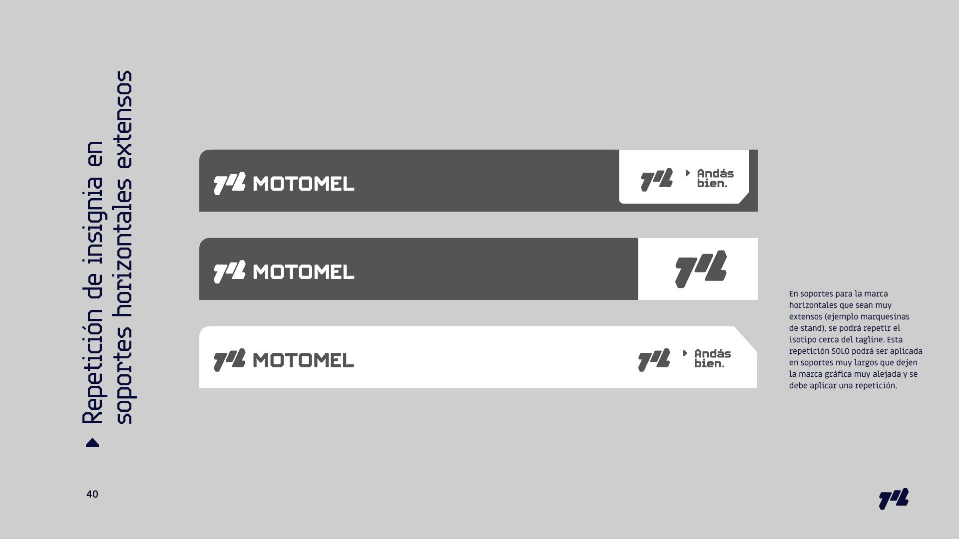
Environmental Branding

The client
Based in Argentina, Motomel manufactures motorcycles since 1992.
Founded by the La Emilia Investment group, the company was the best-selling mororcycle companies of the year during 2022.
As of 2017, Motomel is the largest company importing motorcycles in Argentina and these motorcycles are also being re exported to some other countries in South America.

1 of 5
The starting point:
A functional brand built around the product the company offers, in a business atmosphere where the product is a mean to an end: to be able to move in order to achieve personal goals.
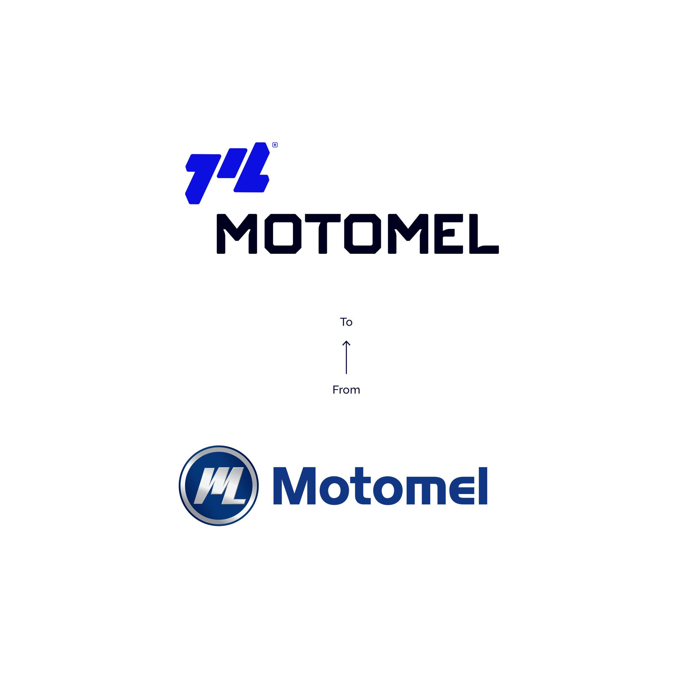
A verbal identity the client felt anchored to a negative perception and a visual identity with no appeal embodying an aspirational product for the target.
The solution:
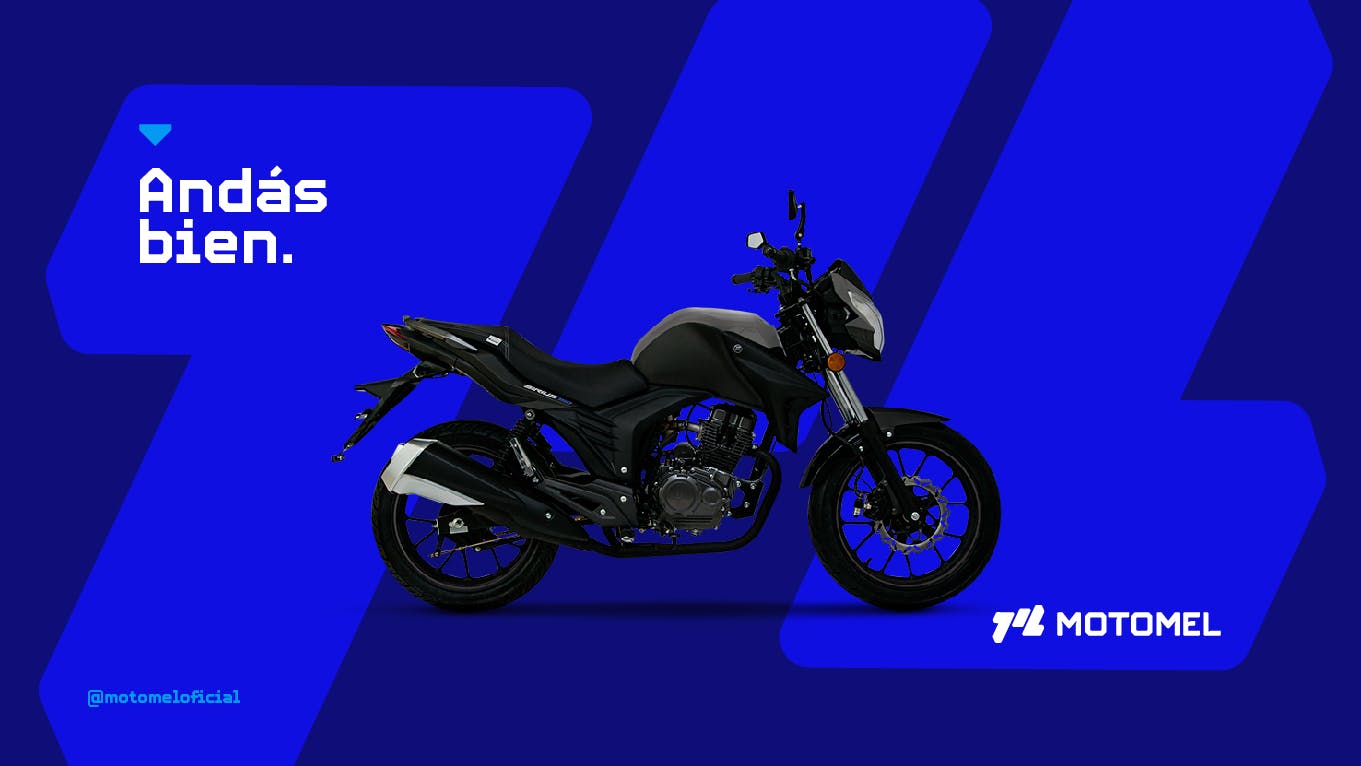
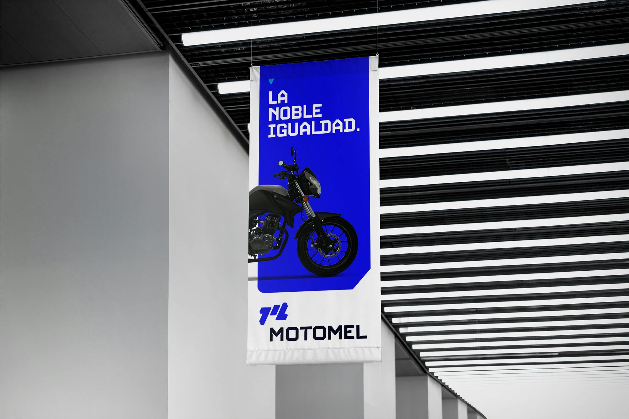
A brand evolution built around their purpose: Putting human connections at the heart of the business. Leveraging its real and honest Argentinean personality.
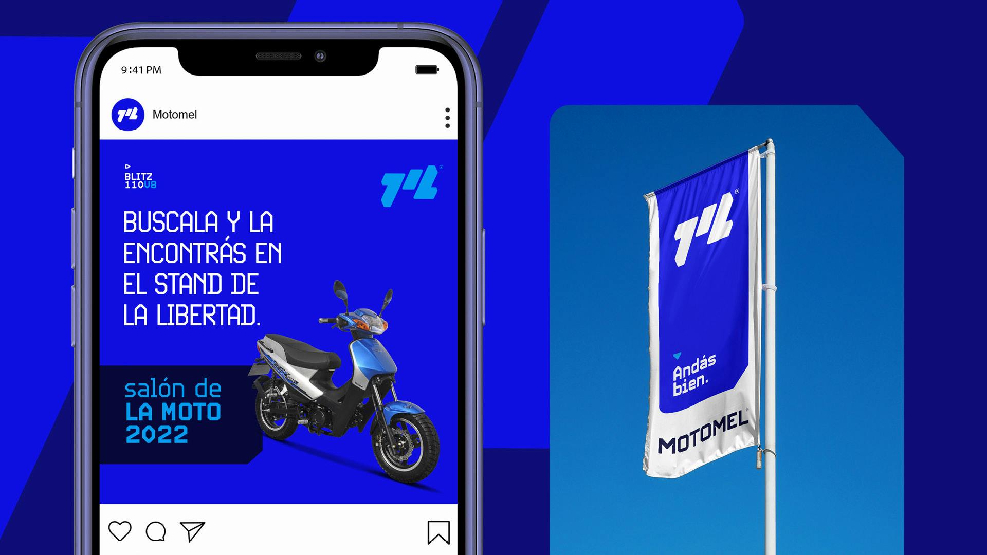
We delivered a 360° solution that expresses the brand essence: ‘You are doing well’ (in Spanish: 'Andás bien' that has double meaning of the verb: moving and being), understanding that optimism and good vibes can have a positive impact on the society’s feelings.
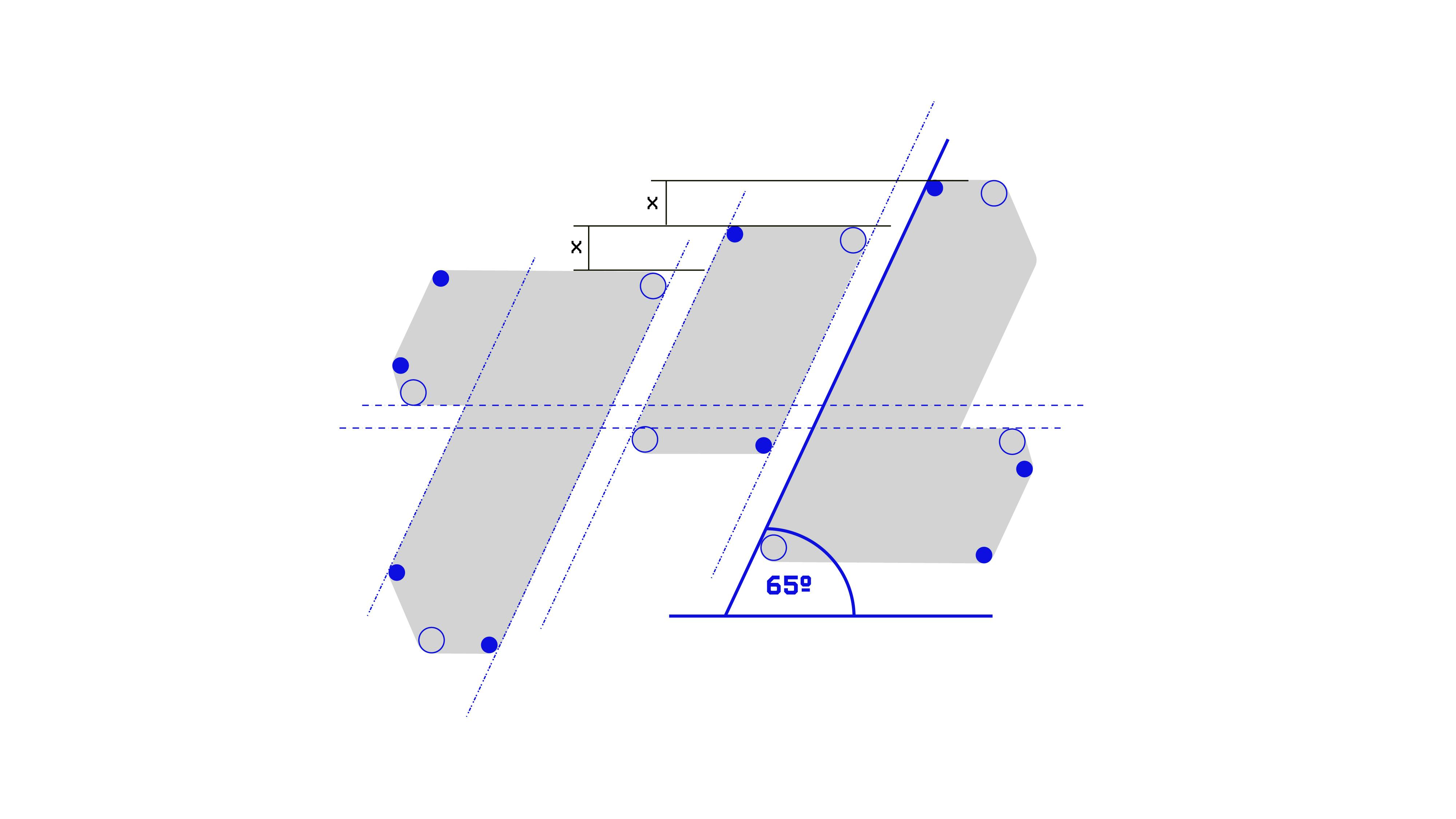
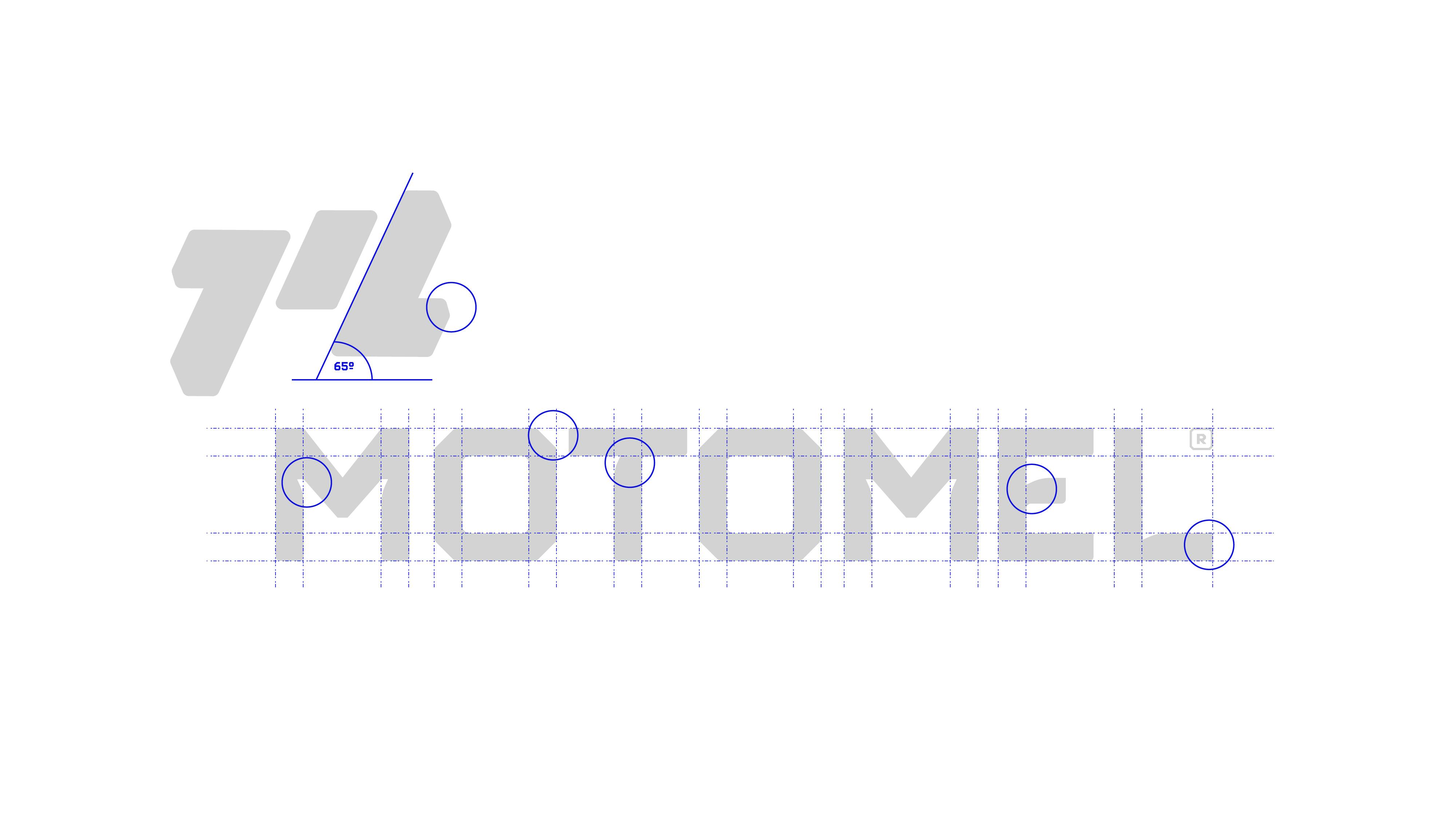
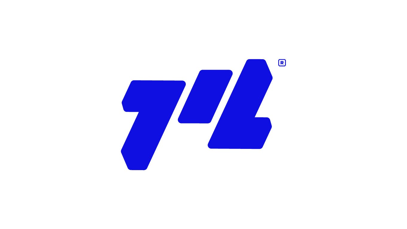
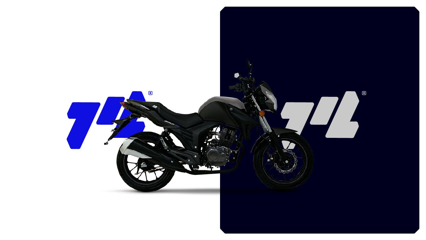
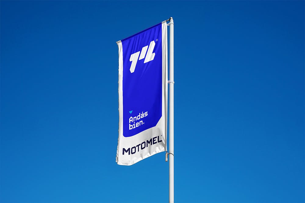
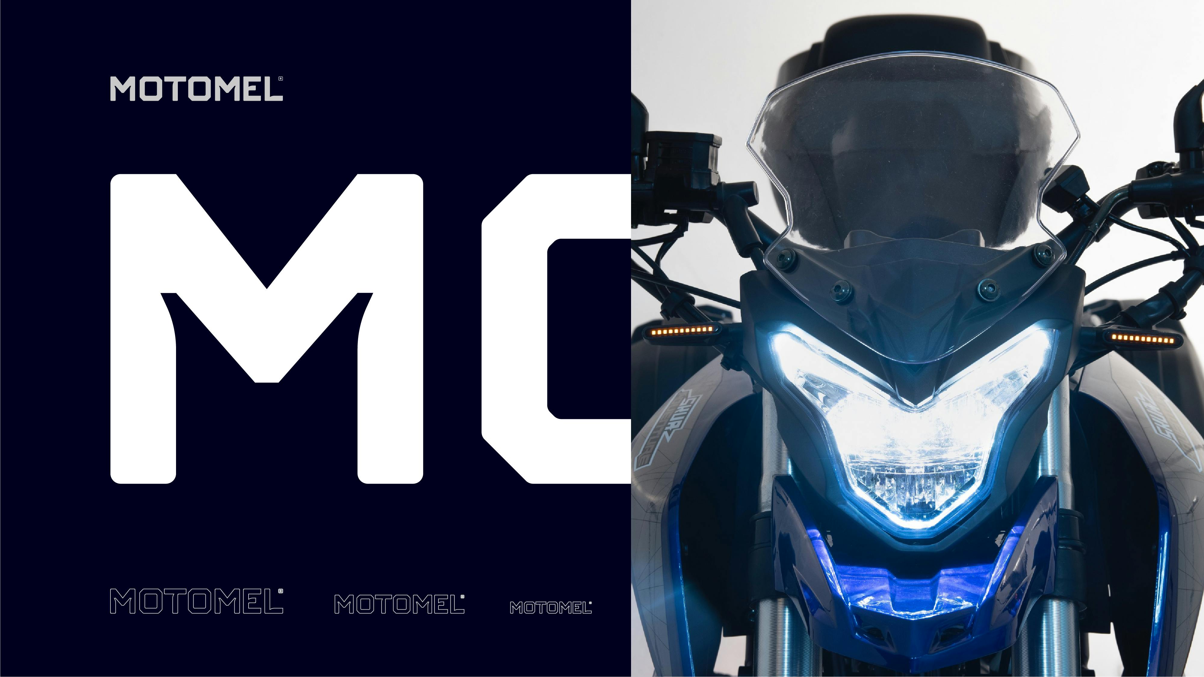
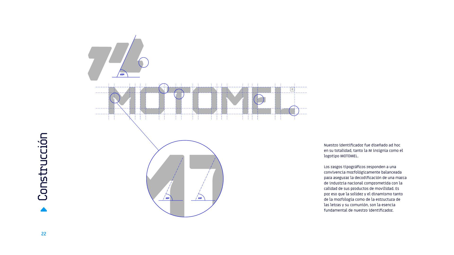
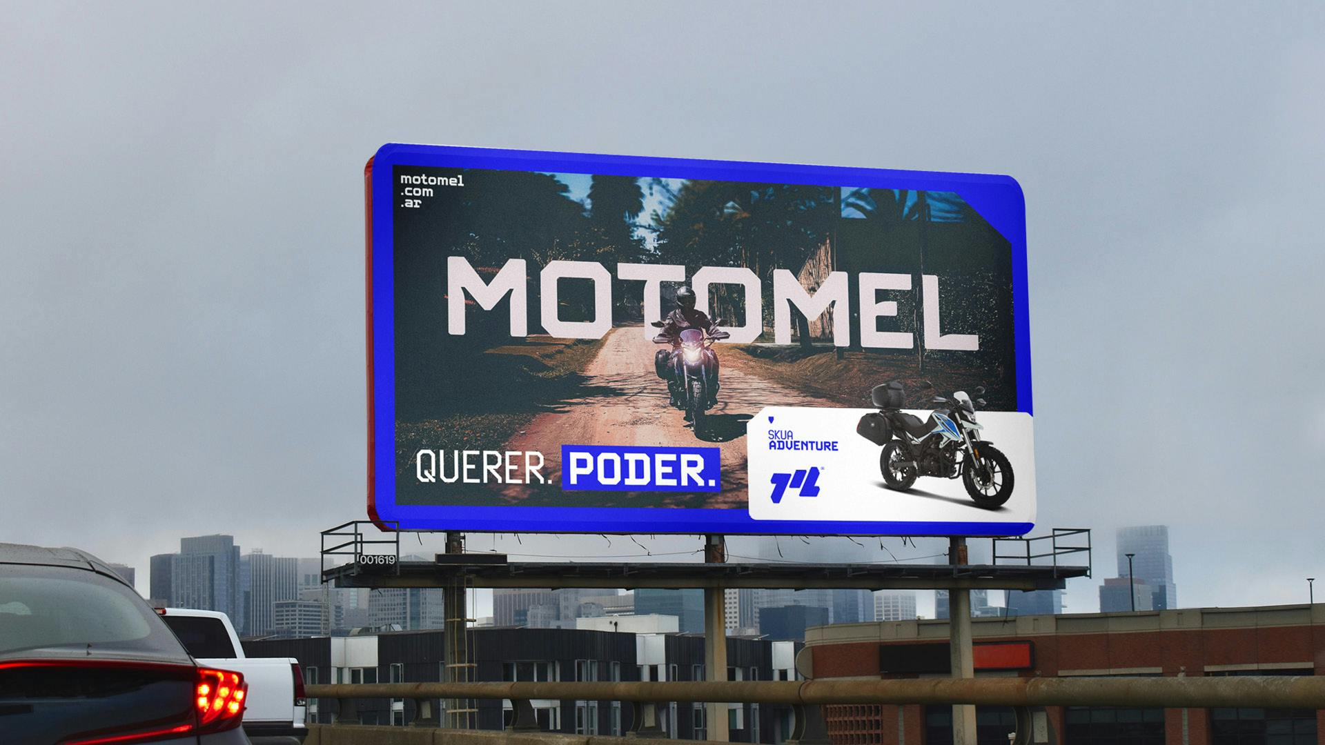
The visual identity basis we established to complement the new strategic positioning of the company, was based on redesigning the emblem letter M of the brand, giving it uniqueness and bringing it to nowadays design standards. The result: a robust symbol that is made up of 3 symmetrical bands that begin with a number 1 and end with the same mirrored graphic element representing an L, providing a clear relationship to the Argentine flag with symmetry and dynamism.
The process guided by Simple prompted us to both creative and structured thinking that led us to deep reflection on our value proposition, even beyond what we expected.
Juan ChavarinoCommercial Director · La Emilia Group
Everything is in the details.
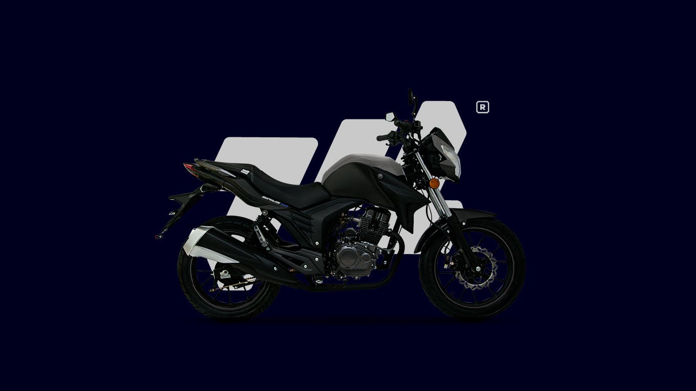
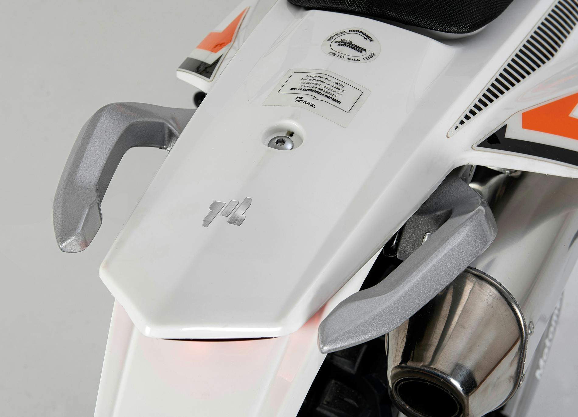
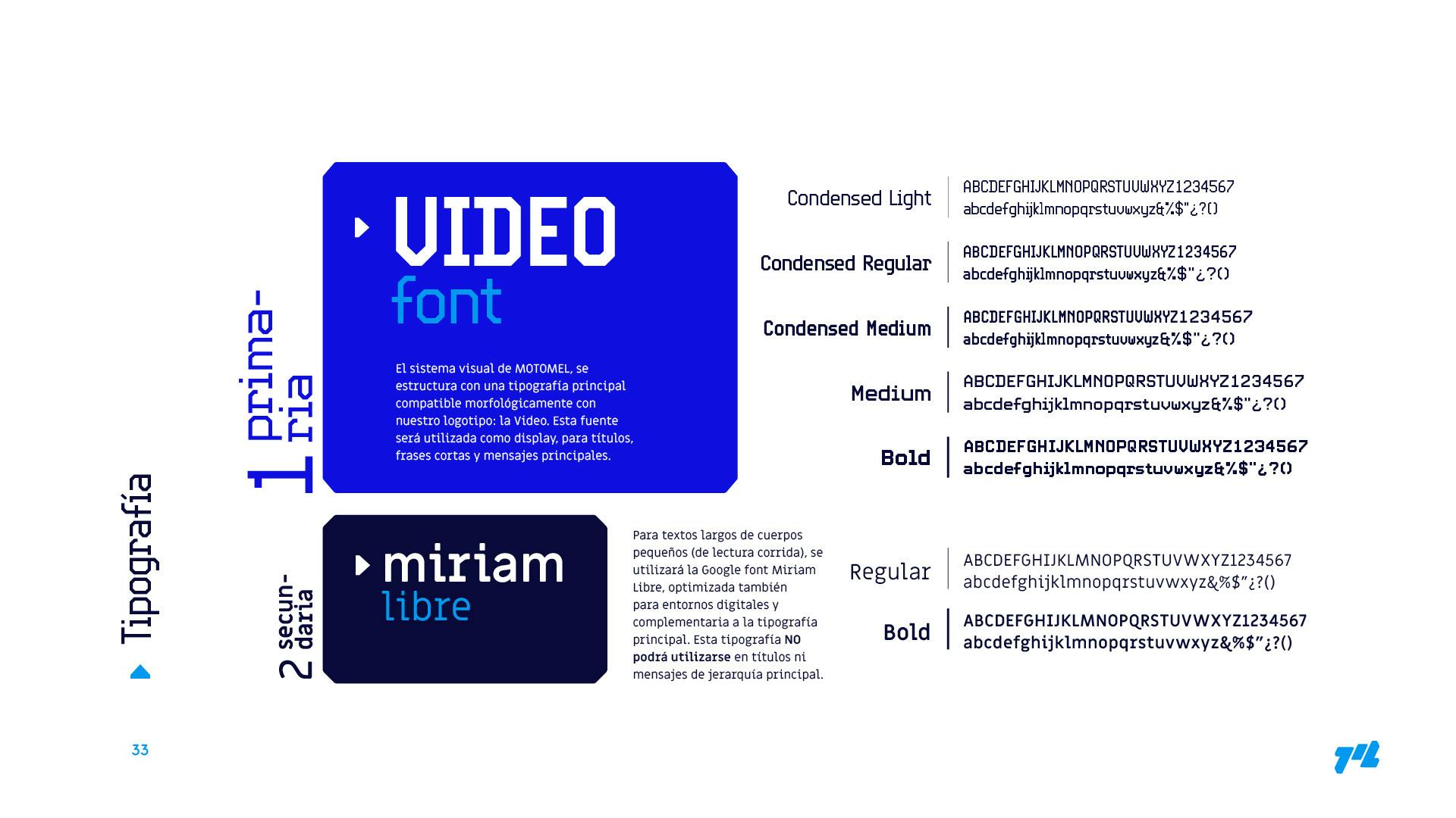
The typographic features of the Motomel logo, based on structural motorcycles' details, are designed to respond not only to the category (capital letters) but also to the digital world in which brands currently operate.
1 of 9
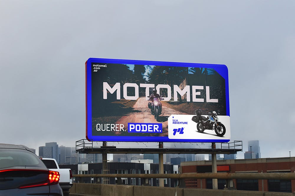
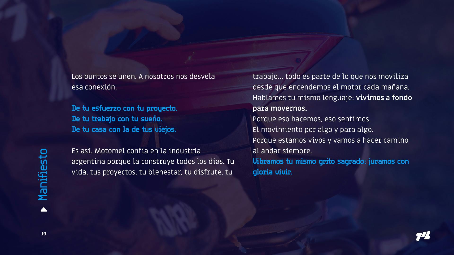
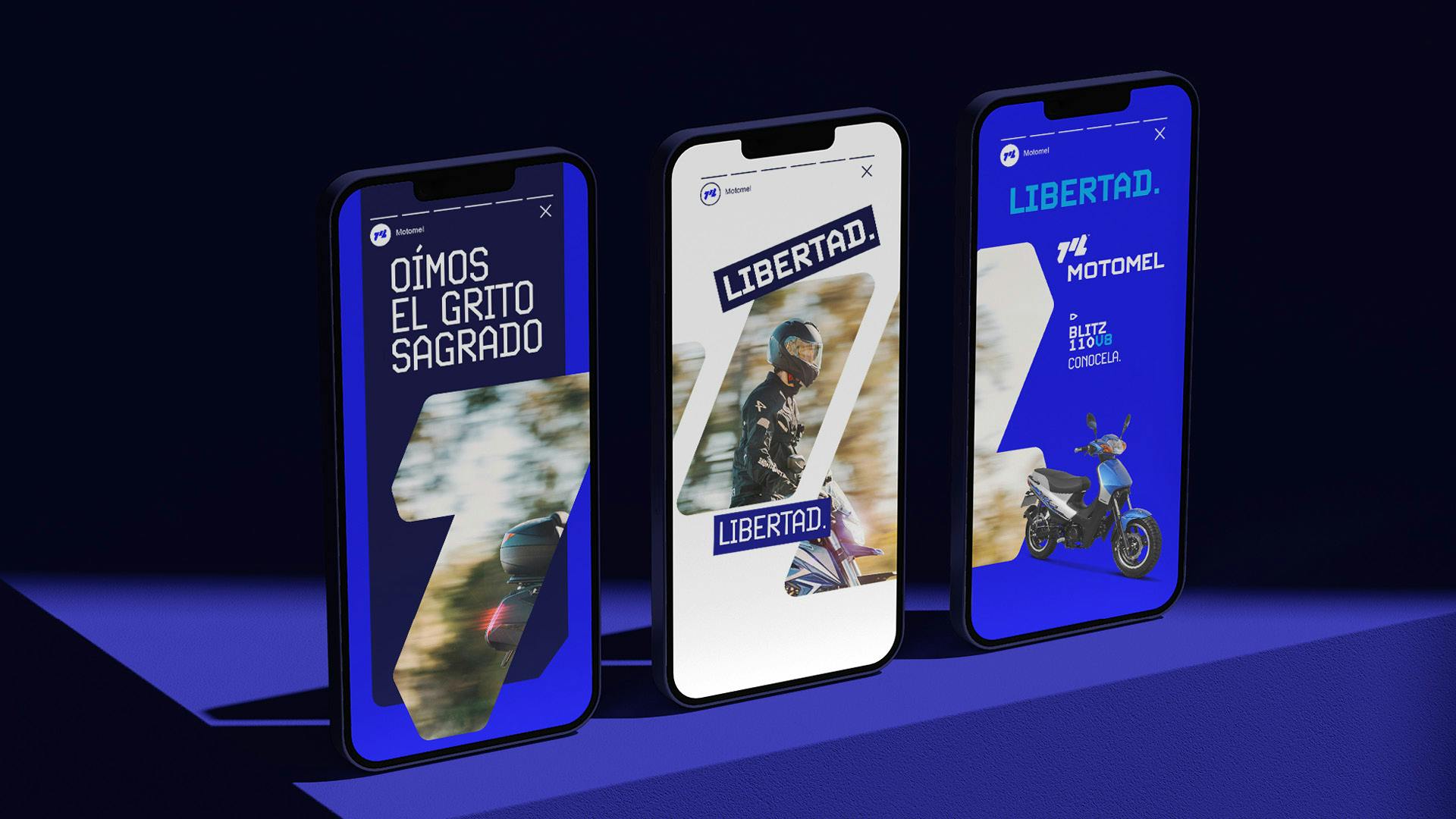
The personality of the verbal discourse that we developed is built from the Argentine essence of the brand. Using messages such as passages from the national anthem, build the strategic and verbal territory from where the brand questions its primary audience.
1 of 3
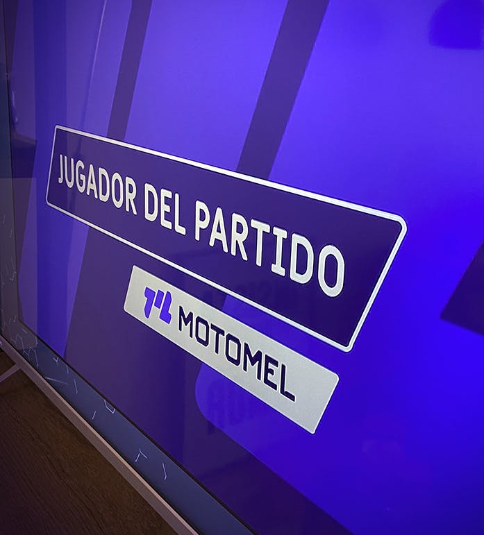
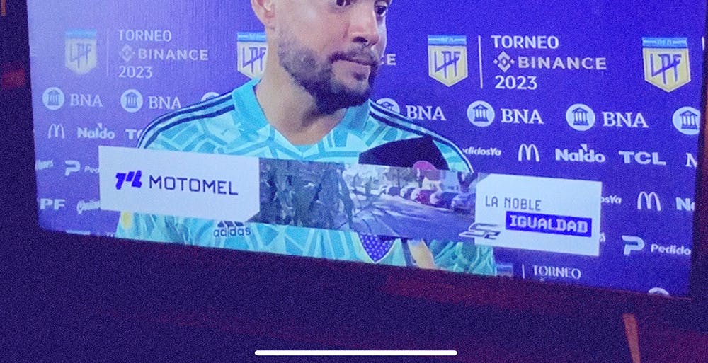
Argentine football personality 🇦🇷
Motomel sponsors the local soccer championship in Argentina, in a brand activation highly connected to the new positioning and strategy that Simple has developed for the brand.

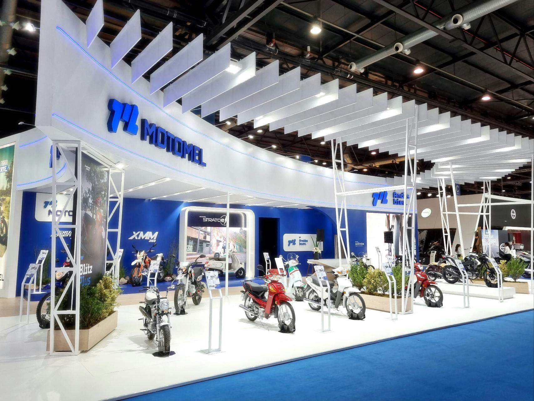
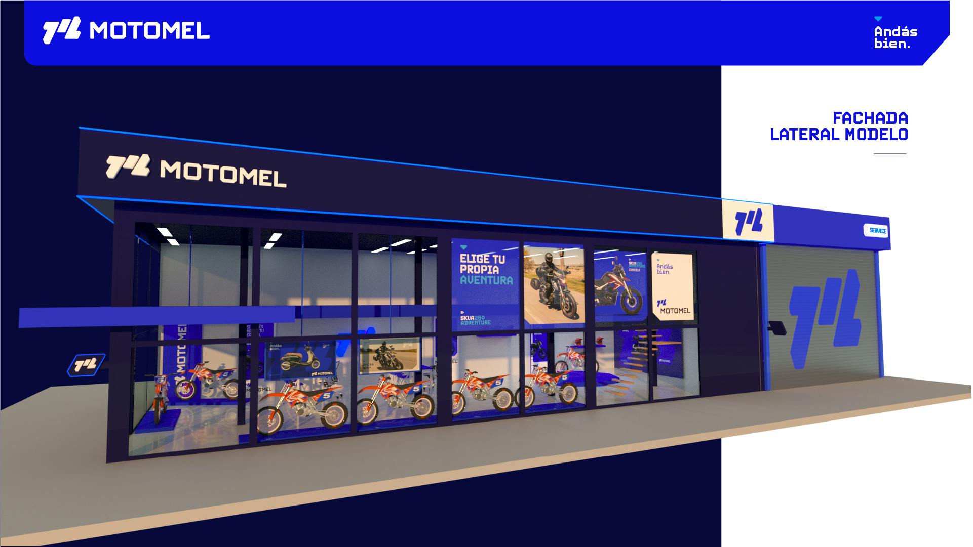
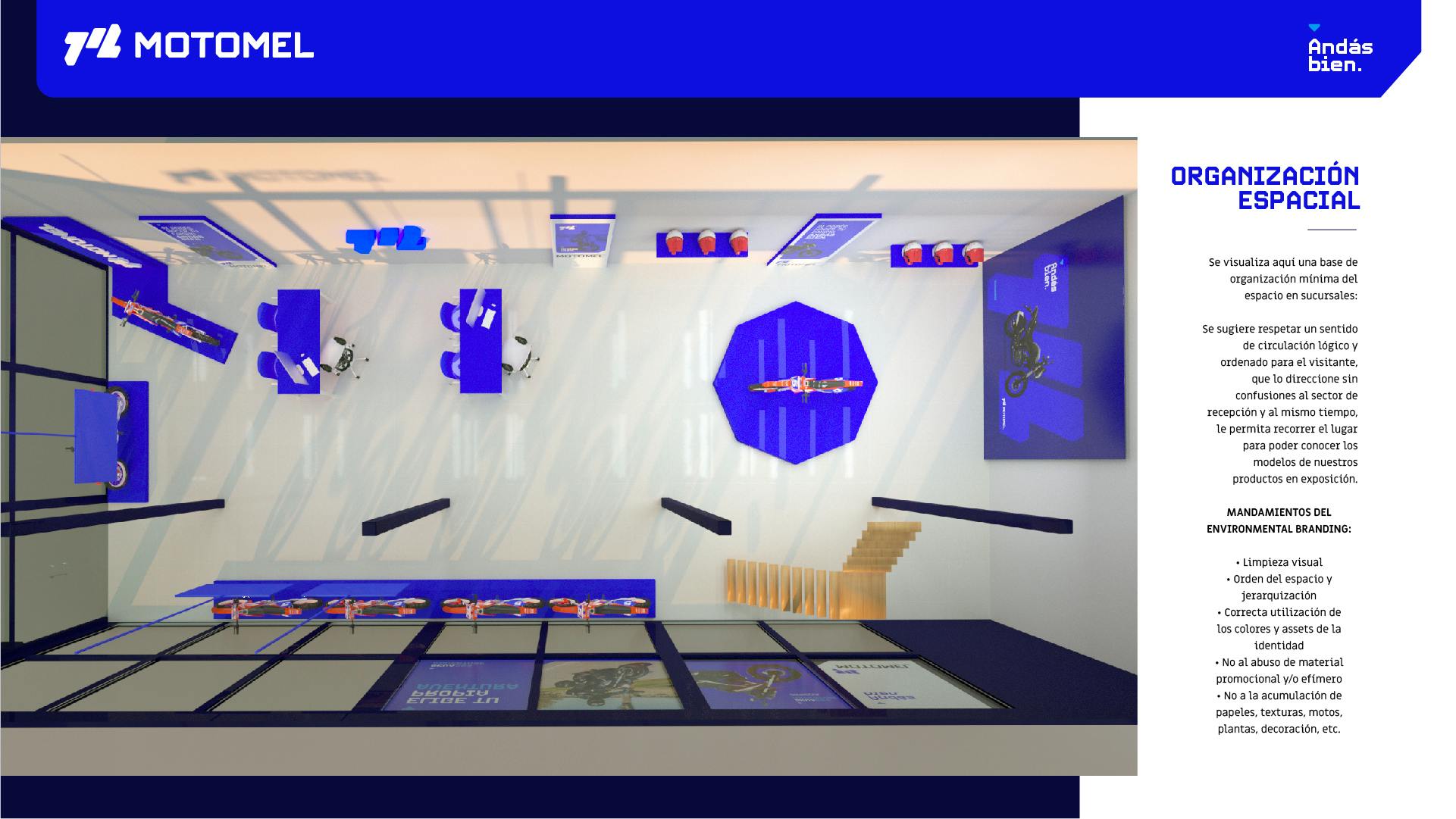
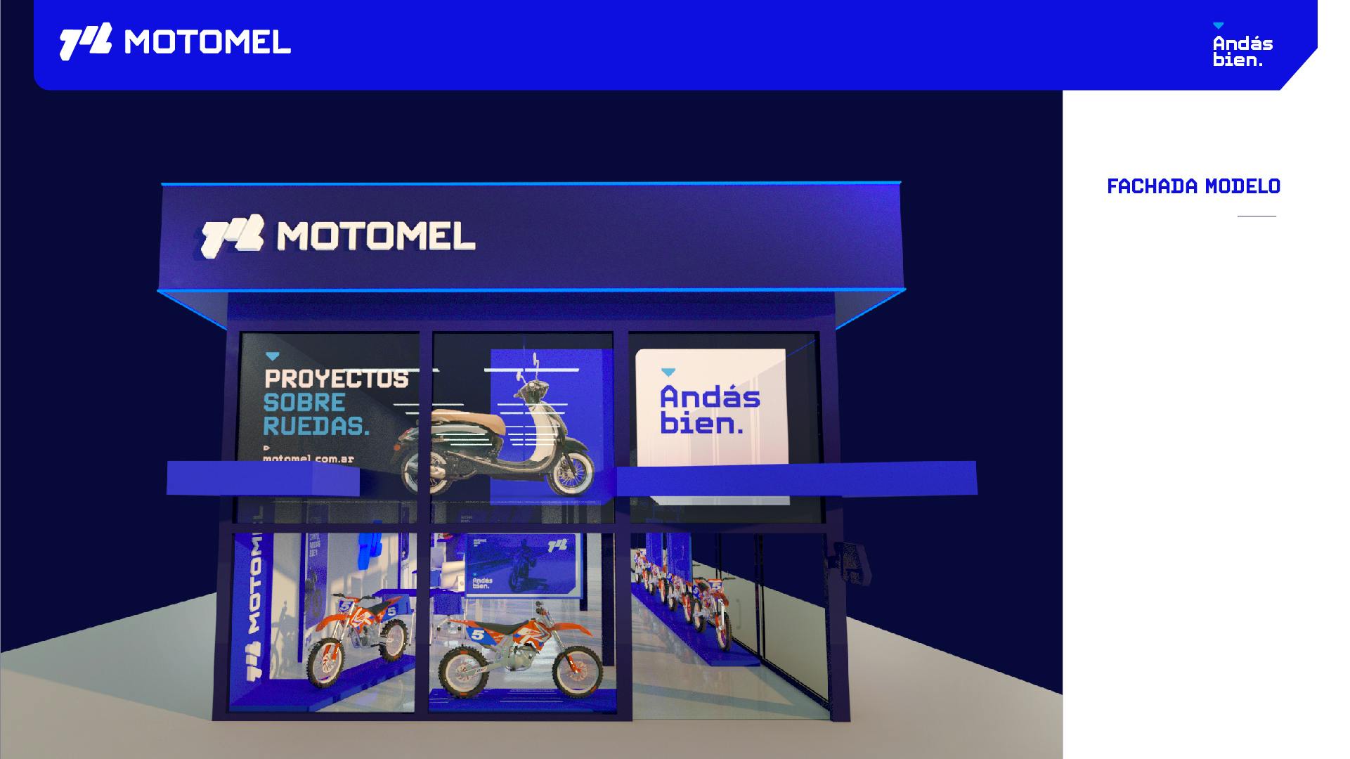
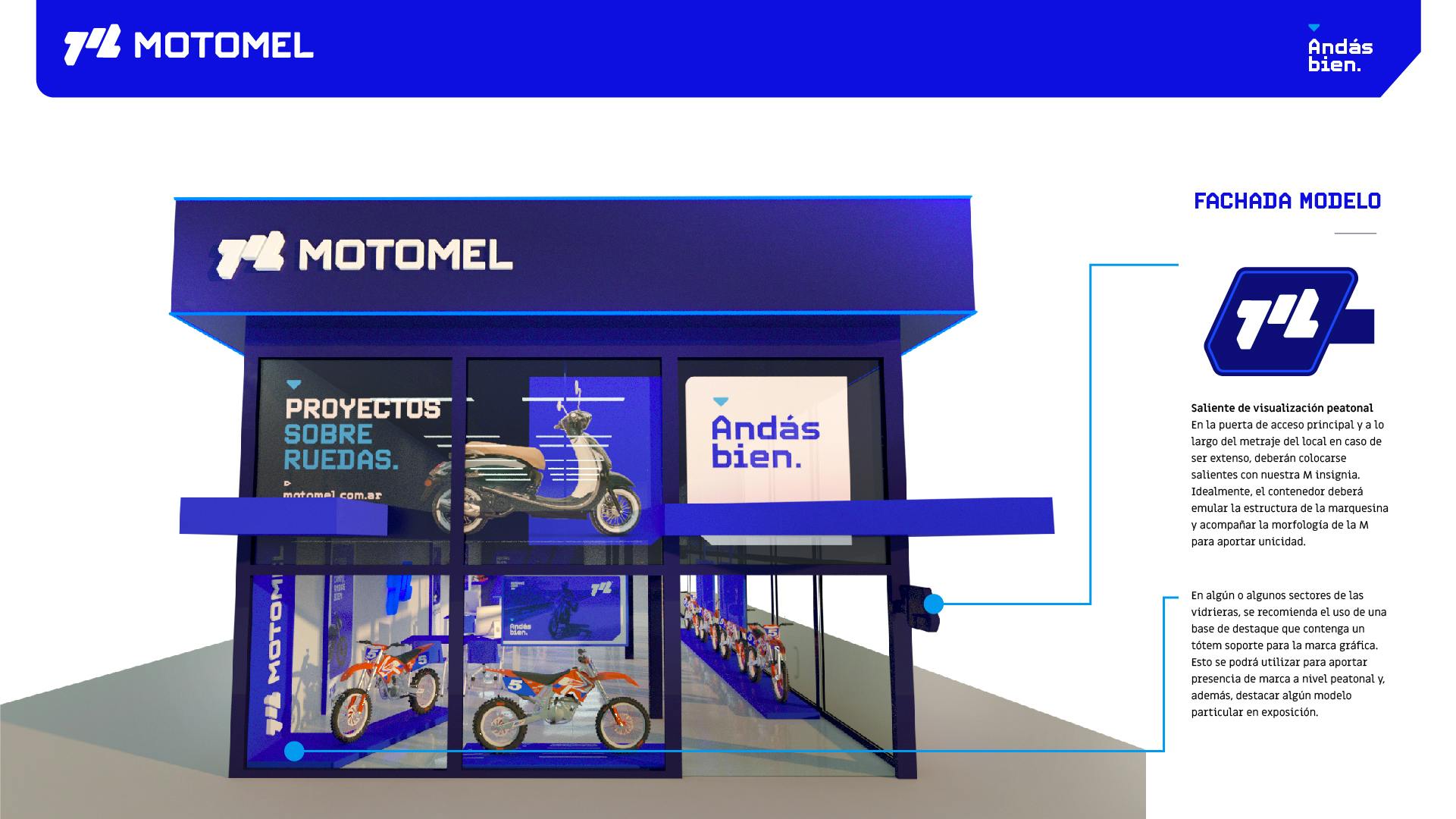
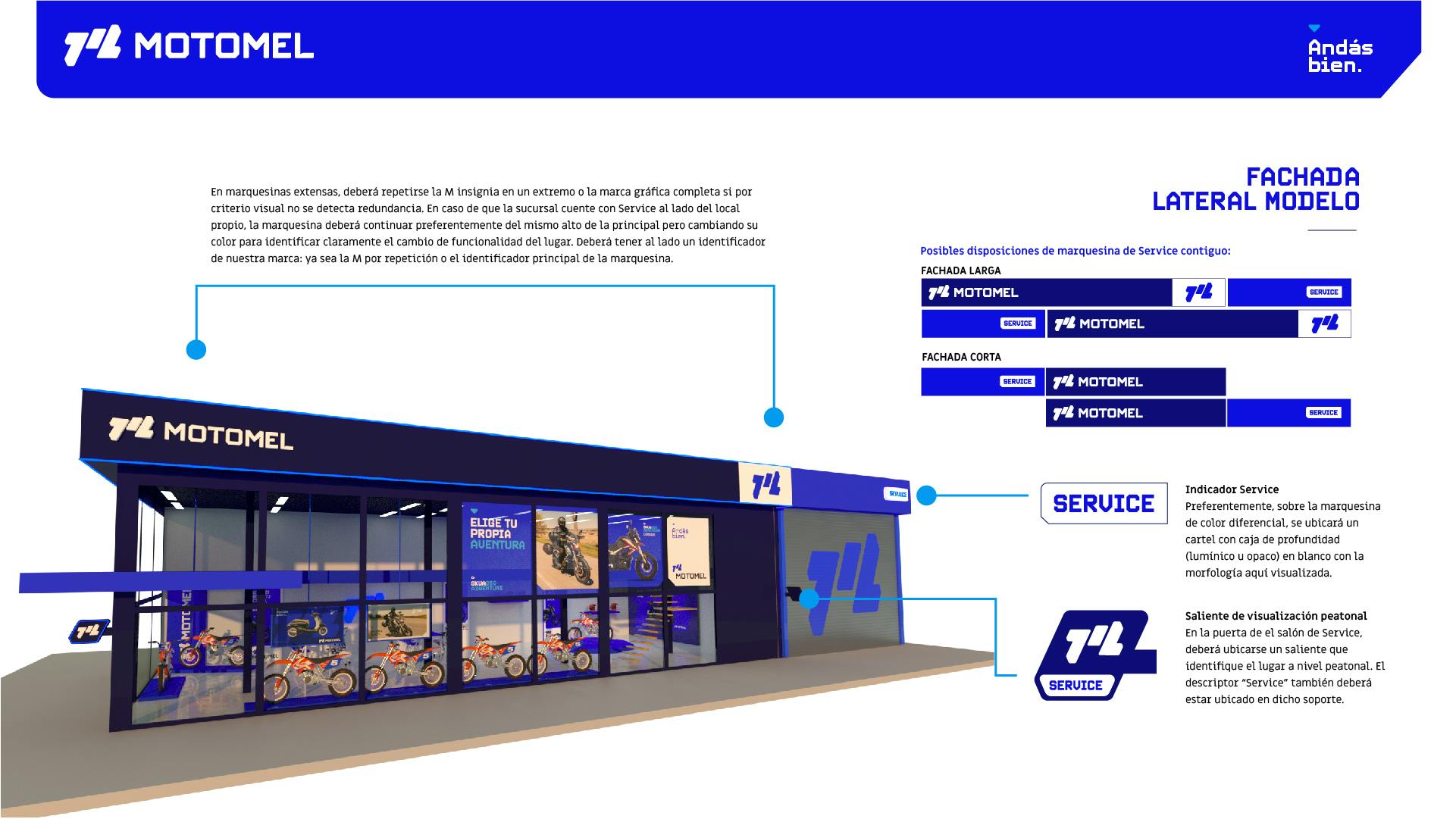
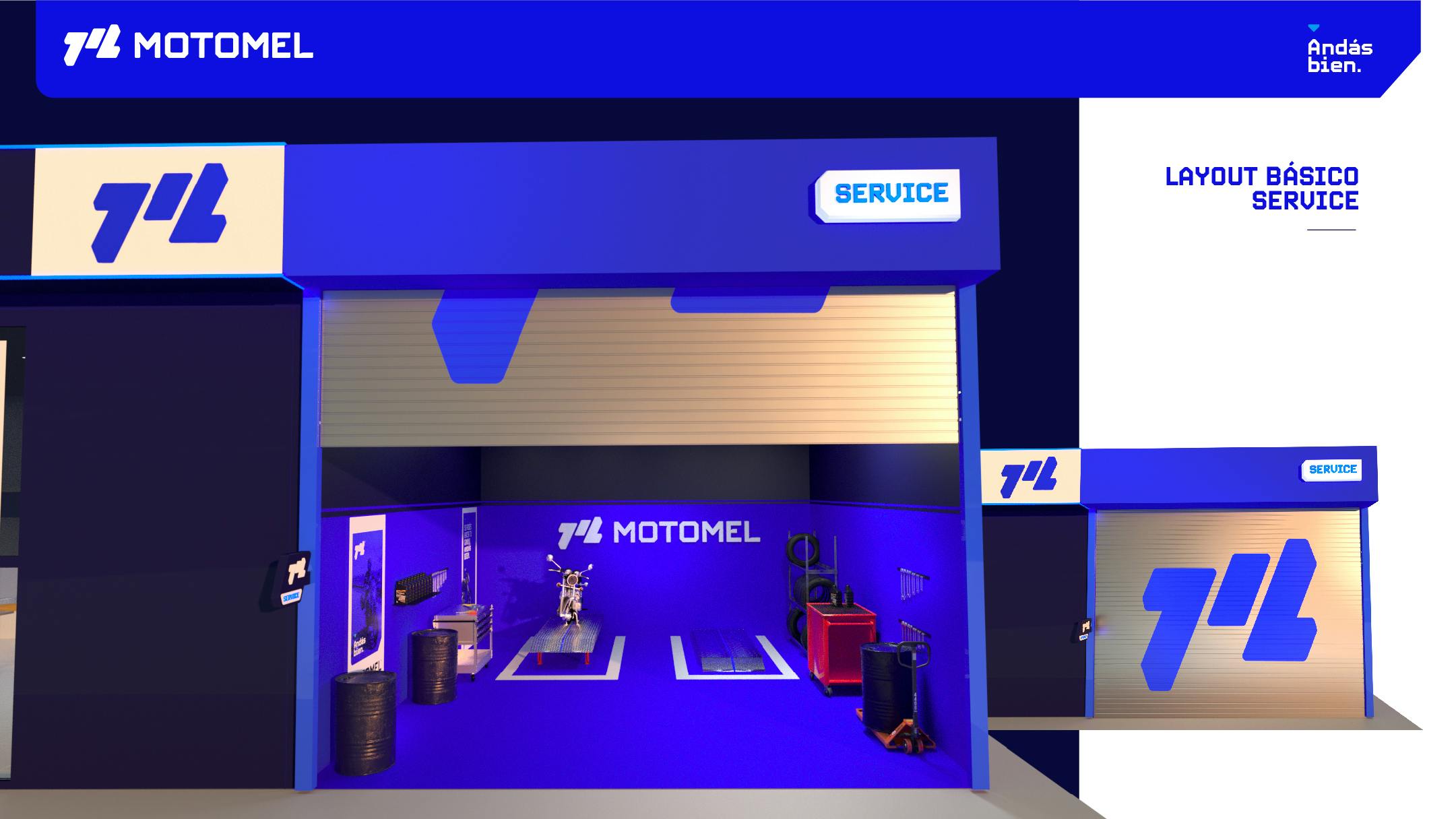
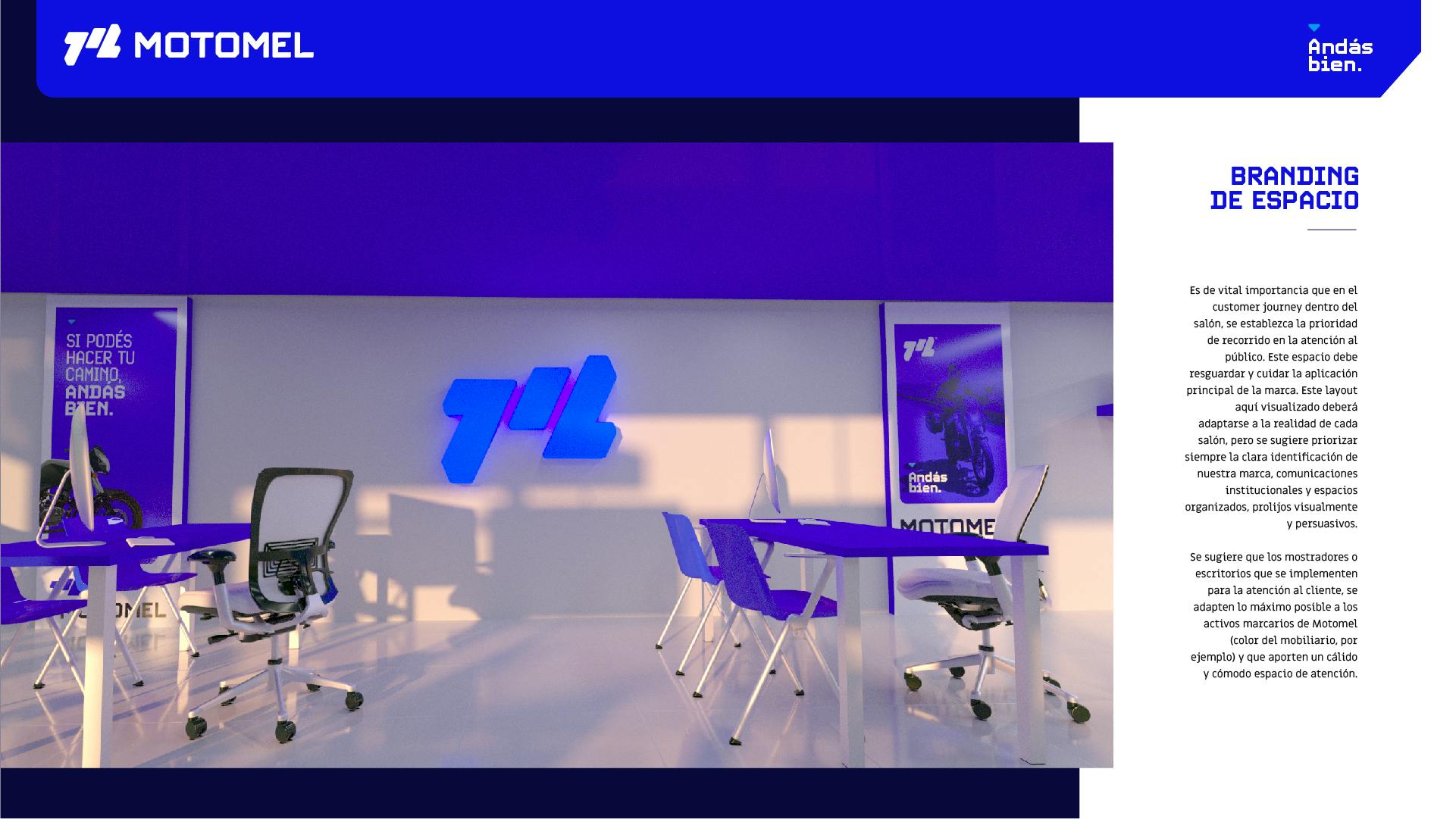
A spatial solution for a brand on two wheels.
We developed a complete identity solution including Environmental Branding for two key brand spaces: branches and event stands for exhibitions. Materiality, colors and information hierarchies united in a holistic spatial process.
1 of 7