Buenbit
Decrypting crypto.
Industry
Crypto
Finance
Digital
Serivces
Brand Strategy
Positioning
Visual identity
Verbal behavior
Buenbit is an Argentine app, which already says a lot about the financial vicissitudes to which Latin America is exposed. Buenbit wants to transport simple financial solutions that allow people to protect what is theirs and project a more stable future. It educates, inform and promote access to financial tools for those who fight from below and for those who are already done.
The end of the manifesto we wrote for Buenbit says:
"We are Buenbit, the ones in charge of decrypting the apparent crypto complexity to bring it to you and allow you to decide. We want to be your business peers, who are happy with every success and toast with you with every success. We are Buenbit, a group of people who once dreamed that dreams can come true.
And who did it."
1 of 2
A strategic evolution:
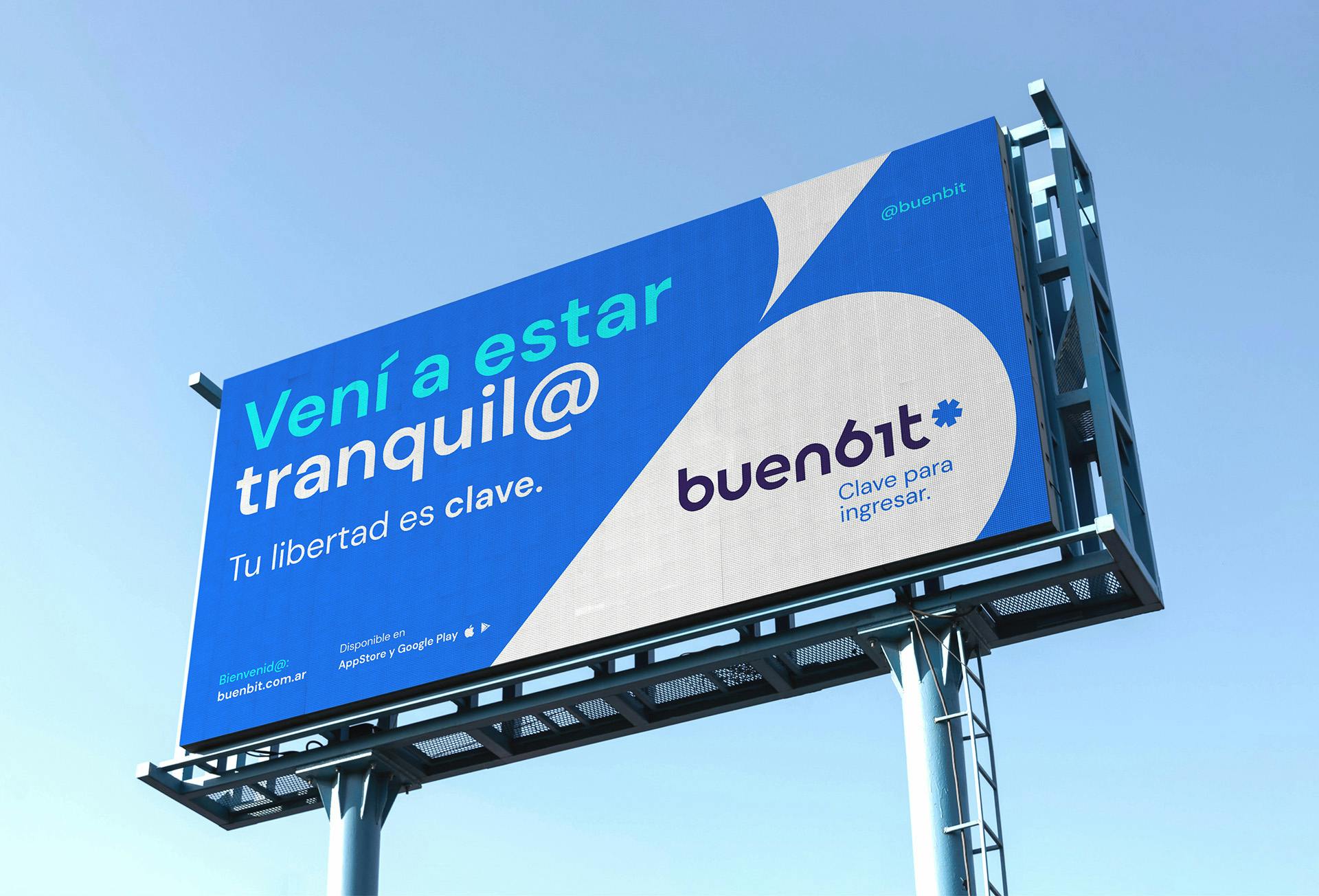
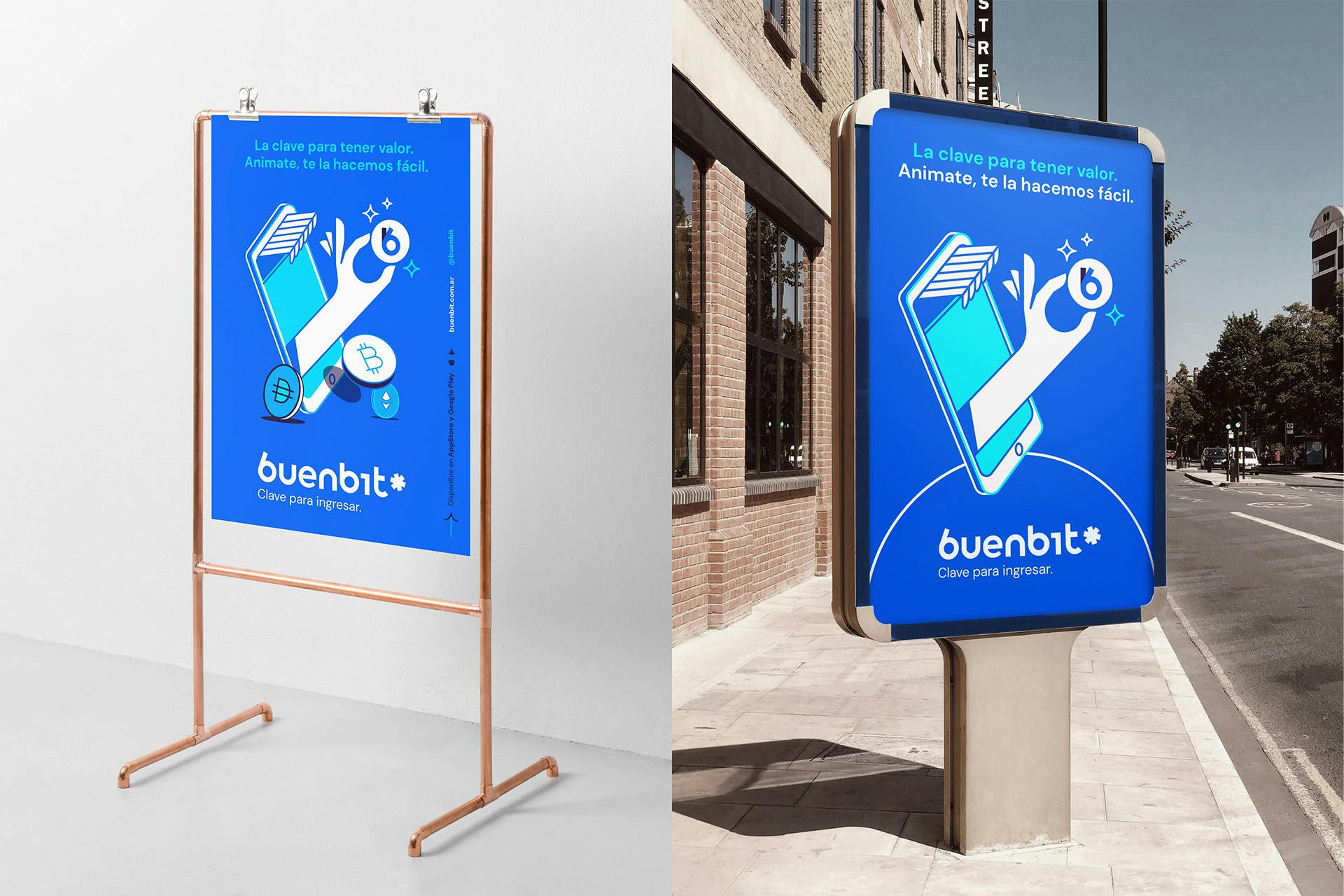
The purpose that we established in the strategic platform was as clear as effective: Buenbit comes to decrypt the crypto world. That is why it is key to enter the financial future in the easiest and most direct way. A strong visual brand had to complent the strategy platform developed and connect with the techincal needs of a digital-native brand.
Solid graphic assets:
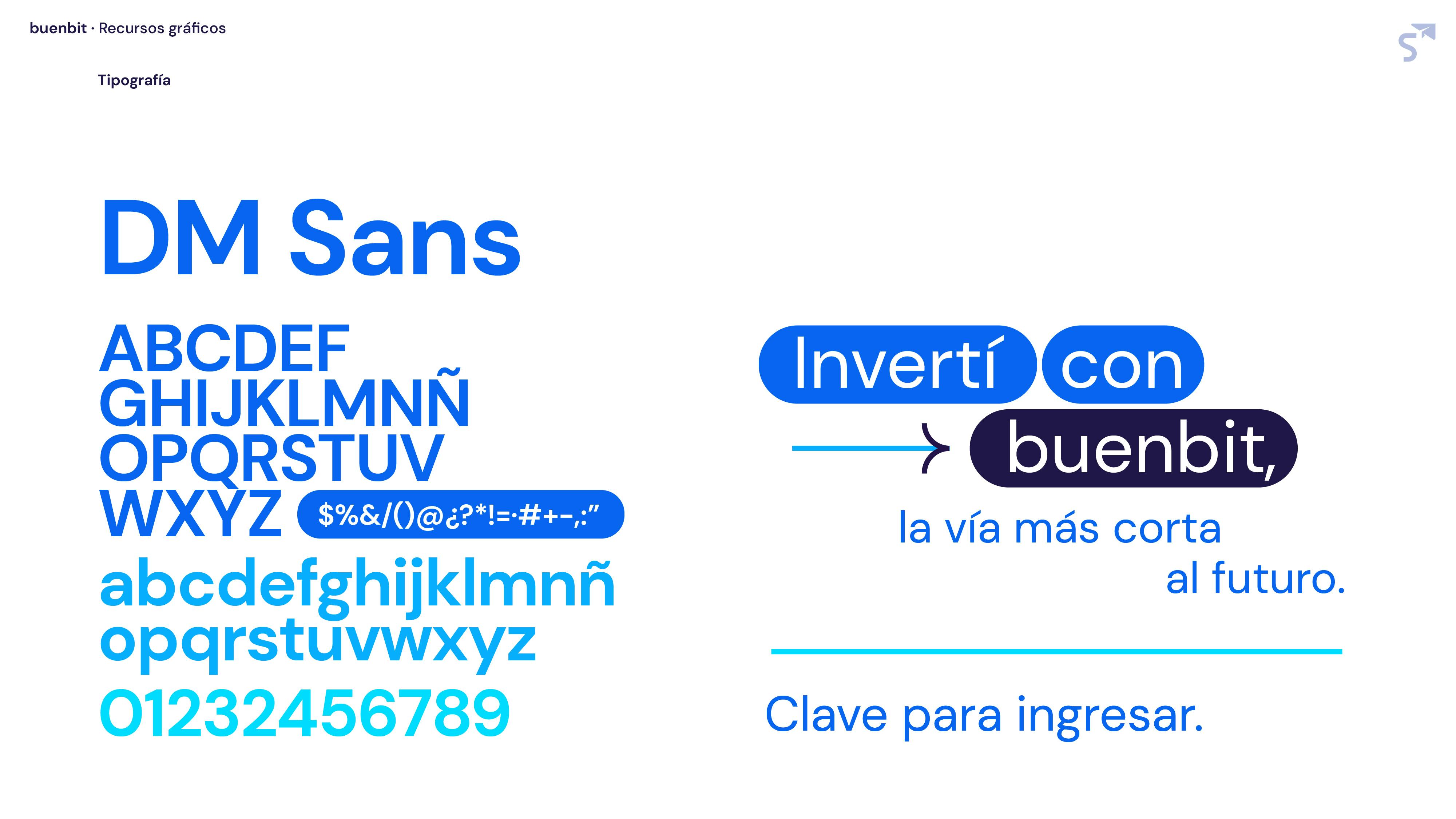
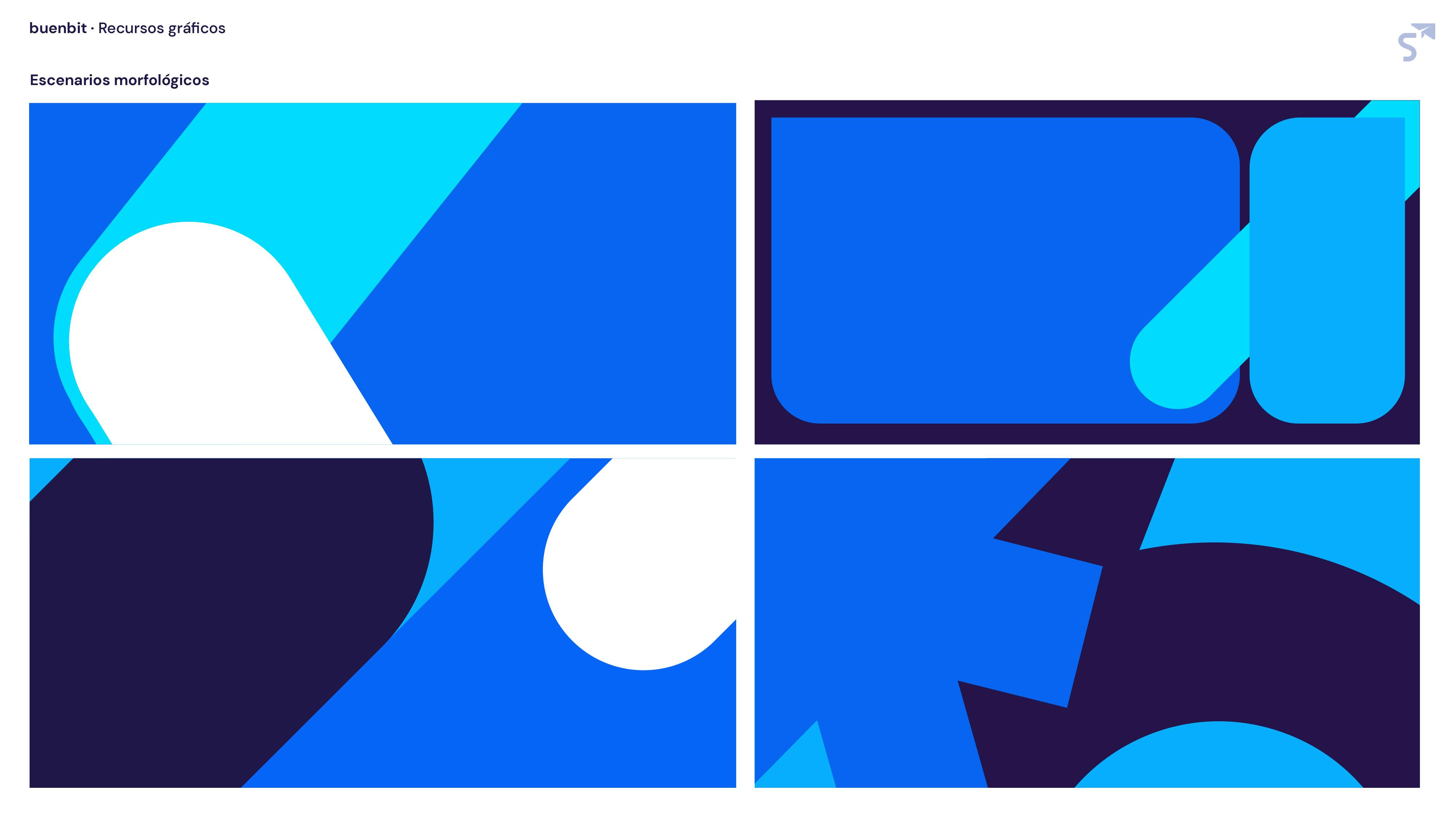
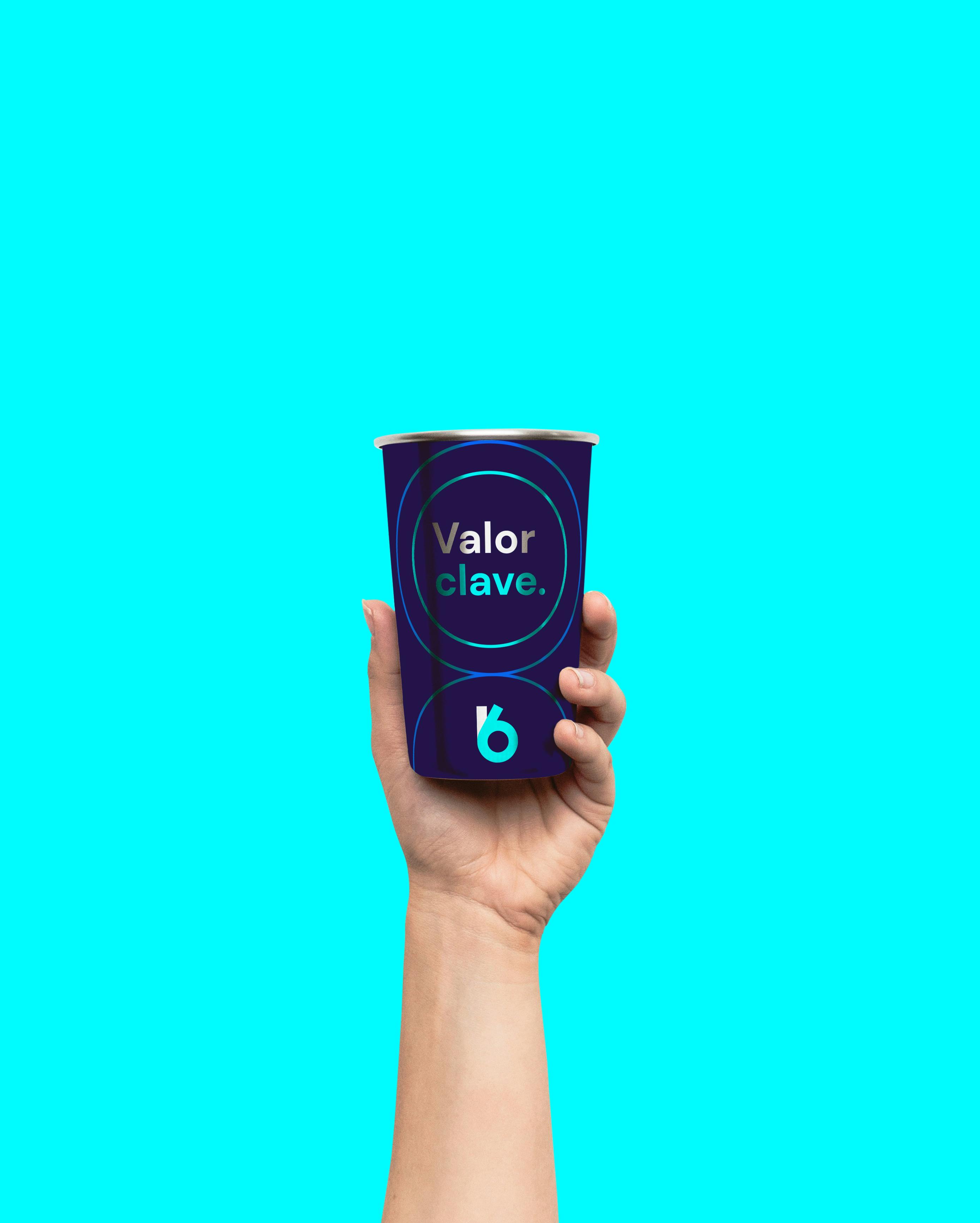
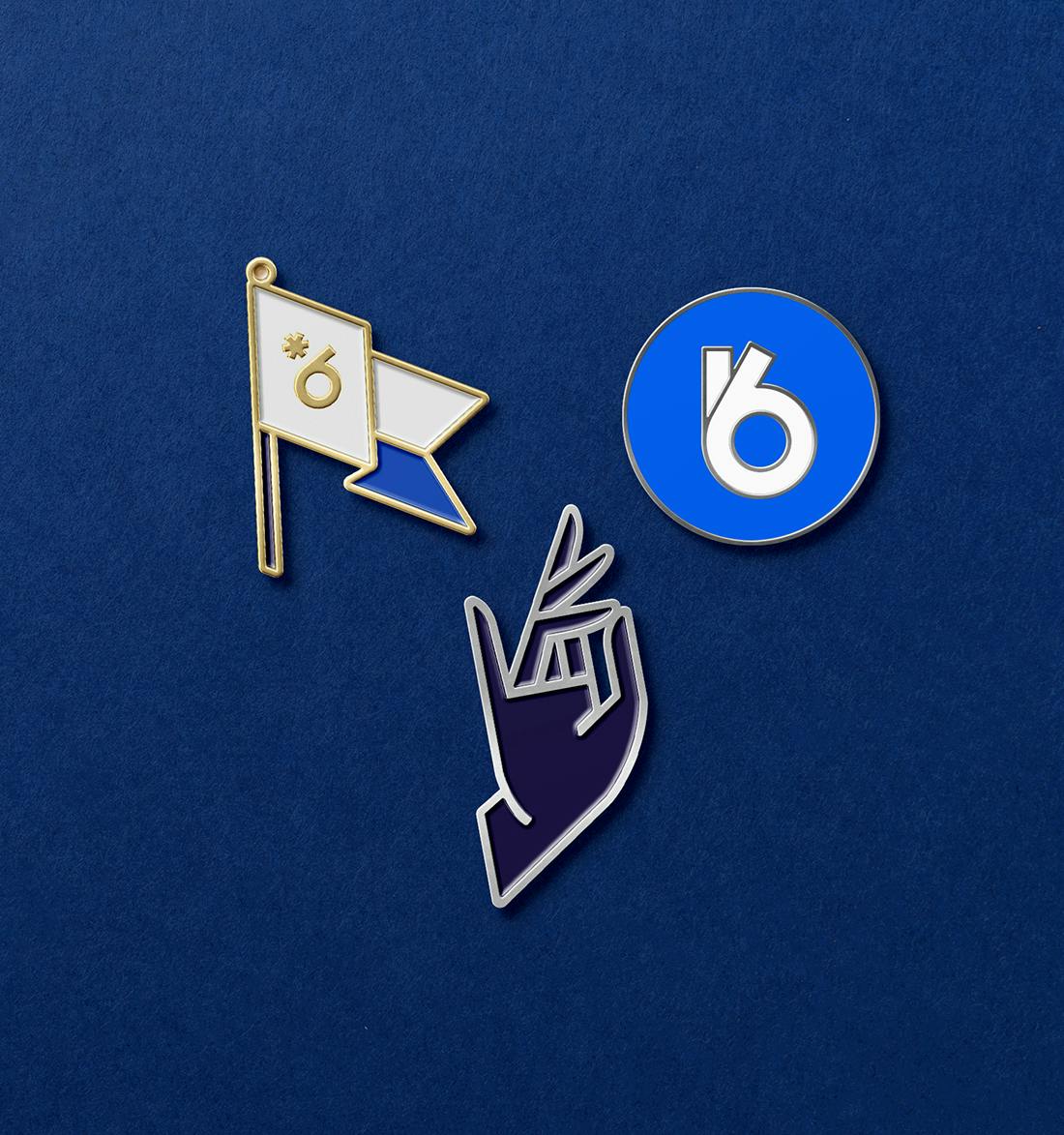
The graphic space is based on the chromatic terrain that the brand already had as a clear asset, which we combine with typographic tools + simple and effective iconographic illustrations that feel comfortable in digital environments. It is about communicating in a simple, relaxed, contemporary and, at the same time, solid way.
Tone & voice
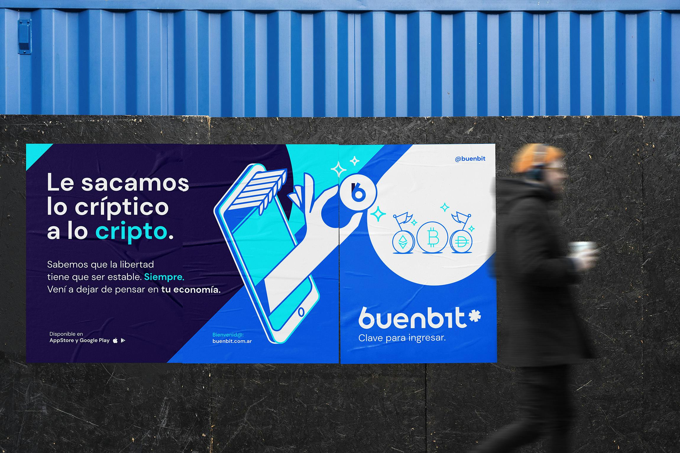
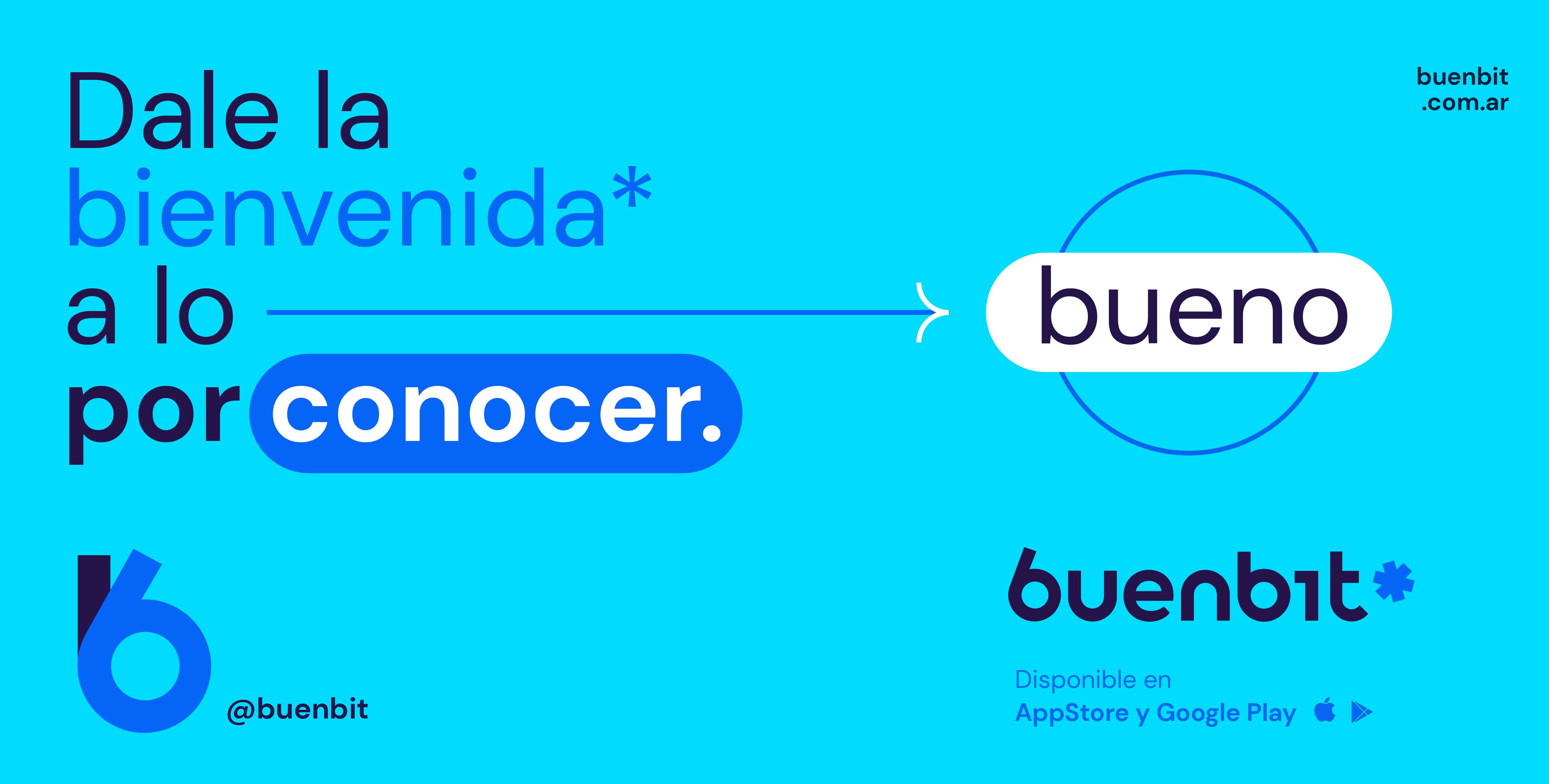
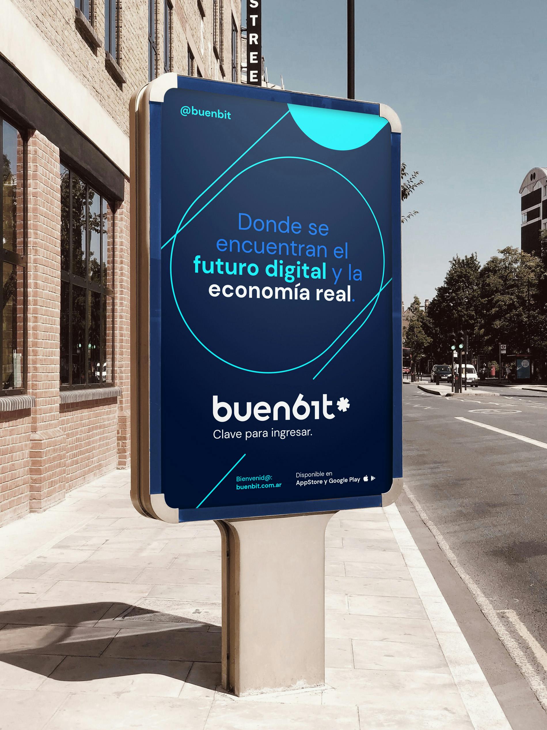
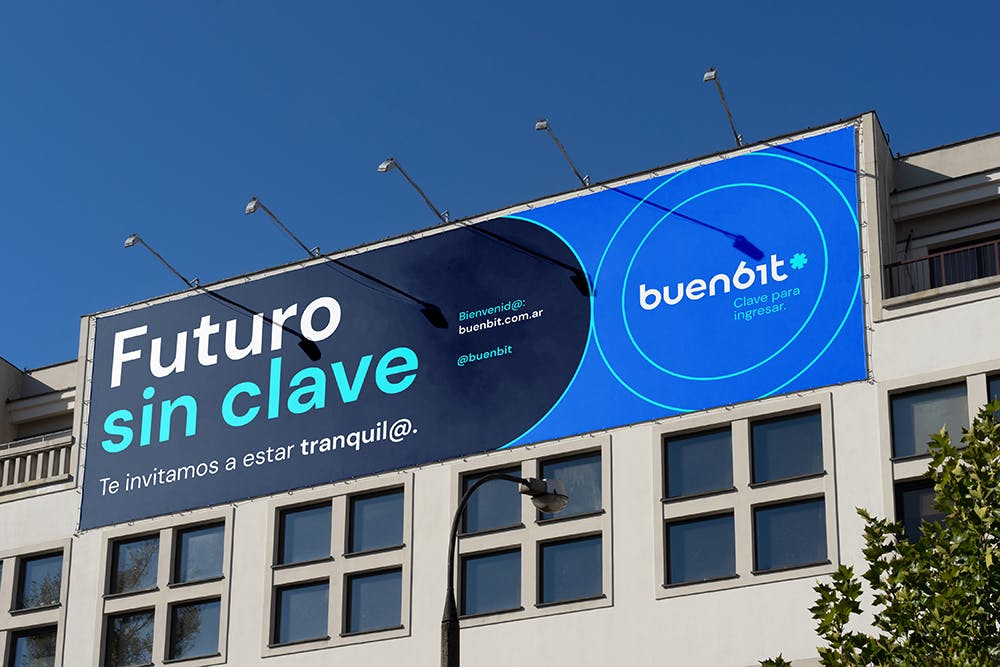
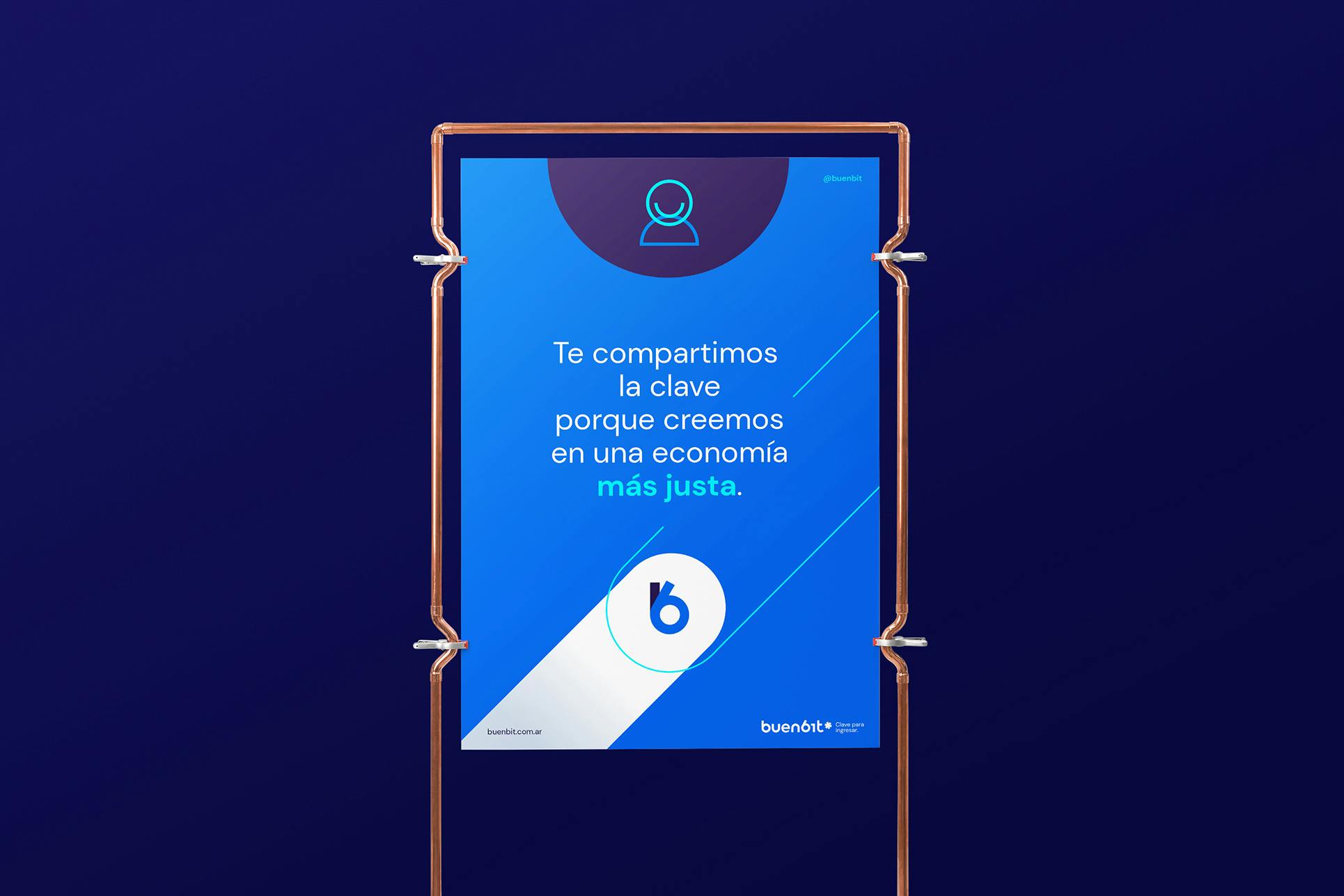
A crisp yet empathetic messaging and voice enables Buenbit to go beyond economic aspects and encourage its users to enter a new -easy and simple- financial universe.
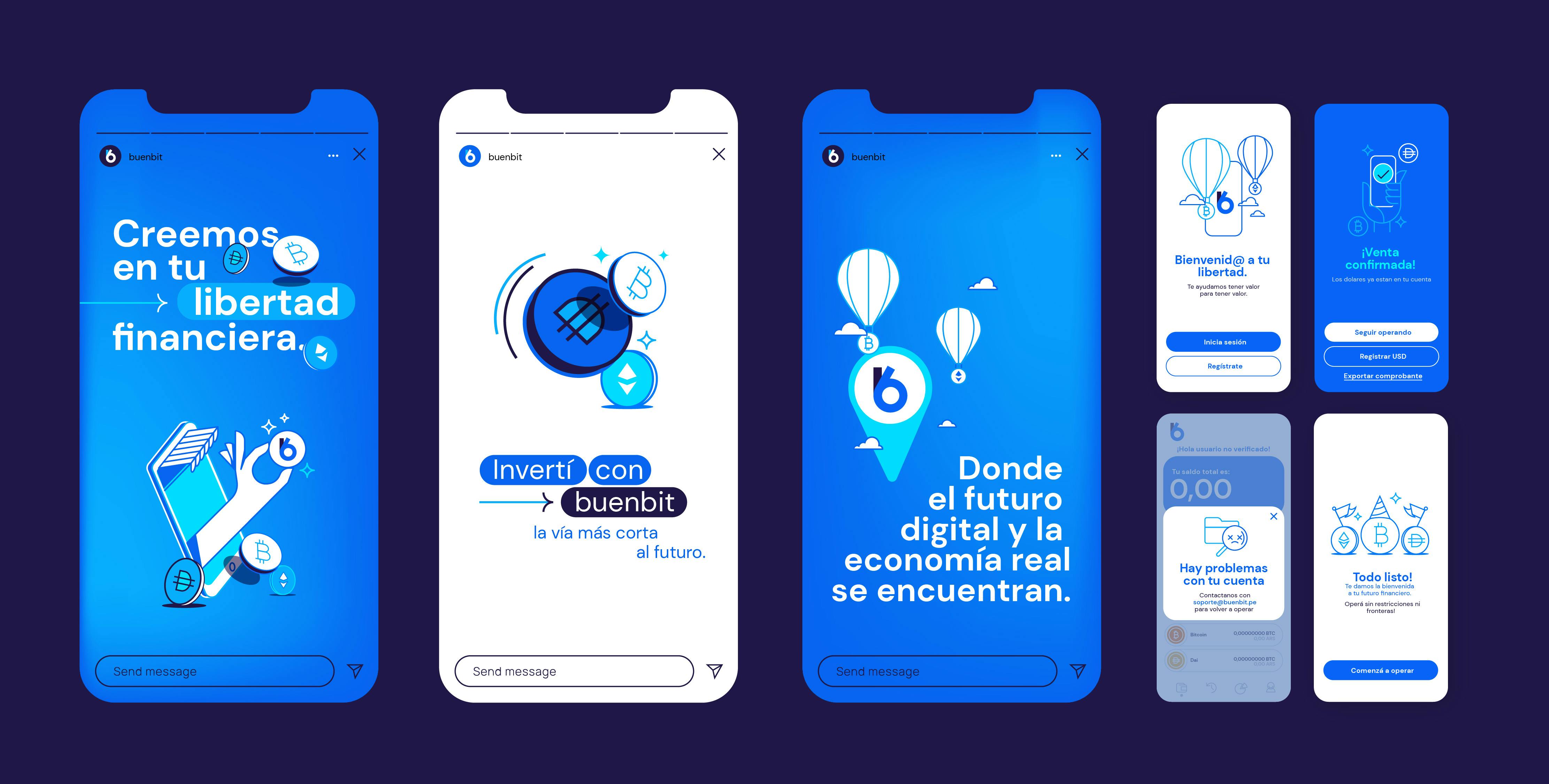
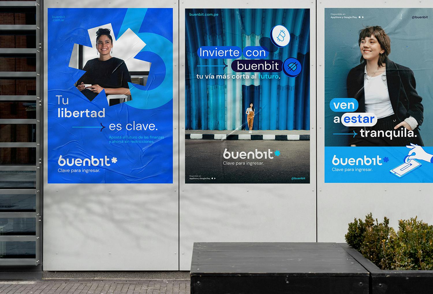
We played with the double meaning of different words and concepts to establish several key messages that make sense within Latin American people in this geographic expansion of the company.
Some of the messages are:
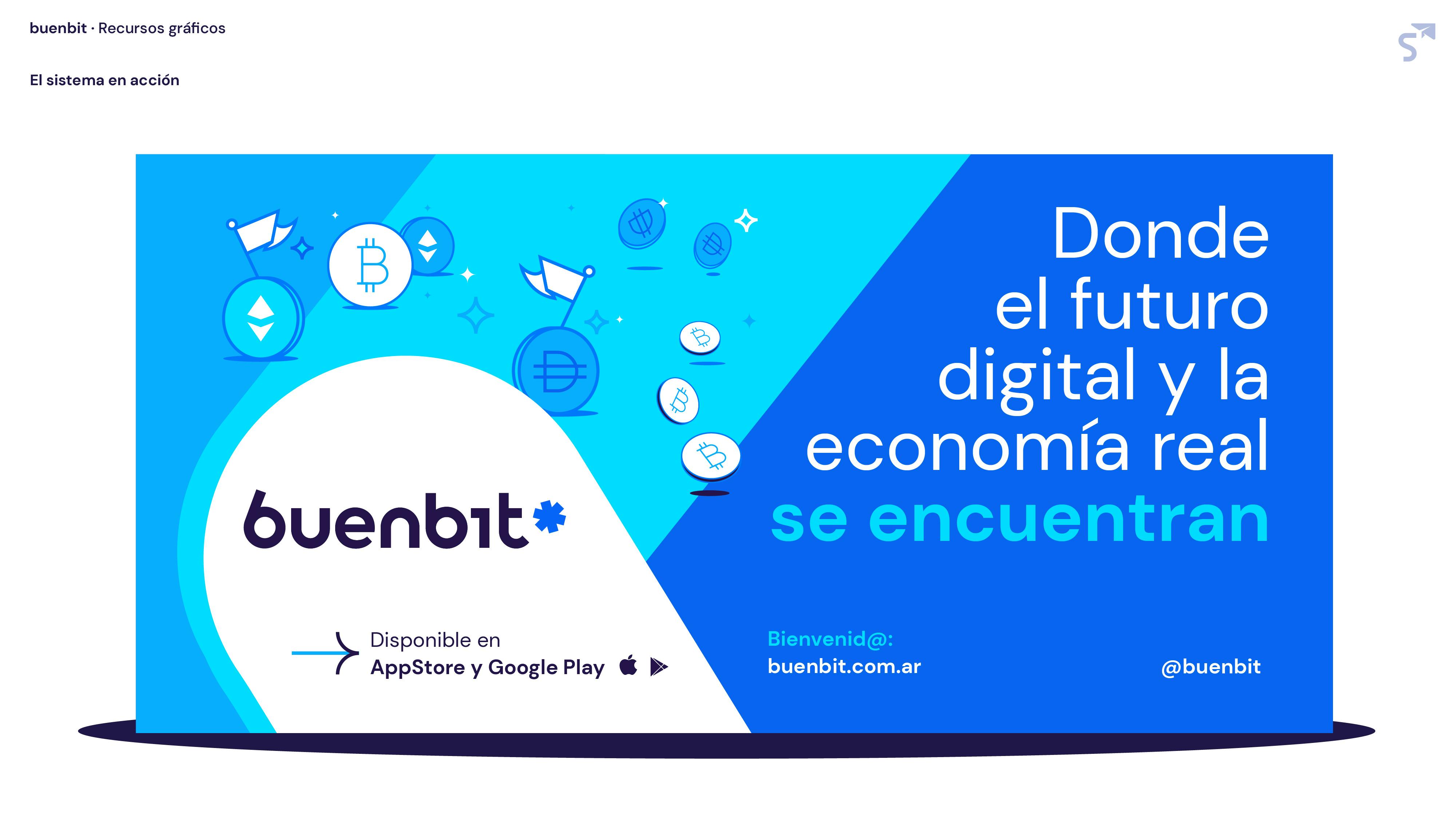
- Buenbit, where the digital future and the real economy meet.
- Future without passwords.
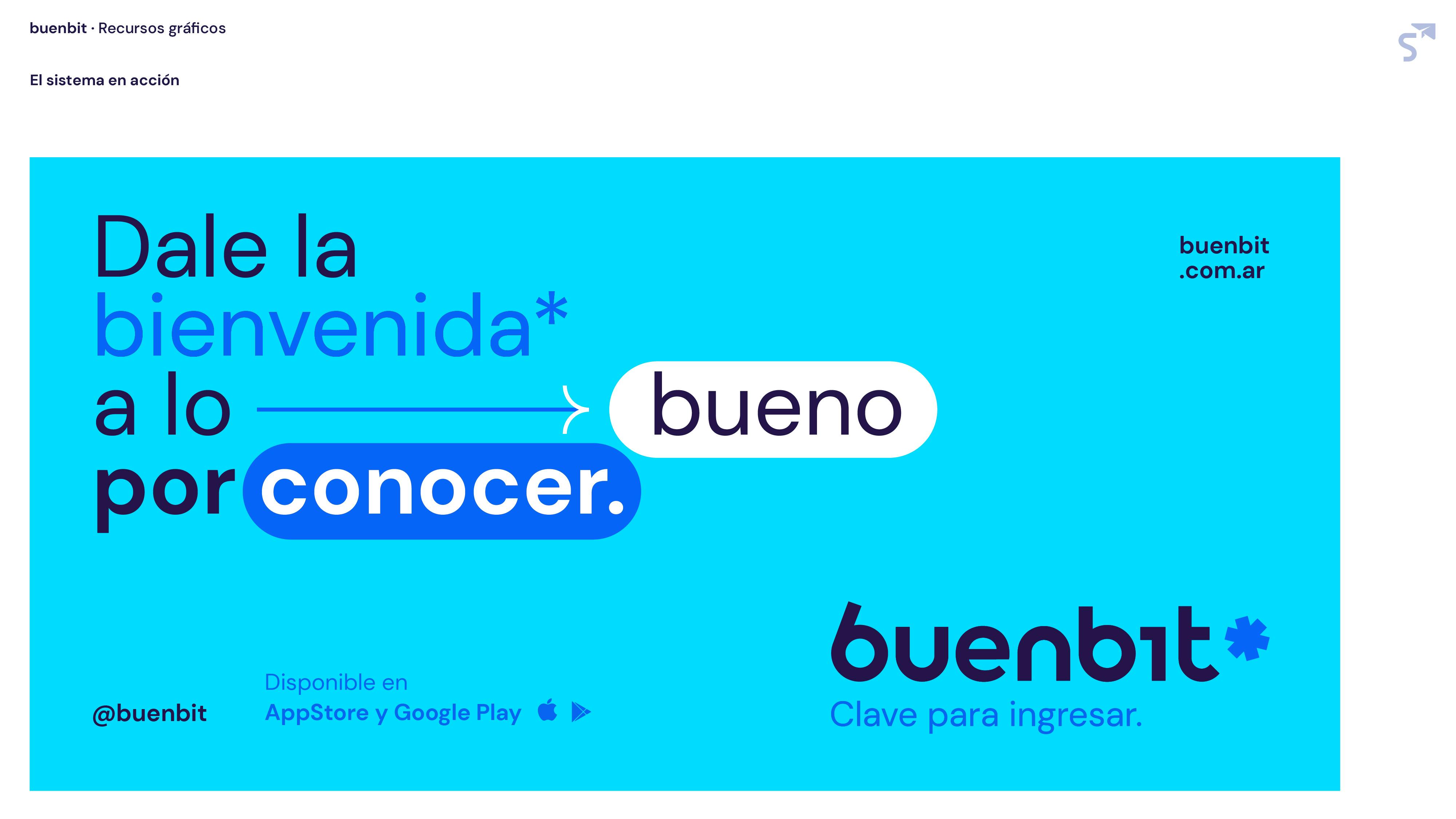
- Say hi to the "good to know".
A clear passage of the brand manifesto:
What you do with your income is your matter. We free you from the obligation to understand to win. Part of our vision for the future is to bring people the easiest way to enter a dimension that is complex only in appearance and that has all the ingredients to become the new normal.

1 of 4
The brand essence:
To enter is "to access", it is a gateway: Buenbit gives its users the freedom to enter a dimension that is complex only in appearance, where they can pay, buy, invest and plan. That is why Buenbit is 'the key to enter'. We describe the brand's conceptual audience as "non-conformists", those people who are always in search of 'the good to know'. For this reason, Buenbit positions itself as a 'curator of future': the fintech that adapts the financial future to your reality faster and easier.
The solution:
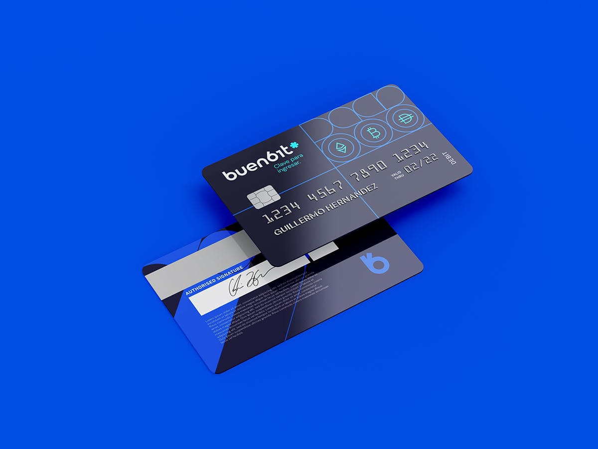
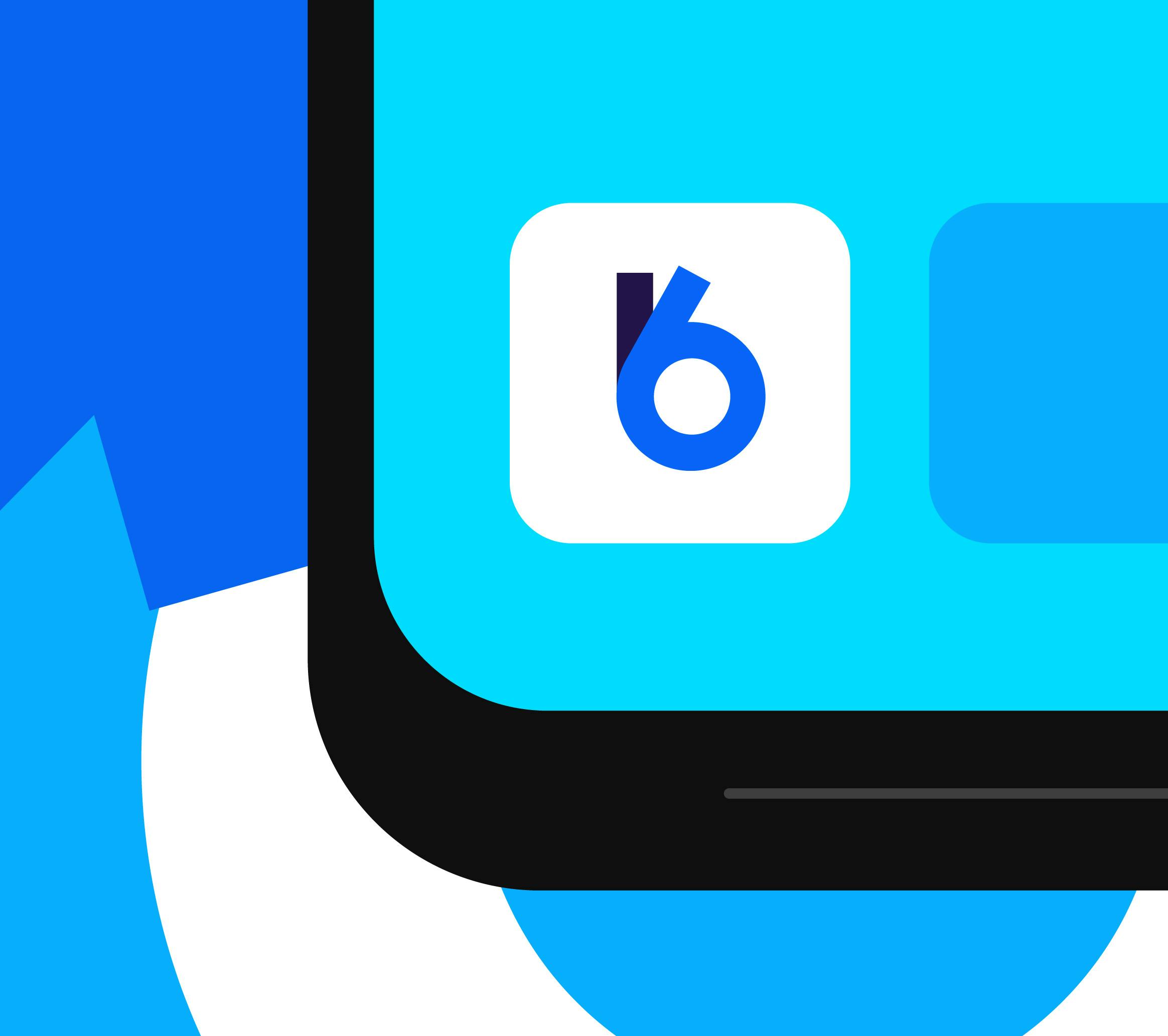
In our one-shot solution for Buenbit, we arrived at a typographical proposal that gave visual weight to the name with some specific touches such as the inclination in one of the "b", which added to the incorporation of the "i" perceived as a 1 and the final asterisk, give the logotype the perception of a 100% "readable" password that represents the strategic positioning verbalized in the tagline. The reduction symbol of the brand is achieved precisely with the overlapping of the two letters B of the name, which achieves a clear evolution of the symbol that the brand had as an isotype.
1 of 2