

Brelo
A flexible bonding experience.
Industry
Fintech
Digital
Finance
Serivces
Strategy
Naming
Visual Identity

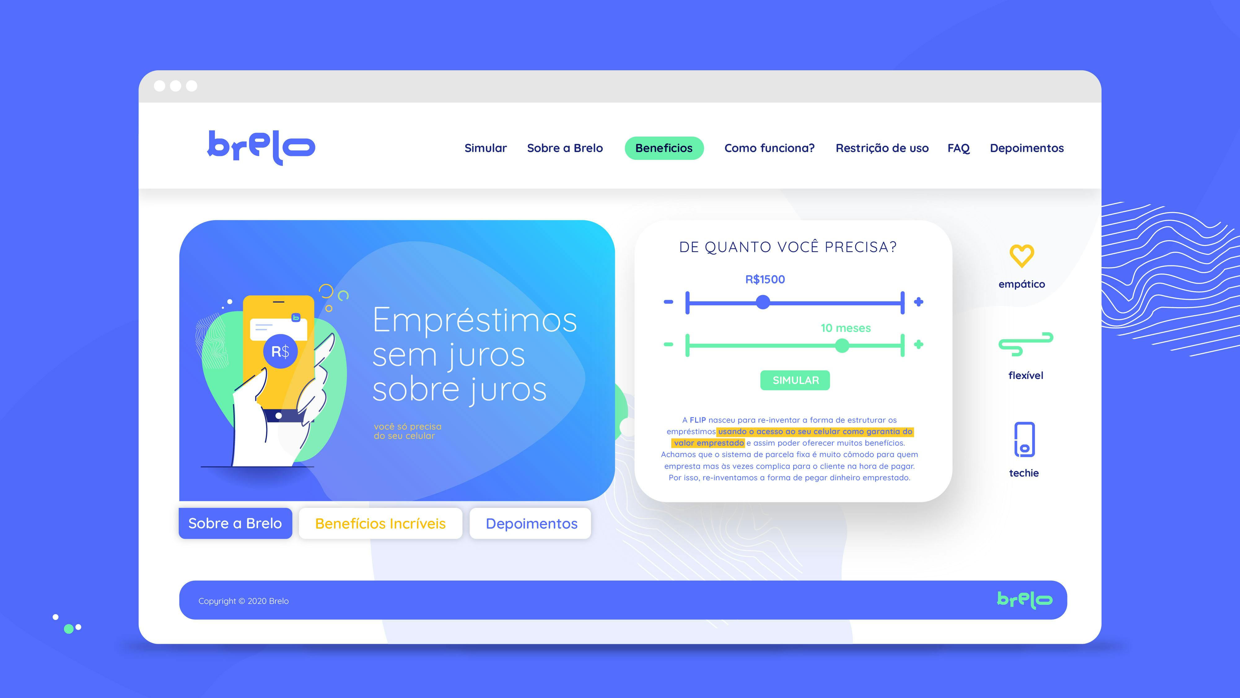
Brelo is an innovative brazilian app that offers personal loans by using the cellphone as collateral. We developed the brand strategy, naming and visual identity in a co-created process with clients’ team.

The starting point:
• A brand name, Flexipag which needed to change for legal reasons.
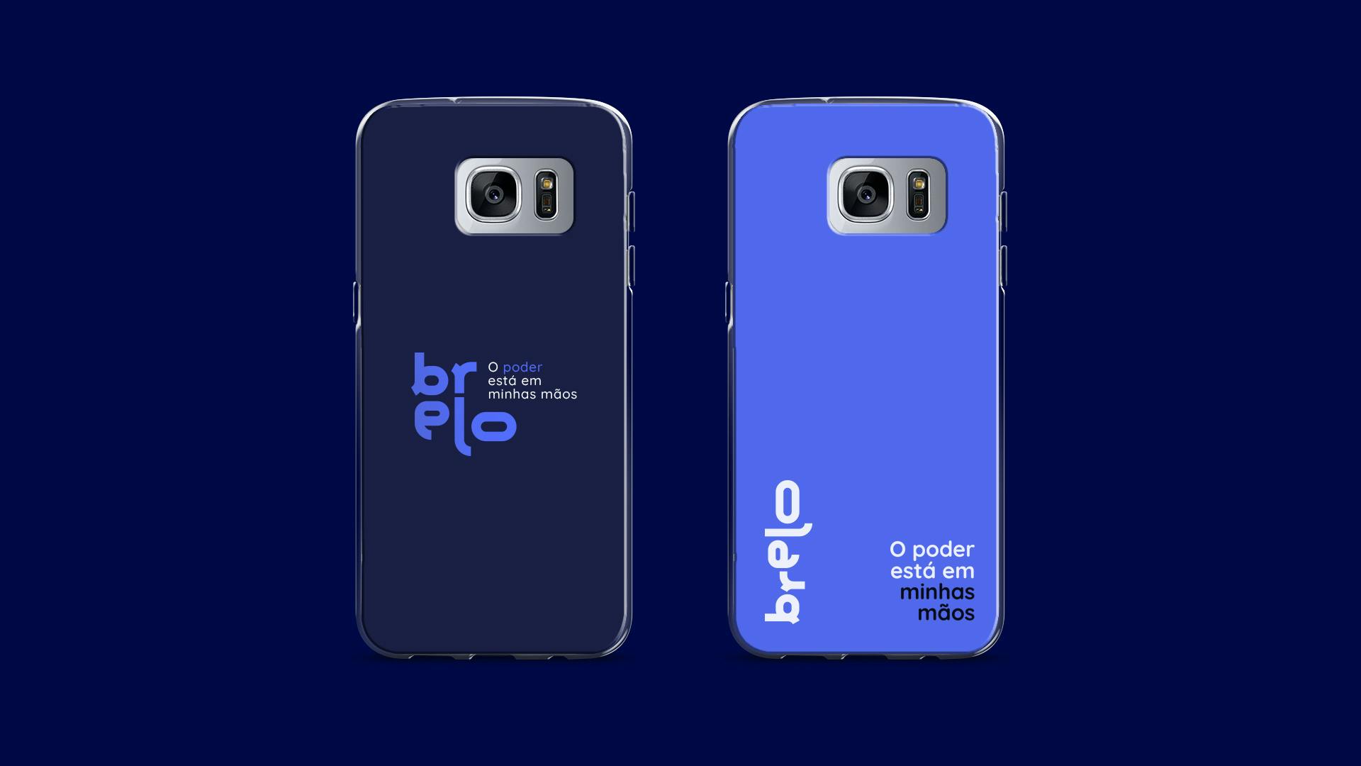
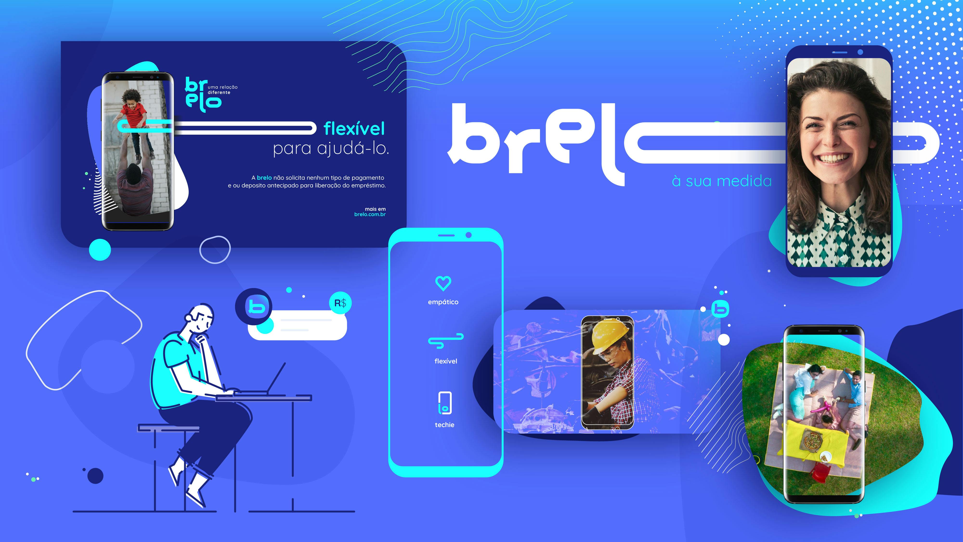
• A powerful purpose completely hidden. Brelo mission is to generate a positive real impact in the life of its users, becoming the main supporting reference for people who need financial help.
• A brand full of humanity embodied in a cold visual identity.
The solution:
A brand revolution built around bonds.
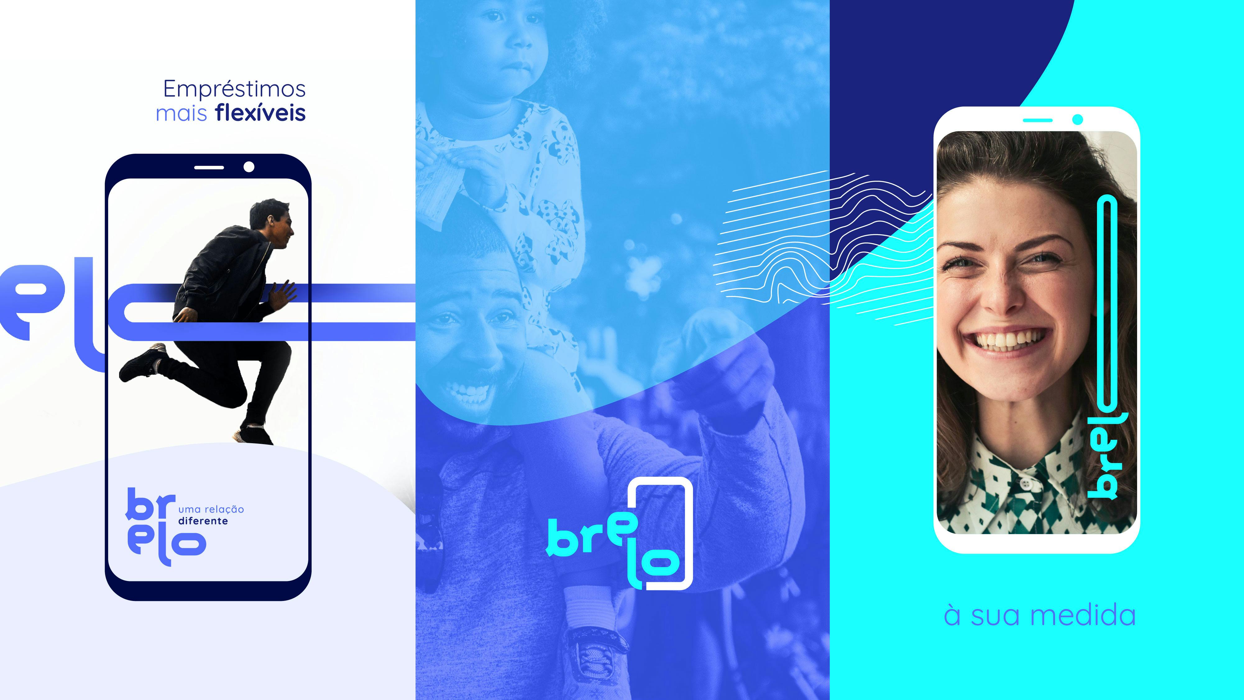
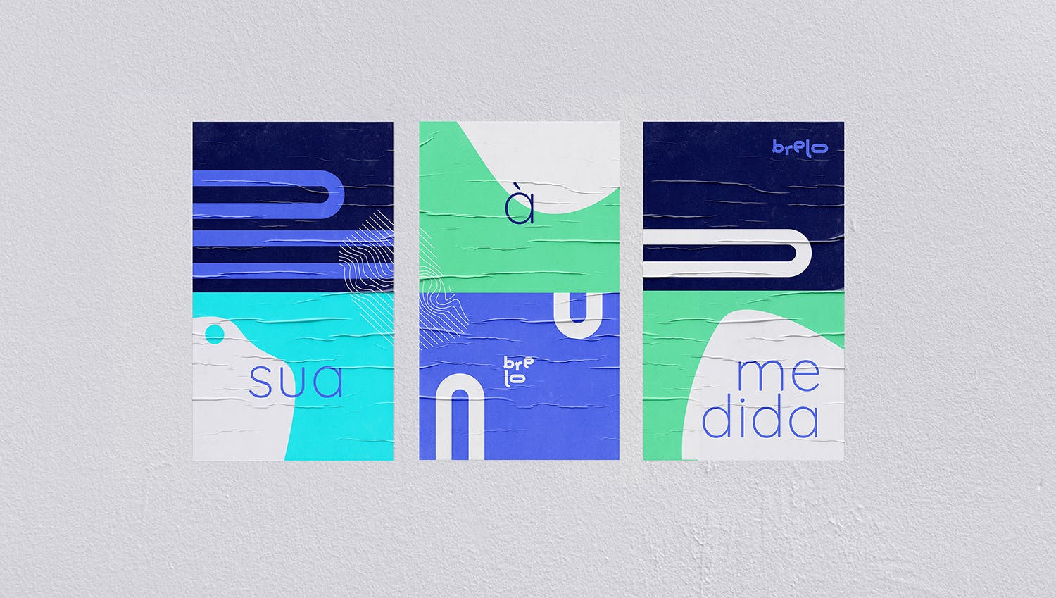
“Elo” means ‘bond’ in Portuguese. The brand concept we developed combines different associations in a simple way, achieving a pregnant and digital name prepared to be easily pronounced in Portuguese, Spanish and English.
Brelo = Brazil + Elo (Portuguese for bond)
We semanticizes the ‘flexi’ aspect of the former name on the visual identity.


1 of 3
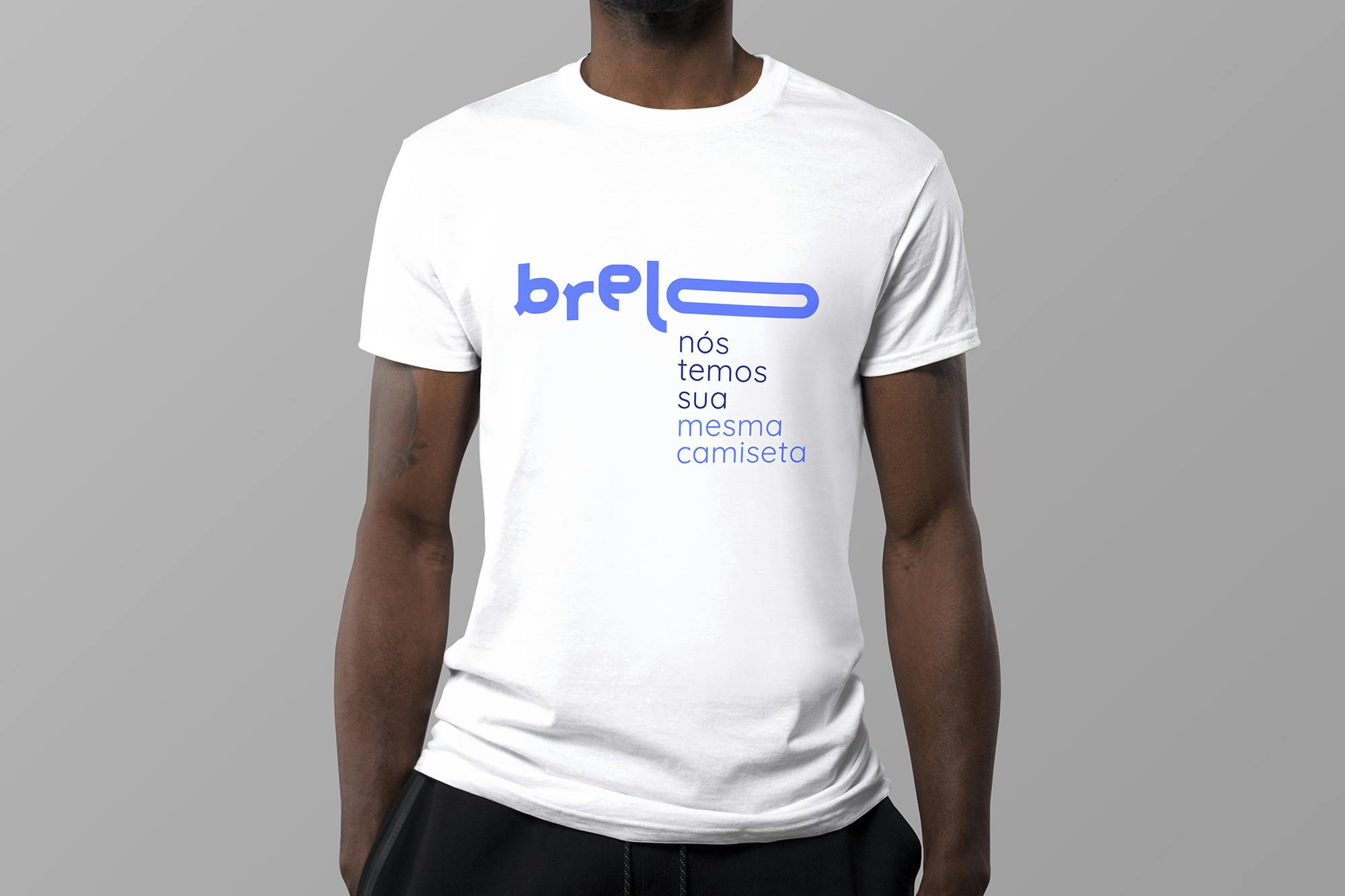

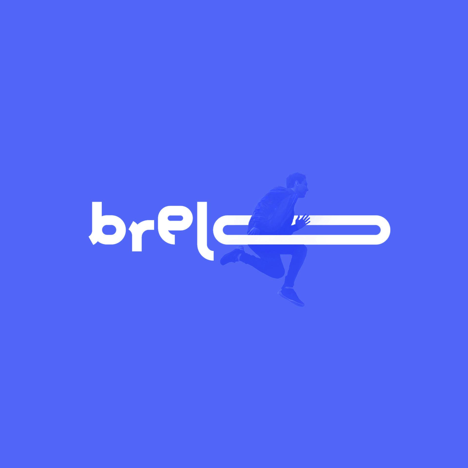
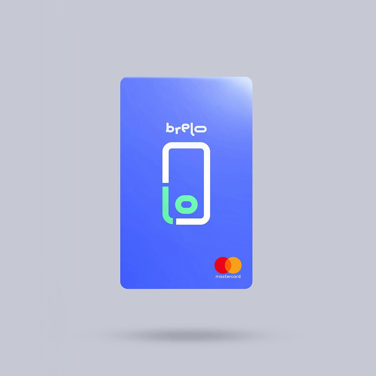
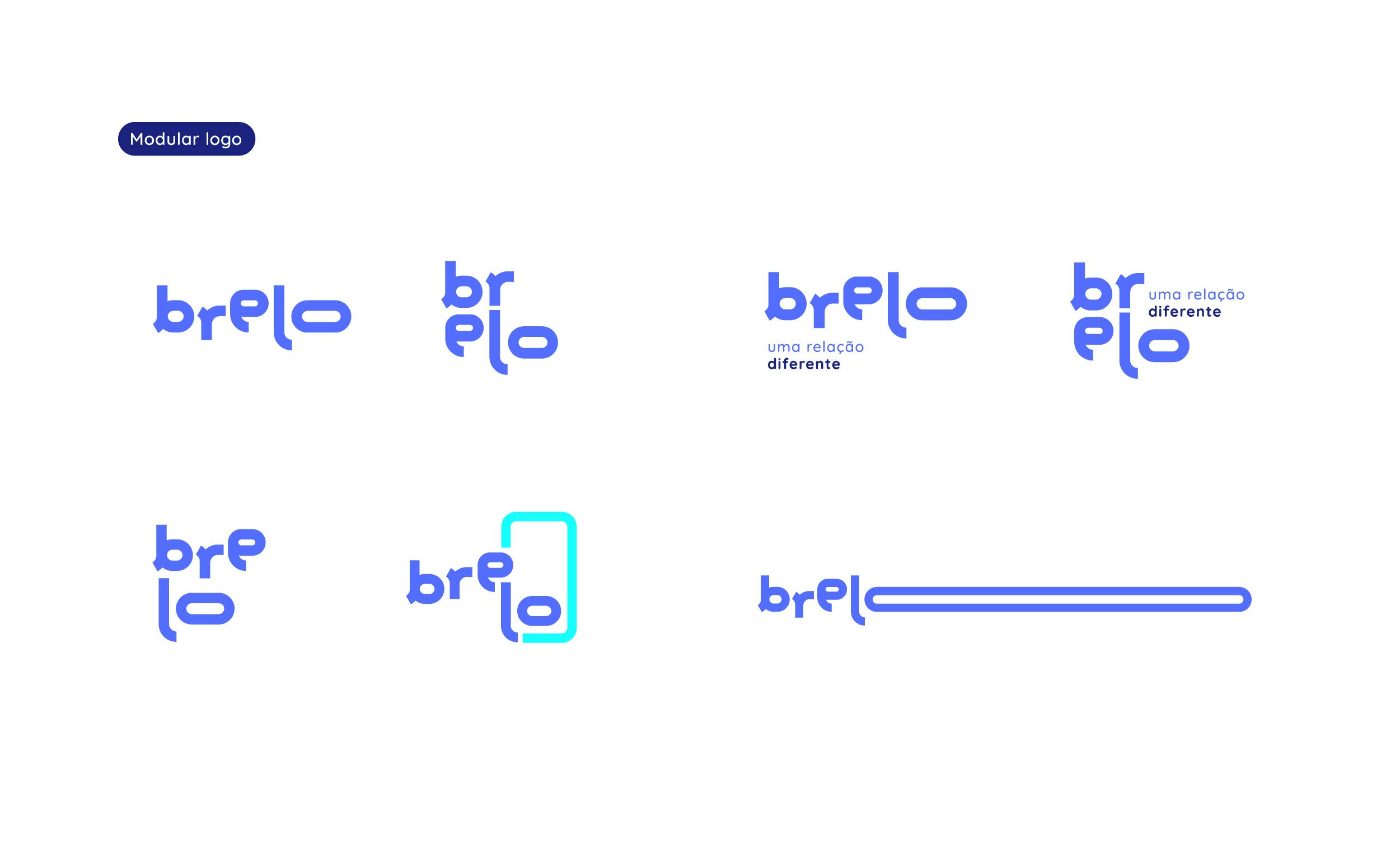
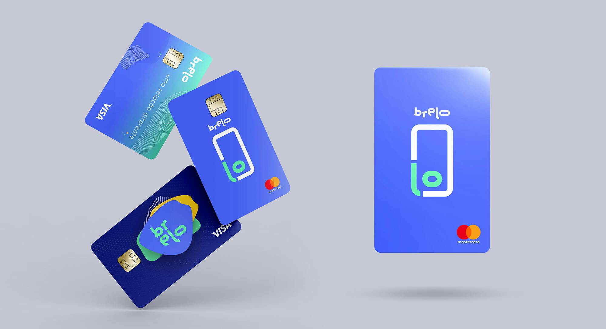
A kinetic logo
Brelo logotype is modular to represent flexibility in different ways and has a graphic reduction, designed with the initial ‘b’ that brings the elasticity of the letter ‘o’ to represent the brand in every responsive need.
Brelo adapts itself to the possibilities of each user.

Simple's team is superb! Is not just about having a "nice designed logo", but the entire working process was a game changer for our company.
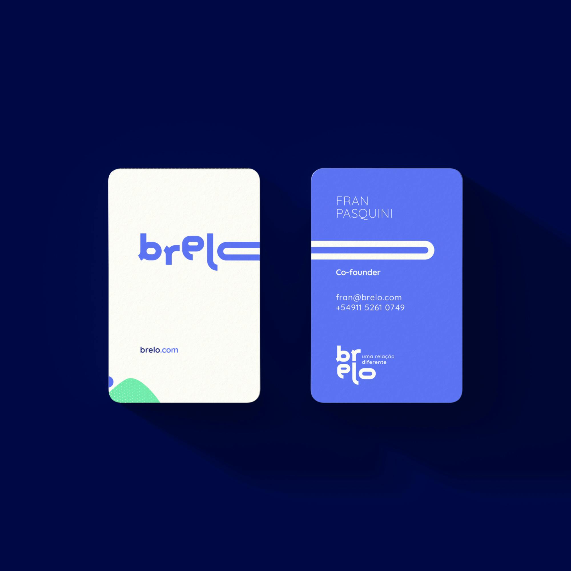
Fran PasquiniCo-Founder · Brelo


1 of 5
